entries Tagged as [typography]

Typographic rhetoric 1

‘Almost all human reasoning about facts, decisions, opinions, beliefs, and values is no longer considered to be based on the authority of absolute Reason, but instead, is seen to be intertwined with emotional elements, historical evaluations, and pragmatic motivations. In this sense, the new rhetoric considers the persuasive discourse not as a subtle, fraudulent procedure, but as a technique of ‘reasonable’ human interaction, controlled by doubt and explicitly subject to extra logical conditions.’ -Umberto Eco, Italian Scholar and Semiotician

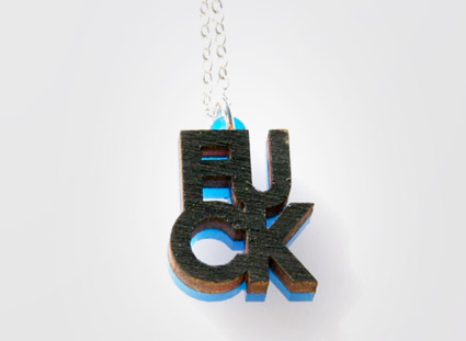
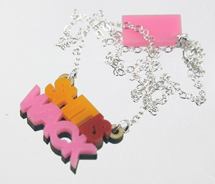
Here’s a great article at Mert TOL on using type to  . . .  manipulate and control.
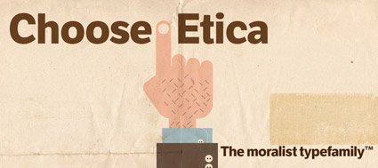
Photo by mehallo

Check out THE TPUTH

New socially-generated NEWSPAPEP. Go HEPE. Cool design.

A look at The NYT Magazine redesign

‘It’s all in the details. Our end slug was pulled right from the logo itself, the dot on the ‘i’ to be exact. This was a small but proud moment for us. I’m sure you saw the connection right away  . . .  right?’

Check out this great, detailed article about the recent NYT Magazine redesign at the Society of Publication Designers Blog.

The NY Times on sleep


Click for larger version/jump.

Plus,
Here’s their All-Nighters series on insomnia, ‘a nuisance, a disease, a curse, an opportunity or even a gift.’

I just know from Twitter and Facebook that most of the United Kingdom is waking up when I’m typically designing stuff.

And this hour we lost this weekend  . . .  total BITCH.

Obamabats

24 Obama dingbats. TrueType format. Free. Here.

Al Gore improves the Brioni typeface

‘he explained that they were designing a new book for Al Gore, Our Choice, the sequel to An Inconvenient Truth’

Better numbers = better reading. Article here.

Etica

Type Together’s Etica fonts are a rethinking of Helvetica for the 21st Century. Details here.

Found via Helen Brennan

Deuno

‘The lettering was based both on Mayan hieroglyphics for their shape and grid-like structure and the hand painted lettering found on signs all over Mexico’

Designer Mike Abbink and Paul van der Lann’s Deuno Sans, designed for El Banco Deuno (One’s Bank) in Mexico. Details here.

Unfortunately, Deuno is not available for licensing.

Yellow, Gray

Video for We Have Band’s March 22 release Divisive. Directed by Jul&Mat, produced by SoLab. From the upcoming, self-titled album WHB.

Official Website. MySpace.

Found via Jason Malmberg

Logorama, Oscar-winner

Over 2,500 logos. And six years to make.

Congratulations to Nicolas Schmerkin, François Alaux, Herve de Crecy, Ludovic Houplain and their team for winning the 2010 Best Animated Short Film Oscar for Logorama.

Watch the actual film above. Website here.

And
Snag your own downloadable copy of the film at the iTunes store – where it’s going for just a couple of bucks.

Logorama is a riveting French look at American consumerism (and film making).

Shein

‘Nope, it’s not French Connection United Kingdom. It’s plain and simply Fuck.’ –Between the Cracks magazine

Jewelry by Steven Shein.


Creative Commons License

the work at the mehallo blog. beta. is licensed under a creative commons attribution - noncommercial - no derivative works 3.0 united states license.  if reposting, credit must be given to steve mehallo - and if possible, please provide a link back to the mehallo blog. beta.

i include images for the purpose of critique, review, promotion and inspiration - and always make my best effort give credit/link back to the original source.  if i’ve screwed up, please fire me a note.

page layout based on the wordpress 'darkwater theme' by antbag, adapted and redesigned by mehallo.  valuable php assistance from bill mead.