entries Tagged as [typography]
Type specimens galore!
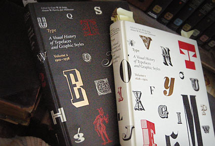
These two oversized coffee table books – which were published in the past year or so – are an odd sort.
Both volumes of Type A Visual History of Typefaces and Graphic Styles sell themselves as design history books.
They have the current editor of Meggs (and similar cover design), but the history is really just a backdrop (with, unfortunately, poorly annotated notes) to what the books are all about: They’re actually an incredible collection of rare typography specimens dated c. 1830-1930. [Read more →]
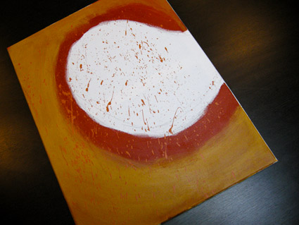
Anderson: Cooper Black
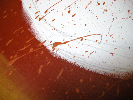
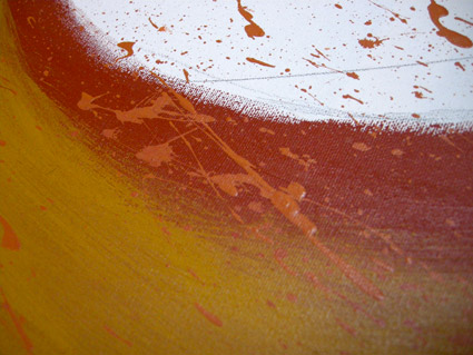
David M. Anderson’s Chaotic Times of Cooper Black, 2008. Mixed media on canvas.
Based on the type of Ozwald Cooper (1879-1940). From my Typography 3 course at Art Institute of California Sacramento.
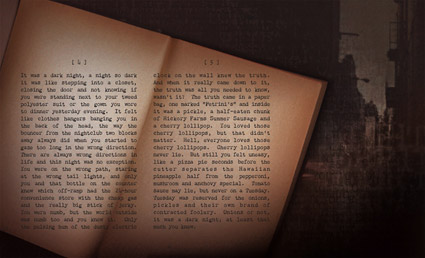
It was a dark night . . .
Chandler 42 was one of my first typefaces – and one of the earliest ‘grunge’ typewriter font packages to hit the market.
It has details in it one won’t see in other autotraced typewriter adaptations. Eight fonts in the complete package. Snag your copy here.
Click on the above image to read/jump. Mood music below.
Randy Brooks And His Orchestra: Harlem Nocturne
Autobahn font
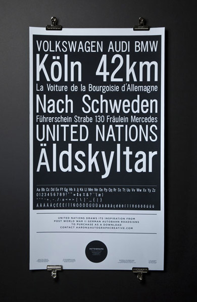
‘Drawing inspiration from WWII German Autobahn road signs and Helmut Lang’
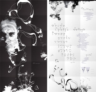
Berkeley-based Autograph Creative’s United Nations poster and typeface.
