Alta Helvetica mug
Helvetica on a mug, set in my Alta California font.
Dark brown text, vintage baked enamel-like styling. Great for sweet tea, moonshine, or hell, even prison-grade pruno.
Snag it here.
Helvetica on a mug, set in my Alta California font.
Dark brown text, vintage baked enamel-like styling. Great for sweet tea, moonshine, or hell, even prison-grade pruno.
Snag it here.

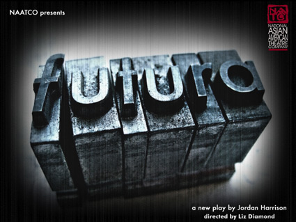
‘Can a font change the future? On her first day back at the University, a rogue Professor sets out to avenge her missing husband – and the lost art of ink on paper – by conducting a dangerous lesson on typography. When the Professor’s lecture jumps the rails, we peer into a near future where desperate people search for the tangible in an ever more virtual age.’
Futura, as a play, is an interesting concept. It starts with a history of typography lecture – then weaves in its own story about a paperless future.
But is a type history talk good enough to stand on its own – without a play attached? The NYT thinks so. There’s a lot of cool stuff in type history.
The play closed last week, but here’s a few more details.
Found via H&FJ
‘Jean François Porchez was approached at the end of 2009 to create a set of typefaces to relaunch the Conqueror papers collection.’
Jean François Porchez’s beautiful Conqueror fonts are based on some great historical design eras – and are available free via Arjowiggins Creative Papers thru end of March 2012.
The fonts themselves are mostly caps and missing a few punctuation marks – but they also have similar widths, cool alternate characters (such as swashes) and 3D carved versions (as extras) – making them vastly interchangeable. And who knows, since they’re free, maybe they’ll conqueror the design world.
A standard commercial font license applies. Grab em here.
More details here.
Fontfabric’s free sanserif Hero fonts. Two weights, multiple language support.
Grab em here. Fontfabric has a great section of other freebies too.
Pictured: Cap Z from Penabico, a new font based freely on ‘the copperplate script styles to be found in the Universal Penman.’
Available at MyFonts. And currently trending as one of their best sellers.
More detail here.

‘The last logo ran for 20 years’
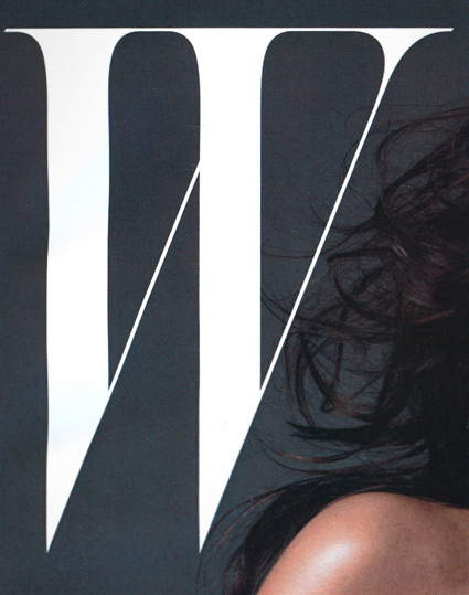
A few months back, Stefano Tonchi jumped over from singular letter T magazine to reboot singular letter W magazine. And the results are quite elegant. [Read more →]
‘Originally used on hand-cranked Vandercook Proof Presses, each piece of type used in these necklaces were worn out ever so slightly by normal printing use . . . These obsolete pieces (each measures a little under 1 inch long) have been rescued, plated in silver, and hung from a 22 inch silver-plated brass figaro chain.’
Erica Weiner’s Double Letterpress Necklace.
Also available in Gold. And brass chain options [Silver and Gold].
‘T shirts that were designed to have the silhouette of 5 famous typefaces; Helvetica, Caslon, Baskerville, Courier and Cooper Black.’
Masashi Kawamura makes type into clothing. Details here.
Found via Tiffany Valdez