entries Tagged as [typography]
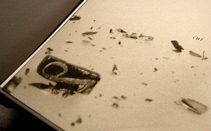
Cutting Bembo
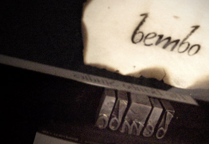
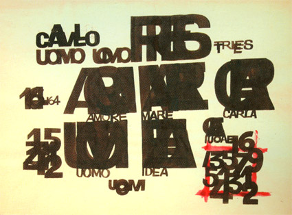
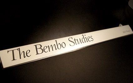
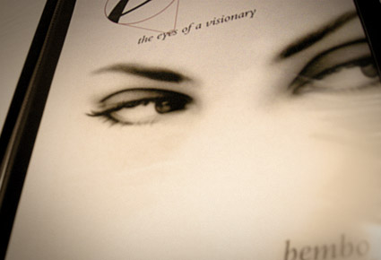
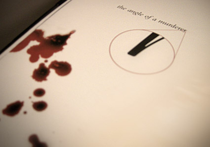
Student Mike Thomas went back to basics with his work for my experimental type course.
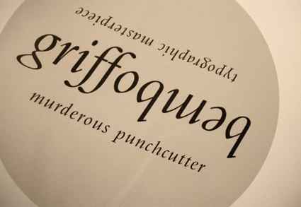
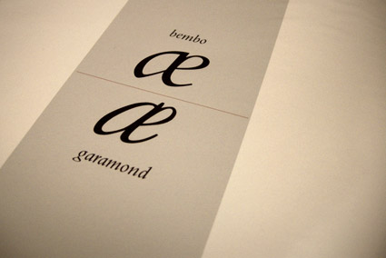
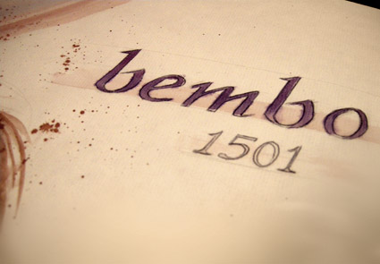
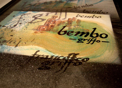
As part of an 11-week study, Mike explored types created by the originator of italics, Francesco ‘Griffo’ da Bologna (1450-1518).
Mike’s work was produced using a stack of 20 year old, aged paper – and involved media ranging from paint to ink to digital.
His final project (above) was realized by cutting Griffo’s italic directly out of pieces of lead and creating a ‘soot proof’ of the carved letters. Not quite to spec, but challenging nonetheless.
John Bell in verse
I teach an experimental typography course at Ai Sacramento. And this past quarter, student Joyce Tabujara ventured into song.
For her final project, she wrote and preformed This Is To Mister Bell (above) – a tribute to typographer John Bell (1745-1831) and his types.
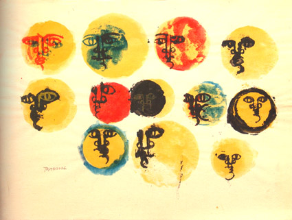
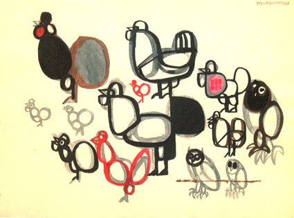
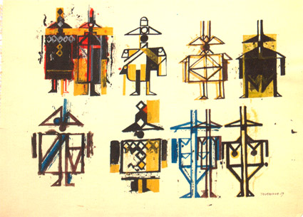
Below, a few of her studies.
Arthur Baker and my type classes
It started with the advice: ‘You have to go back to the broad edge pen. It’s all there.’
Brilliant calligrapher Arthur Baker gave me direction when I first set up my beginning typography course. And I’m still using the same approach today. [Read more →]
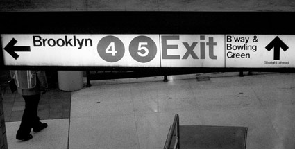
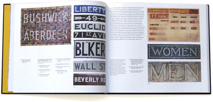
Helvetica Subway
‘Legend has it that Helvetica came in and vanquished the competition. Paul Shaw shows that it didn’t happen that way’
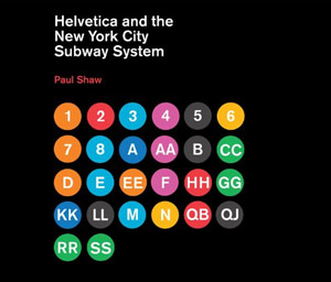
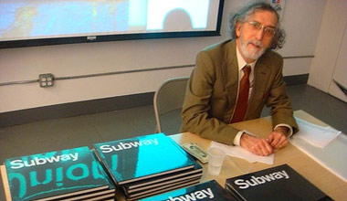
In his new book, Helvetica and the New York City Subway System: The True (Maybe) Story, designer and historian Paul Shaw (below) takes a look at some Swiss type and the trains of the MTA.
Pre-order your copy here (book drops March 11, 2011). Official site here. Idsgn interview with Shaw here.
Found via Delve Withrington
(Untitled)
‘white paint, reinterpretation and raw materials’
(Untitled) fragrance by Martin Margiela. Package design by Fabien Baron.
Found via Nina Stössinger
