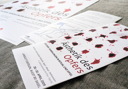
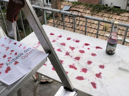
‘Some of my favorite assignments are posters and program flyers for conferences dealing with complex subjects. This one was about patterns, forms, functions and aesthetics of sacrificial rituals. Raster design with blood (OK, beet juice)!’
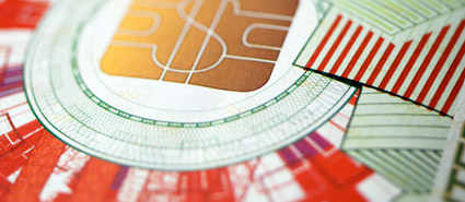
‘Guilloché machines (also known as geometric lathes) have been used since the 17th century by watchmakers and goldsmiths, such as Fabergè, for ornamentation.’
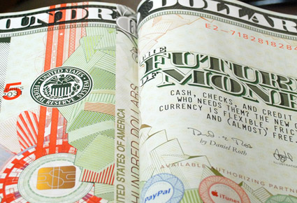
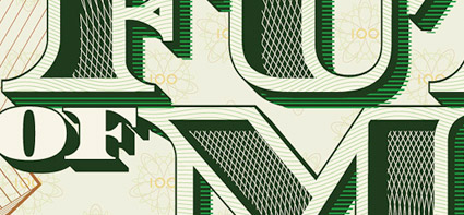
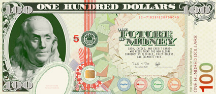
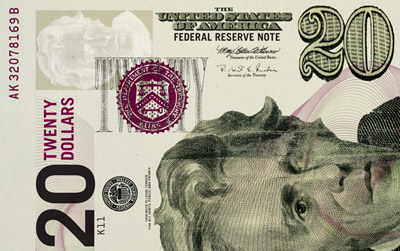
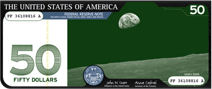
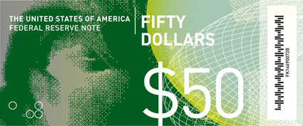
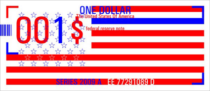
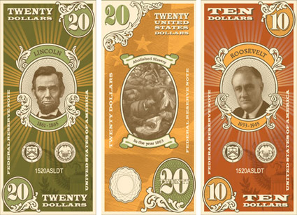
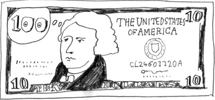
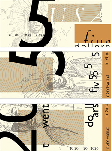
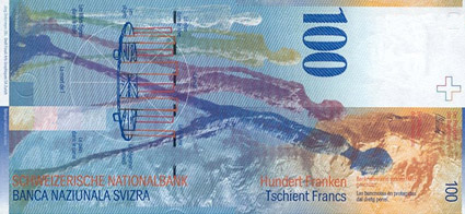
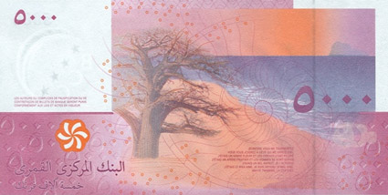
These days, I get really depressed when I look the design of US money.
At least the one dollar bill is going to stay the same (not worth counterfeiting), but gads; new money we have: so ugggly. Tiny gold 20s floating everywhere. Horrid layouts, random mismatched Helvetica number on the back. Bleeeh.
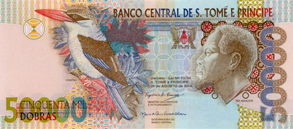
The Art of Money author David Standish picks the ‘top 10 most beautiful bills’ from around the world – check out the slideshow here.
And
Here’s a look at the color – and current, um, design – of US money at COLOURlovers.
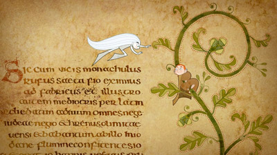
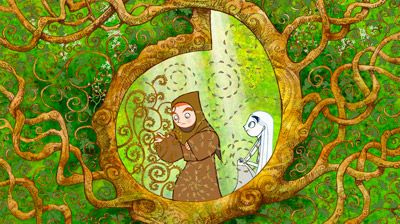
‘Your eye travels over Celtic crosses and through forest glades, studies architectural schematics and drinks in delicately washed landscapes . . . And it is only fitting that a movie concerned with the power and beauty of drawing – the almost sacred magic of color and line – should be so gorgeously and intricately drawn.’ –A. O. Scott, NY Times
The Secret of Kells, which premiered last year in Berlin, has been quietly gaining attention on the festival circuit, racking up awards – as well as an Oscar nomination for Best Animated Film. (tho – Disney’s Up won the statue)
The film is the story of Brendan, a 12-year-old who – in 9th century Ireland – discovers the beauty of art and sets out on a life’s journey to complete work on The Book of Kells.
Right now my history students are freaked out by the study guide they received this week.
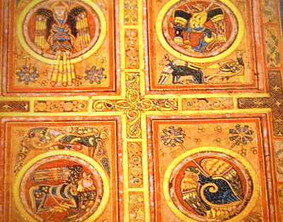
Among the many graphic design historical items listed is the Irish Book of Kells, c. 800 A.D.
The Book of Kells is the most elaborate illuminated manuscript ever created – that we know of. A brief overview can be seen in the NBC video above; its origins are the stuff of legend.
book of kells resources
Many different resources exist for study. A detailed history can be found on the Wiki site here. There are also introductory books, official sites, fan sites and more. The most accessible would be The Book of Kells on DVD, which details every page of every folio. Preview video below:
Or
If you simply want a Kells-based journal, you can snag one here.
‘Canada’s home grown electro kings Holy FUCK lend their funk to this incredible snippet of the digital graffiti out of the olympic village. A huge backlit projection was set up in conjunction with photoshop and given to a group of anti-athletes’