Lo Stile Italia
Lo Stile Italia (Italian Style) from killermedia on Vimeo
A short film about the history of Italian graphic design, by Antonio Prigiobbo, Clemente Brunetti and Gianluca Lannotta.
Lo Stile Italia (Italian Style) from killermedia on Vimeo
A short film about the history of Italian graphic design, by Antonio Prigiobbo, Clemente Brunetti and Gianluca Lannotta.
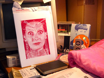
So we just sat thru a really sucky decade. And there’s just a few weeks left.
And even though it was predicted, oh, almost 15 years ago; the End of Print may finally be here. Next year.
Watch the video.
The stiff hands may be caused by some atomic power issue thingie. I hear they’re working on it.
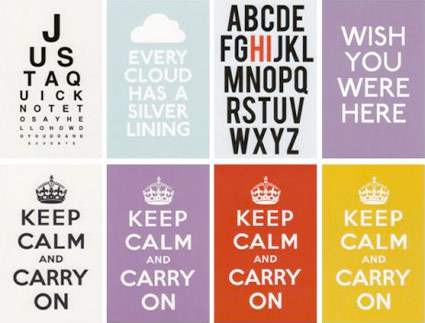
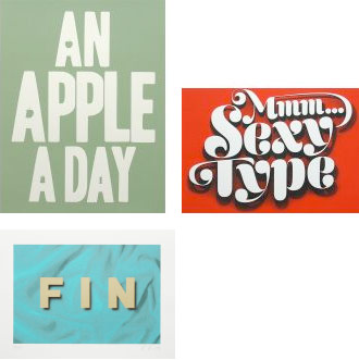
Found in a pile of dusty old books, the British Ministry of Information’s ‘Keep Calm and Carry On’ poster from WWII has become an icon. In addition to stores here, here, here and here – there is also the Keep Calm Gallery.
Images are from the Gallery’s collections; click on any image for jump.

I’m going gaga over the Poker Neutra Face video (above).
Neutraface in use in the Quantum of Solace (2008) logo (below).

The Neutraface fonts are a product of House Industries.
Click on the above images to jump to places/articles.

Collection: Urban Landscape; Location: Columbus, Ohio
More than just another image collection, HistoricType plans to be an online research library for students, professionals and scholars – concentrating on non-print typography, lettering used for old signs and buildings throughout the US.
Visit the HistoricType website here. Blog here.
HistoricType is edited by Laura Franz and Anna Dempsey; programmed by Randy Apuzzo/Jetscram Design and funded thru a grant from the University of Massachusetts Dartmouth.

Collection: Downtown, USA; Location: Grafton, West Virginia
Found via Justin Nelson

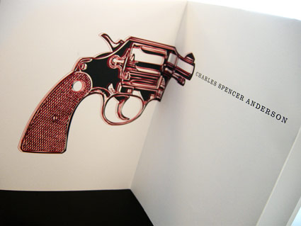
Charles S. Anderson Design’s promotional materials for French Paper are legendary. Snag some of the posters here.
The rarities are not cheap though, the Seinfeld final episode commemorative (above) goes for $500.


Every time I teach a publication design course, I assign a famous designer (or other acclaimed individual) as a biographical research subject. As part of the class, students have to do their own research, write their own text and design their own book.
Back in the 1980s, Charles S. Anderson pioneered ‘bonehead’ design, which involved a midwestern attitude and lots of clip art. Art Institute of California Sacramento graphic design student Trixy Riggan ran with it, developing the handmade biographical tome pictured.
On the side, Trixy runs a clothing company, Fabulously Butch. I still have to snag one of her shirts. I’m told there would be irony in me wearing one.

Drive Ins always had double features and Sacramento’s six screen is still open (Facebook group here). Also projecting is the local Movies on a Big Screen.
For intermission: Commercials, community service ads and countdown animations used to remind everyone to be back in their car in time for the second film. Here’s a bunch.
And
Check out my Burlingame Drive In prints, cards and postcards.
For the record, I did propose to my wife at the (now gone) chilly Burlingame between Nine Months and Clueless.
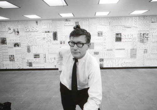
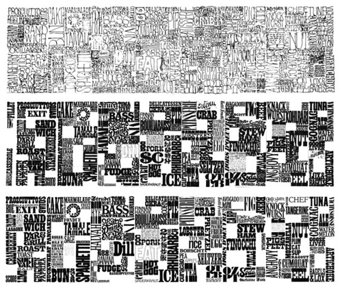
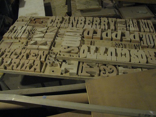
Back in the 1960s, CBS art director Lou Dorfsman created one of the most influential typographic treatments of all time.
Today, designers have rediscovered the Gastrotypographicalassemblage’s 3D complexity – and today it’s been influencing everything from the design of Zune advertisements to kinetic typography videos (note that the new adaptations also tend to be in black/white with minimal color).
The video (above) gives history. And here’s more history. Plus, photos and restoration images here.


the work at the mehallo blog. beta. is licensed under a creative commons attribution - noncommercial - no derivative works 3.0 united states license. if reposting, credit must be given to steve mehallo - and if possible, please provide a link back to the mehallo blog. beta.
i include images for the purpose of critique, review, promotion and inspiration - and always make my best effort give credit/link back to the original source. if i’ve screwed up, please fire me a note.
page layout based on the wordpress 'darkwater theme' by antbag, adapted and redesigned by mehallo. valuable php assistance from bill mead.