entries Tagged as [graphic design]

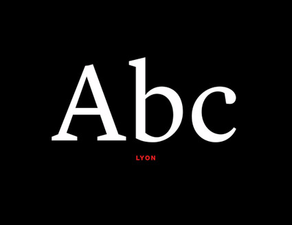
A look at The NYT Magazine redesign

‘It’s all in the details. Our end slug was pulled right from the logo itself, the dot on the ‘i’ to be exact. This was a small but proud moment for us. I’m sure you saw the connection right away . . . right?’
Check out this great, detailed article about the recent NYT Magazine redesign at the Society of Publication Designers Blog.

The NY Times on sleep
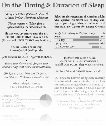
Click for larger version/jump.
Plus,
Here’s their All-Nighters series on insomnia, ‘a nuisance, a disease, a curse, an opportunity or even a gift.’
I just know from Twitter and Facebook that most of the United Kingdom is waking up when I’m typically designing stuff.
And this hour we lost this weekend . . . total BITCH.
Etica
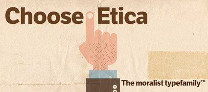
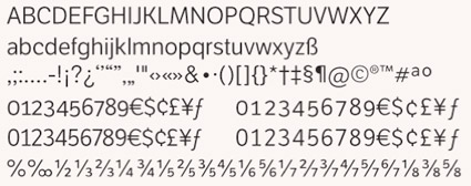
Type Together’s Etica fonts are a rethinking of Helvetica for the 21st Century. Details here.
Found via Helen Brennan
Deuno
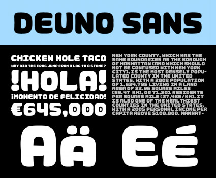
‘The lettering was based both on Mayan hieroglyphics for their shape and grid-like structure and the hand painted lettering found on signs all over Mexico’
Designer Mike Abbink and Paul van der Lann’s Deuno Sans, designed for El Banco Deuno (One’s Bank) in Mexico. Details here.
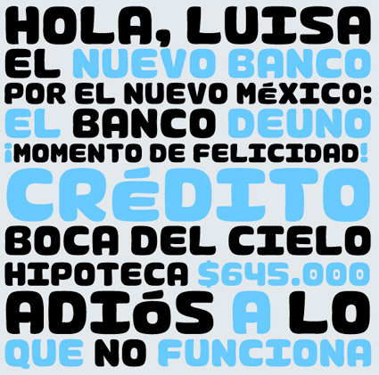
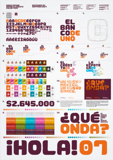
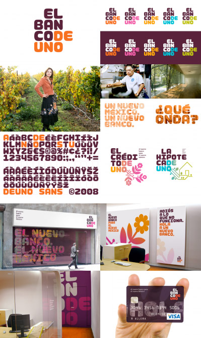
Unfortunately, Deuno is not available for licensing.
Logorama, Oscar-winner
Over 2,500 logos. And six years to make.
Congratulations to Nicolas Schmerkin, François Alaux, Herve de Crecy, Ludovic Houplain and their team for winning the 2010 Best Animated Short Film Oscar for Logorama.
Watch the actual film above. Website here.
And
Snag your own downloadable copy of the film at the iTunes store – where it’s going for just a couple of bucks.
Logorama is a riveting French look at American consumerism (and film making).
Mapping the body
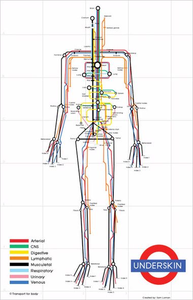
‘And no matter what the locals tell you, don’t take the pink line to the yellow line.’ –Gizmodo
Speaking of the Underground, here’s Sam Lomen’s Underskin.
Found via Justin Nelson
BBC News title design 2
‘This set of opening title sequences for the BBCs regional news bulletins was unveiled in 2008 as part of the Corporations attempt to create a unified brand for BBC News across all platforms (television, radio and new media).’
This is the real thing, though I prefer Michael Wood’s interpretations. Designed by Lambie-Nairn. I like the subtle nod to the Underground. More below:
BBC News title design 1
I look at swirling American television news graphics – which include CNN’s uncanny ability to use the wrong apostrophe – with Trajan, voice overs from Michael Douglas, James Earl Jones and Morgan Freeman. Music by legendary movie composers John Williams, James Horner. Dramatic excess.
Amongst all this, the graphics for BBC News are a breath of fresh air.
Here’s a bunch of constructs by designer Michael Wood. Simple, cool intros . . . not quite the real thing (I’ll feature those in part 2), but smoooth.

handpicked posts

a piano falls in old manhattan
tetro and typography
it’s typography: film, song and dance
ghosts of gustov klimt
the great times new roman controversy
picking fonts
kapitaal
defining terms: design is not decoration
garcia's 'pure design'
'enhance that image!'
magic highway remixed
the cynic
rad anthem
Brought to you by man dom-


buy my fonts
go shopping
mehalloreads

Divinely Elegant: The World of Ernst Dryden
Jozsef Pecsi: Photo and Advertising
Color: A Natural History of the Palette
Collage: Assembling Contemporary Art
Modern Dog: 20 Years of Poster Art
Gaberbocchus Press: An Experiment in Publishing, 1948-1979
Advertising Art in the Art Deco Style
Googie Redux: Ultramodern Roadside Architecture
Hot Sour Salty Sweet: A Culinary Journey Through Southeast Asia
now playing


the work at the mehallo blog. beta. is licensed under a creative commons attribution - noncommercial - no derivative works 3.0 united states license. if reposting, credit must be given to steve mehallo - and if possible, please provide a link back to the mehallo blog. beta.
i include images for the purpose of critique, review, promotion and inspiration - and always make my best effort give credit/link back to the original source. if i’ve screwed up, please fire me a note.
page layout based on the wordpress 'darkwater theme' by antbag, adapted and redesigned by mehallo. valuable php assistance from bill mead.


