Locals or tourists
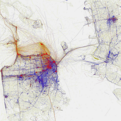
‘Blue pictures are by locals. Red pictures are by tourists. Yellow pictures might be by either.’
Where everyone hangs out in San Francisco. According to photos posted on Flickr. More cities here.
Found via CommandZed
‘Blue pictures are by locals. Red pictures are by tourists. Yellow pictures might be by either.’
Where everyone hangs out in San Francisco. According to photos posted on Flickr. More cities here.
Found via CommandZed

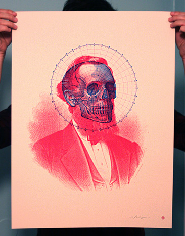
‘A German, Jewish gynecologist, artist, and popular science writer extraordinaire, Fritz Kahn (1888-1968) is considered by many to be the founder of conceptual medical illustration.’
The influence of Fritz Kahn’s Der Mensch als Industriepalast (Man as Industrial Palace) was far flung.
Here’s a sum up of the work of Kahn by Vanessa Ruiz at Street Anatomy.


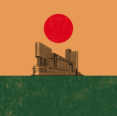
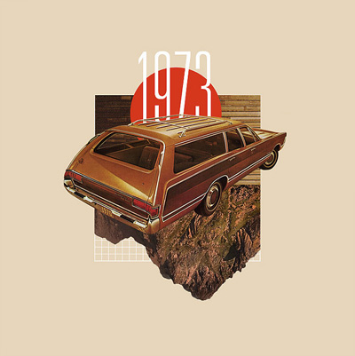
The work of Chad Hagen.
Also available: Prints of his Nonsensical Infographics.


Found via Designer Daily

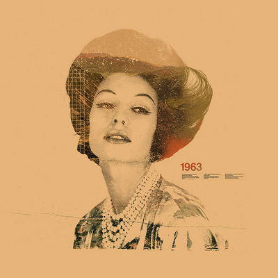
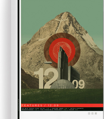
The work of Mark Weaver.
I really enjoyed his redesign of the incredible Paste magazine (sadly, now an online-only venture) – and do check out his Make Something Cool Every Day project.
‘An original 21st-century design by Alejandro Paul, Brownstone is a monoline sans-serif with ornate details inspired by historic brownstone buildings of Brooklyn, NY.’
Love type. But also love Artie Shaw.
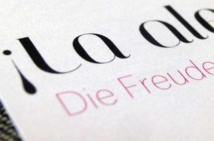
Nina Stoessinger does great work. Pictured, a bilingual birth announcement she designed for a friend, using my Jeanne Moderno Titling font, paired with FontFont’s Dagny Thin.
She dropped a few to me in the post. It’s always great to see how my fonts end up being used.
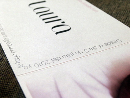
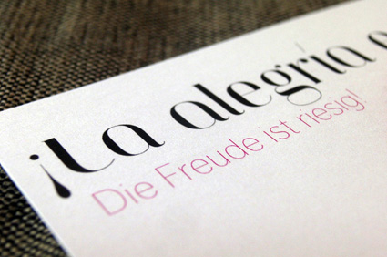
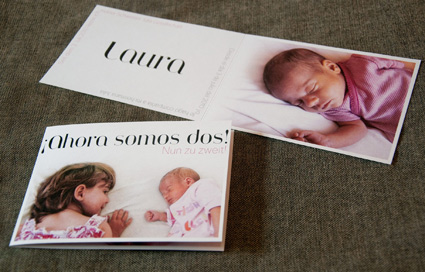
Congratulations to the new parents – and Laura!
‘Storytime, an animated short made in 1968 by Terry Gilliam of Monty Python.’
Found via Laughing Squid
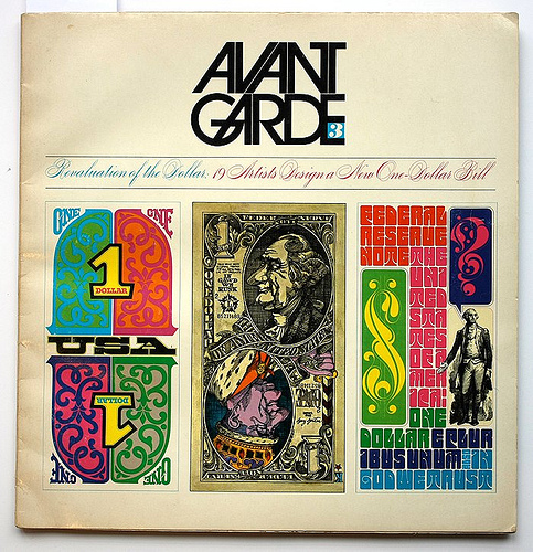
‘The third issue of Avant-Garde, May 1968, ran an attention-grabbing feature entitled ‘Revaluation of the Dollar: 19 Artists Design a New One-Dollar Bill.”
I have this issue of Avant Garde. Managed to acquire a stack of them at a rummage sale. Just thumbing thru, it’s great to see the original stuff that inspired so much 1970s revivalism this past decade.
A look at the money article here.
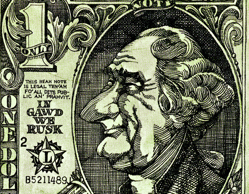
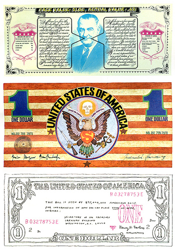
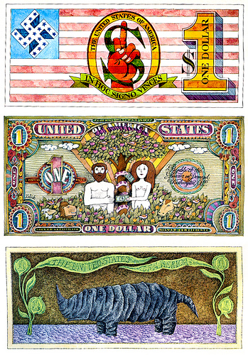
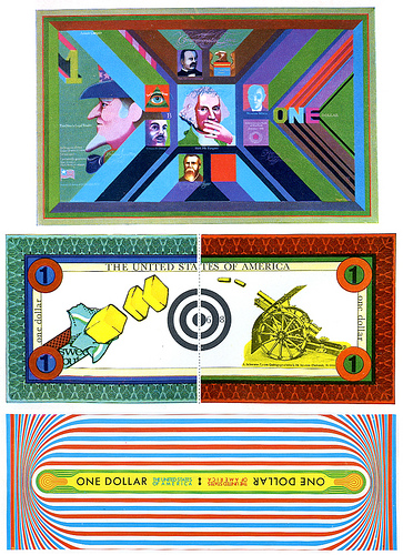
Found via the Eye magazine blog
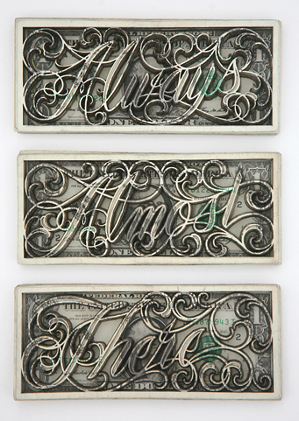
‘The mostly black-and-white collection of works includes ornate latticed designs and cursive phrases ‘tattooed’ with lasers into dollar bills.’
The ‘currency’ work of tattoo artist Scott Campbell.
Found via Young and Brilliant
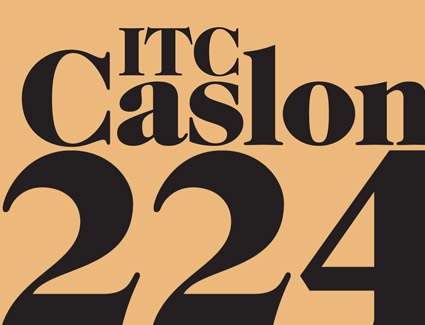
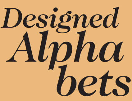
‘Benguiat has frequently said he chose the number 224 because it was the address of the building where he did most of his work.’
Ed Benguiat couldn’t leave well enough alone. And in 1982, created one of the funkiest versions of Caslon ever – for ITC.
I love the swoops and the ear on top of the lowercase g.
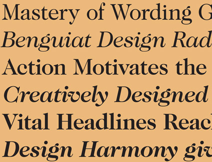
What would William Caslon look like if he were working today?
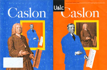
This is one of my favorite takes on Caslon (above) – editorial designed by Mark van Bronkhorst and written by John D. Berry.
It’s the 1998 front and back cover of one of the final print issues of Upper & Lower Case magazine (and as you can see, my copy is a bit mussed up). William Caslon would be wearing a blue suit today, such is the nature of the biz.
Inside U&lc was an incredible promo for the late Justin Howes’ historically accurate ITC Founders Caslon – one of the most faithful updates ever digitized. [Read more →]


the work at the mehallo blog. beta. is licensed under a creative commons attribution - noncommercial - no derivative works 3.0 united states license. if reposting, credit must be given to steve mehallo - and if possible, please provide a link back to the mehallo blog. beta.
i include images for the purpose of critique, review, promotion and inspiration - and always make my best effort give credit/link back to the original source. if i’ve screwed up, please fire me a note.
page layout based on the wordpress 'darkwater theme' by antbag, adapted and redesigned by mehallo. valuable php assistance from bill mead.


