Neolithic Coke
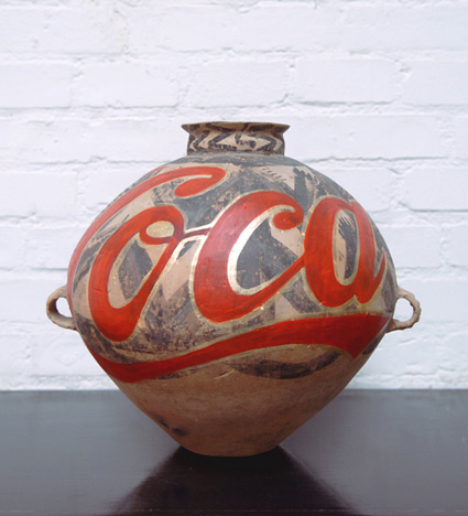
3 – 5,000 year old vase, Coca-Cola logo. The work of Ai Weiwei.
Article here.
Found via Daily Serving
3 – 5,000 year old vase, Coca-Cola logo. The work of Ai Weiwei.
Article here.
Found via Daily Serving
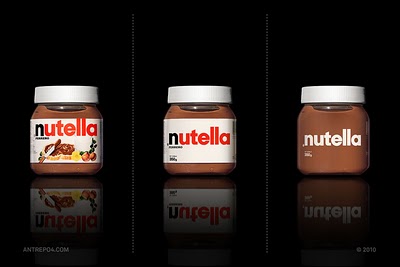
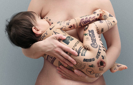
‘about unnecessary items on the global brands’
Products screaming far too much for attention? Competition for shelf dominance taken to excess? Overdesigned labels that are trying too damn hard?
Antrepo breaks things down into simple. And then more simple.
More studies here.
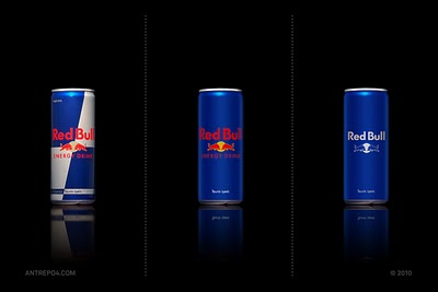
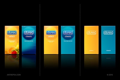
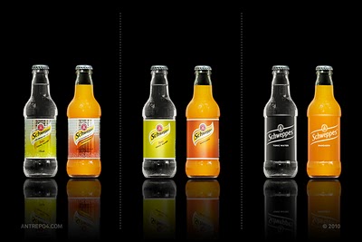
Found via Laura Serra
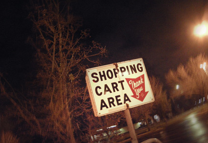
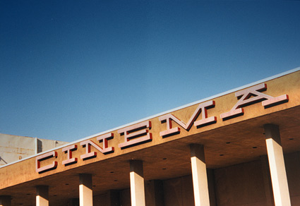
It’s cool to see a few of these vintage signs still doing their thing.
Photo by mehallo, December 2010.
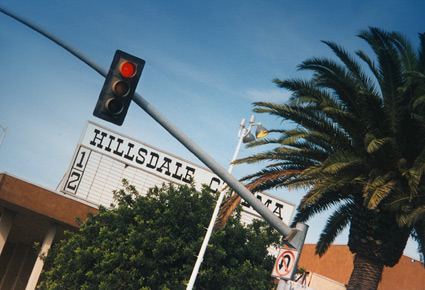
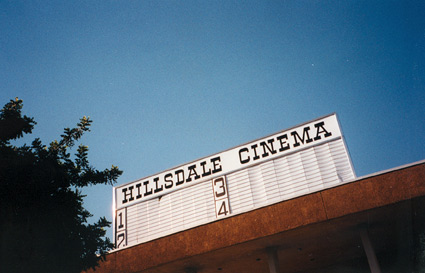
Across from Hillsdale Shopping Center in San Mateo, California was the Hillsdale Cinema. These are snapshots I took in 1997, before the building became something else.
Saw Superman: The Movie and The Wrath of Khan there on opening days. And for awhile, it was dang easy to sneak in; buy one ticket, watch for ushers, then let friends in thru the side door. The Hillsdale was part of the General Cinema chain.
Great article on GC’s history here.
Below, 1964 concept drawings of General Cinema’s modernist theatres. Direct or not, there is a Herbert Matter influence in the type picks.
And I can’t forget General’s famous snap-yer-fingers bumpers.
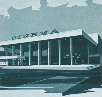
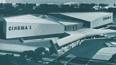
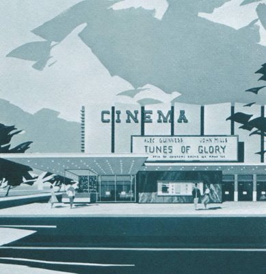

Drawings found via Pleasant Valley Shopping
The most incredible invention ever conceived by human beings.
These commercials scared the shit out of me.
It all boils down to . . . Helvetica.
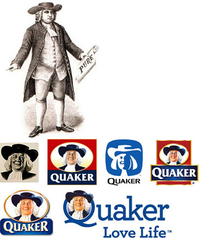
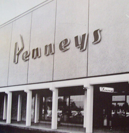
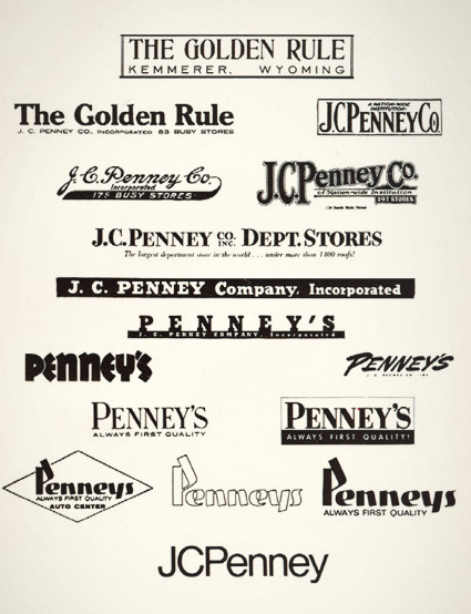
JCPenney started as The Golden Rule store – or so said the literature I read as a kid. Wiki says something else.
My mom worked for JCPenney for 22 years and they had a big anniversary in the 1970s. They had wooden rulers with ‘golden rule’ written on them as part of a anniversary suite of premiums. I remember lots of simple yellow (‘golden’) and black stuff, sort of a 70s take on Victorian style.
And I was fascinated with a logotype history chart that was part of a company history booklet. Above is an old photocopy.
Over the years, the company simply became known as Penney’s – logo treatments reflecting retail trends.
The possessive was dropped and the ‘JC’ was officially re-added in 1971 – the year its founder, James Cash Penney passed away.
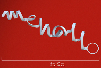
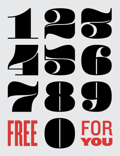
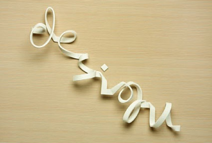
‘The font is based on the concept of a thin and wide ribbon, bending freely through space’
A new take on the thick and thin strokes of letterforms. Type in your text and a final rendering is fabricated for a fee.
Details here and here. Test drive the Kasheeda font here.
Latin alphabet and Arabic script are both available.
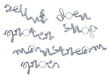

Found via If It’s Hip, It’s Here.


the work at the mehallo blog. beta. is licensed under a creative commons attribution - noncommercial - no derivative works 3.0 united states license. if reposting, credit must be given to steve mehallo - and if possible, please provide a link back to the mehallo blog. beta.
i include images for the purpose of critique, review, promotion and inspiration - and always make my best effort give credit/link back to the original source. if i’ve screwed up, please fire me a note.
page layout based on the wordpress 'darkwater theme' by antbag, adapted and redesigned by mehallo. valuable php assistance from bill mead.