entries Tagged as [graphic design]
Marian’s Valentines
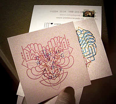
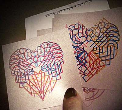
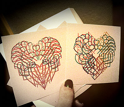
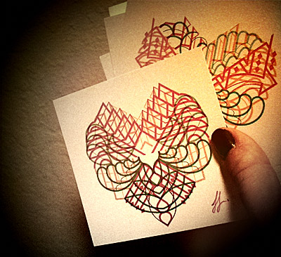
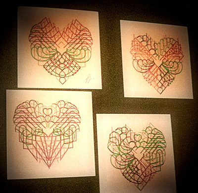
Fresh from my mailbox: A set of Valentines from the great Marian Bantjes.
And if you haven’t already, be sure to snag her incredible I Wonder.
Traffic’s ‘analogue kalender’

‘In daily life and at work, the analogue production world is far away for the majority of people’
This year’s calendar from Thomas Krug and Traffic goes back to basics.
Less digital, more tactile. Screen printed art punctuated by laser dies and perfs. Each month has ‘show thru’ to the next.
2011 artists include Wlodzimierz Szwed (type), Dirk Pokoj (ink, paint, screen), Gisela Berger (pastose, acrylic, graphite) and John T. Manshaupt (red chalk, Chinese ink/acrylic).
For more about the Traffic Agency go here.
(And here’s another look at last year’s offering)
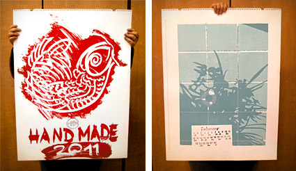
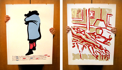

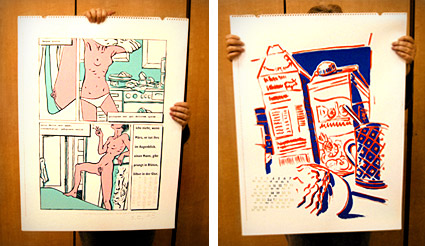

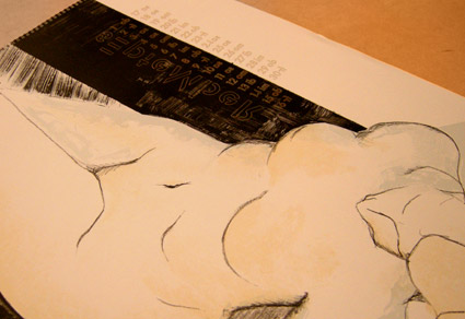
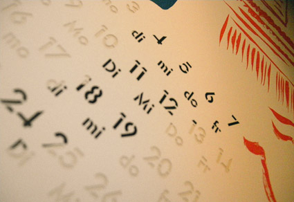
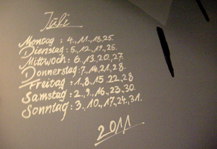

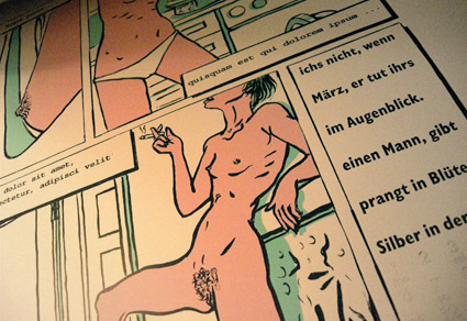
Thanks to Thomas Krug; and to Carrie Svozil for holding this year’s award-winning kalender for the camera
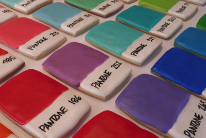
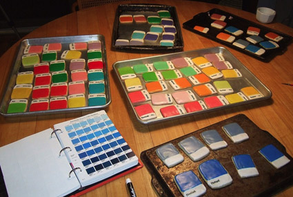
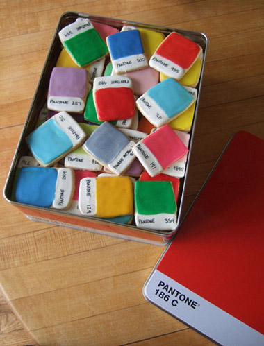
Pantone Chip Cookies
‘Interesting to see which colors went first. PMS 485, PMS 183 and Silver 877 seemed to be the most popular’
Kim Neill’s Pantone color chips in tasty cookie format.
Details and recipe here.
Found via Chank Diesel
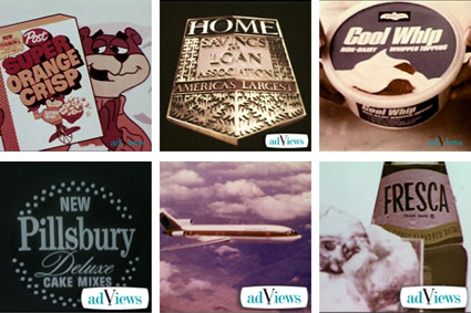
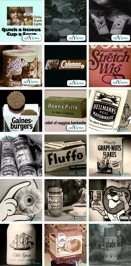
Duke’s advertising archive
‘AdViews is a digital archive of thousands of vintage television commercials dating from the 1950s to the 1980s’
Website here.
Found via Daniel Will-Harris
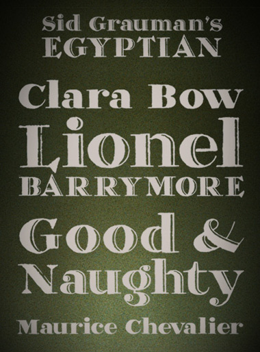
Hadank
‘Hadank is a display typeface developed from hand-lettered words in a German printer’s letterhead from the 1920s’
Andrew Leman makes props for the motion picture industry. And along the way, he’s built a collection of fonts to help with making said props authentic.
Order his Hadank fonts here. Website (with interview video) here.
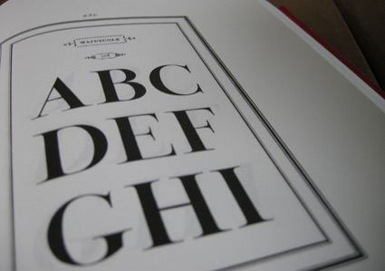
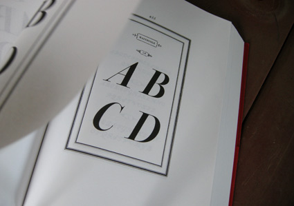
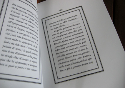
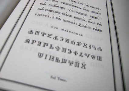
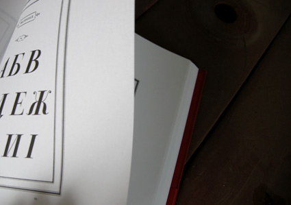
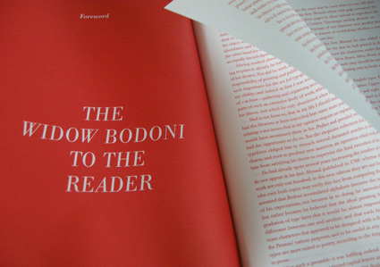
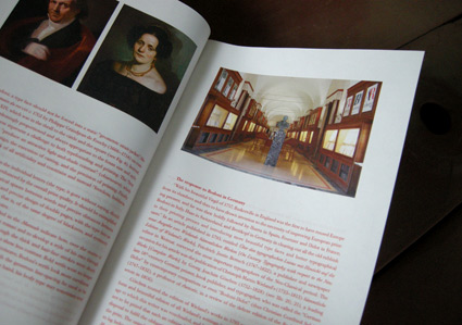
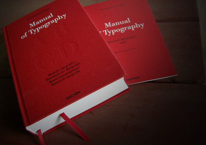
Bodoni’s Manuale Tipografico
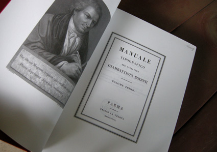
‘Published posthumously in a limited edition of 250, features 142 sets of roman and italic typefaces, a wide selection of borders, ornaments, symbols, and flowers, as well as Greek, Hebrew, Russian, Arabic, Phoenician, Armenian, Coptic and Tibetan alphabets.’
My birthday was last week and to my surprise, my wife got her hands on Taschen’s limited edition reprint of Giambattista Bodoni’s masterwork, his Manuale Tipografico (1818).
Bodoni had almost unlimited funding and resources at his disposal – so the details in his large body of types (he just kept going) is beyond what is seen in most revivals of his work. ITC Bodoni comes damn close, but a lot of Bodoni’s original designs end up on the cutting room floor.
My Jeanne types (named for my wife) have roots in Bodoni – and I used some digital resources to research his Manuale. But it is great to now actually have a print edition in my collection – cause I’m not done with tinkering.
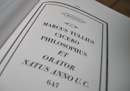
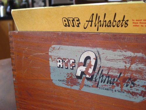
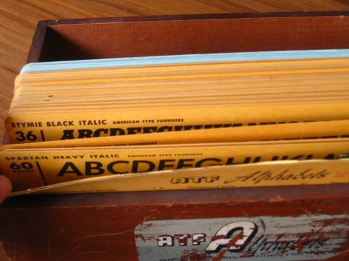
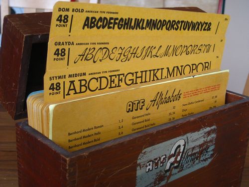
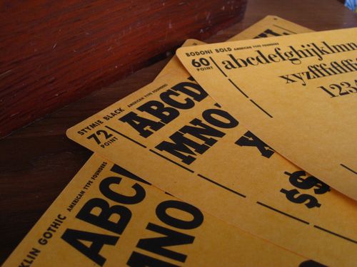
ATF kit
‘Features over 100 cards with specimens from the 1951 type catalog, showcasing dozens of fonts in their various weights and point sizes.’
American Type Founders was the largest metal type company in the world. They came to an end in 1993 in an ill-planned bankruptcy auction.
Tons of type history (literally) were melted down for scrap. Many records and original drawings were destroyed.
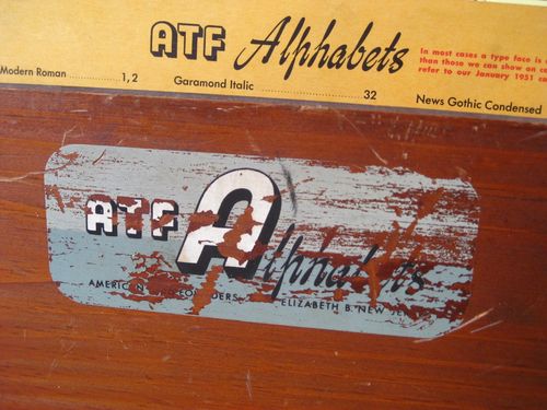
Pictured, Just My Type’s recent acquisition: ATF’s 1951 merchandising case.
