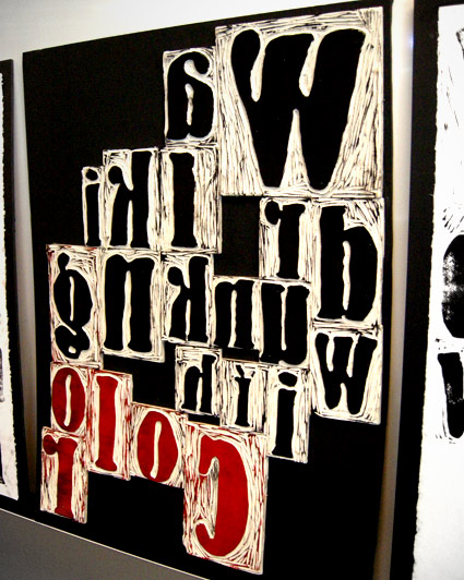
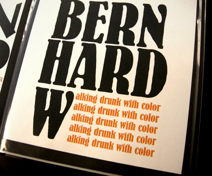
entries Tagged as [fonts]

Carved BERN HARD

‘I was working on maintaining the quality of Bernhard’s handdone type while taking a new and different approach to it’

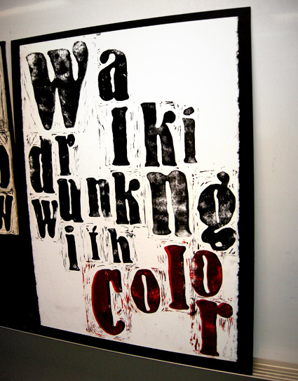
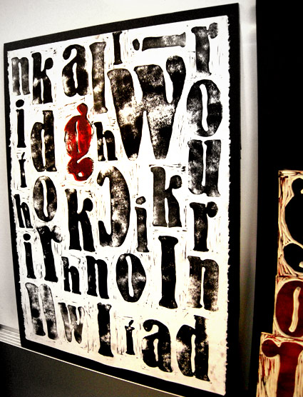
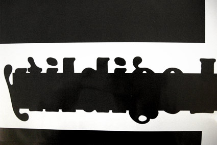
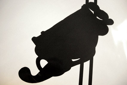
Student Lesley Gaesser’s large scale final project from my experimental type course at The Art Institute of California Sacramento.

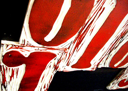
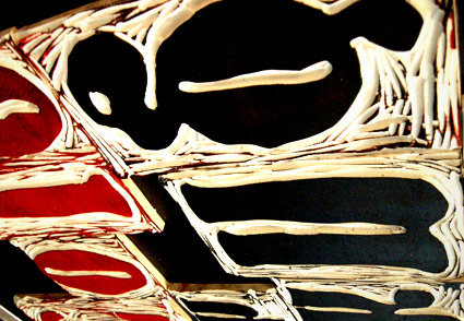
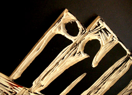
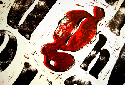
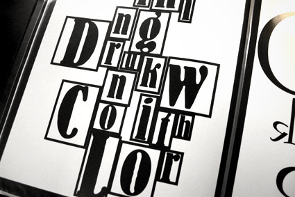
Lesley did an 11 week study on the work of designer Lucian Bernhard (1883-1972) – which culminated in a final linocut-inspired project.

Bernard’s Antiqua type was traced onto Speedball carving blocks, cut by hand, inked and printed on large sheets of watercolor paper.

My next experimental course begins April 8.


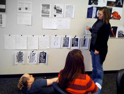
If student hangs roughs low on the wall, one can only critique if lying on the floor; Photo by Daniel Mendez

Tschichold and Alta California

Rare Jan Tschichold book design, featuring his use of an early prototype of the Alta Calfornia font.

Cloth cover for Das lustige Buch (The Funny Book), Verlag der Bücherkreis GmbH, Berlin, 1931.

Camphor

‘clean and cool, modern sans serif’

New from Linotype: Nick Job’s Camphor. Inspired by Edward Johnston’s type for the London Underground, Eric Gill’s Sans and the work of Adrian Frutiger.

Available here.

Butter typography 6

Set in my own Escoffier Capitaux font. Get it here.

Butter typography 3

Helvetica cookies, Helvetica cookie cutters.

The work of Beverly Hsu.

Found via Pardeep’s Design Blog

Butter typography 2

Gemma O’Brien’s Leitura ‘H’ cake.

Info here.

Butter typography 1

Was recently discussing with a culinary instructor that it’d be interesting if some of her students took one of my type classes. Imagine what would happen to plated up food with type knowledge floating thru young cooks’ brains.

Then I saw Zeughaus’ butter letters, above.

Original type by Typejockeys, butter cut by Nadine Ruhm. Info here.

Milk font

‘With 384 glyphs, ABTS milk covers a wide range of languages & dialects, and also includes symbols’

Jay Hilger’s Milk font. Available here.

Luminance

‘Originally made by the Czech type designer Carl Pracht in 1941–43. Having a rather calligraphic style both in regular and italic, MRF preferred it to be more straightforward and modern-looking.’

Another incredible type package by Stefan Hattenbach. Snag it here.

Good Ol Font

Hobo, of course, was the font of choice for Them Duke Boys (1979-85). Theme sung by Waylon Jennings.

Fontjob

Hobo font. Durex Condom ads. The work of Andrej Krahne.


Creative Commons License

the work at the mehallo blog. beta. is licensed under a creative commons attribution - noncommercial - no derivative works 3.0 united states license.  if reposting, credit must be given to steve mehallo - and if possible, please provide a link back to the mehallo blog. beta.

i include images for the purpose of critique, review, promotion and inspiration - and always make my best effort give credit/link back to the original source.  if i’ve screwed up, please fire me a note.

page layout based on the wordpress 'darkwater theme' by antbag, adapted and redesigned by mehallo.  valuable php assistance from bill mead.