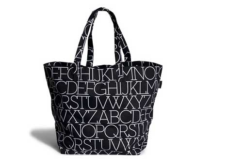
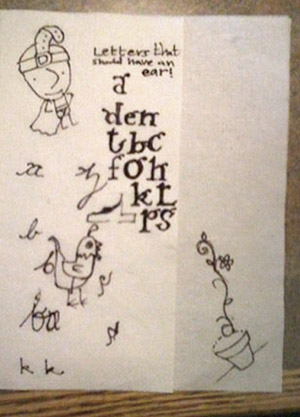
entries Tagged as [fonts]

Alphabet ears


Sketches by dr. mendez and nurse wickland

I think our lowercase g is our screwiest letter. It evolved into something quite odd. It has parts that other letters do not have. It also has an ear. It’s often drawn just like a dog’s ear.

Two of my students have been pondering (above) other letters that should have ears.

Strange fonts

This week, Jeanne Moderno ended up with the dubious honor of being on the
Merkwürdige Schriften 2009 (Strange Types 2009) list over at Slanted.

Thanks guys! Strange, that would be the best way to put it.

Here’s a link. Here’s the same link translated into dubious English.

Tomorrow night: Industrial type atop Times Square

‘The choice of a ‘chamfered’ industrial style works well with the marquee-esque bulb lighting. It also has historical ties with large-scale lettering  . . .’

The 2010 numbers are ready to go in Times Square! Details in this typographic article by Nick Sherman.

Plus
Here’s some historical Times Square signage from the Artkraft Strauss Archive:

Foundation

The work of Alexandre Farto aka Vhils.

Found via Hello Typo

Yakov G. Chernikov

‘Chernikov drew by hand what today can seem only possible with a computer.’

I Love Typography takes a look at the limited edition monograph Graphic Masterpieces of Yakov G. Chernikhov: The Collection of Dmitry Y. Chernikov. Chernikhov’s work is on par with Dürer or Tory. Read more here.

N-N-N-Neutra Face

I’m going gaga over the Poker Neutra Face video (above).

Neutraface in use in the Quantum of Solace (2008) logo (below).


The Neutraface fonts are a product of House Industries.

Click on the above images to jump to places/articles.

More Moderno wallpaper, from Austria

Arno Kathollnig/Typoatelier has been making typographic wallpapers. He had featured my Jeanne Moderno fonts as part of an earlier series. He’s back with a sequel (above). Go here.

Jeanne Moderno in Ponytail

When I drew Jeanne Moderno, my hopes were the fonts would end up somewhere in a cool fashion magazine.

UK-based Ponytail has em and has used them beautifully in their third issue. Website here.


South Central Swiss

‘Talk about a psychedelic mimicking of rubricated blackletter!’ –Tiffany Wardle

South Central Swiss is a free fontstruct by dom nokes (domald). Grab it here.

Check out domald’s other fontstructs here.

Mota

Mota Italic the name of a type foundry out of Berlin. Their types are both unique and (most important) very usable. Check out their Vesper text types here.

Roos

New from Canada Type: Roos. An historical revival of type designed during World War II by Sjoerd Hendrik De Roos (1877-1962). Go here.


Creative Commons License

the work at the mehallo blog. beta. is licensed under a creative commons attribution - noncommercial - no derivative works 3.0 united states license.  if reposting, credit must be given to steve mehallo - and if possible, please provide a link back to the mehallo blog. beta.

i include images for the purpose of critique, review, promotion and inspiration - and always make my best effort give credit/link back to the original source.  if i’ve screwed up, please fire me a note.

page layout based on the wordpress 'darkwater theme' by antbag, adapted and redesigned by mehallo.  valuable php assistance from bill mead.