Still from Ingre Druckrey: Teaching to See
As an educator, I’ve broken graphic design into three components: Message, Typography, Layout.
I’m not the first educator to do this – just happened to constantly notice these three elements staring back at me in all the student pieces I evaluate. In my opinion, careful appreciation, understanding and implementation of the three can lead to beautiful work.
message
Graphic design is a communication field, so Message should always drive the project. Today we are bombarded by thousands of Messages on a daily basis, so being on Message is critical. And yes, this usually involves language and writing – which is why I love when students take their written studies seriously.
typography
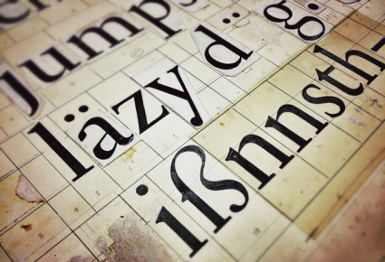
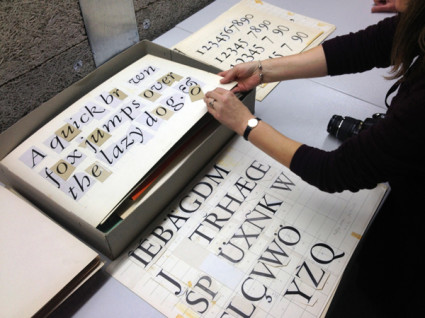
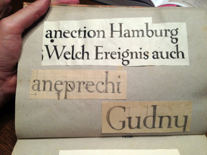
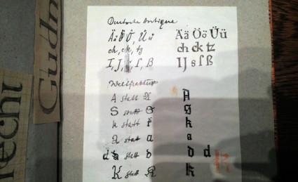
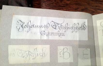
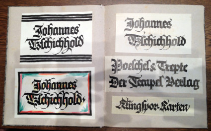
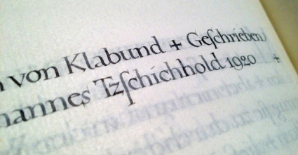
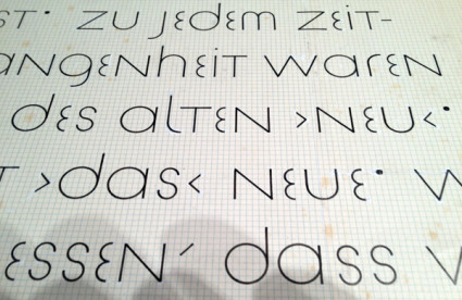
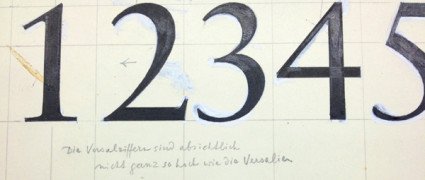
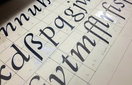
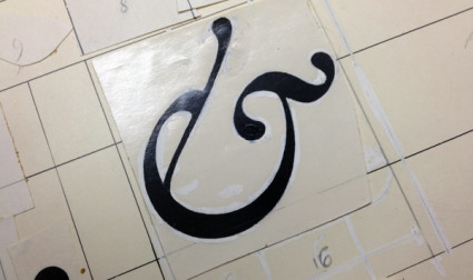
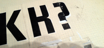
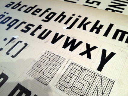
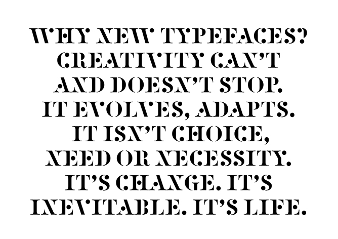
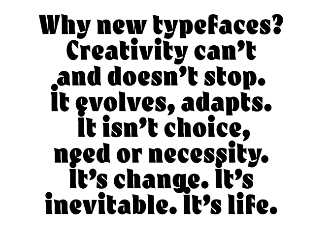
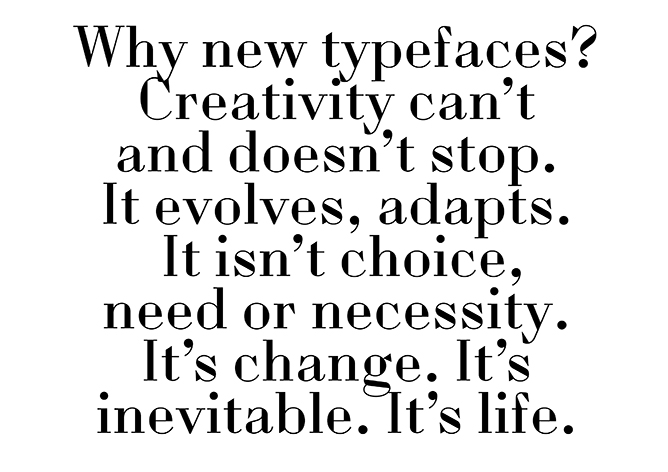
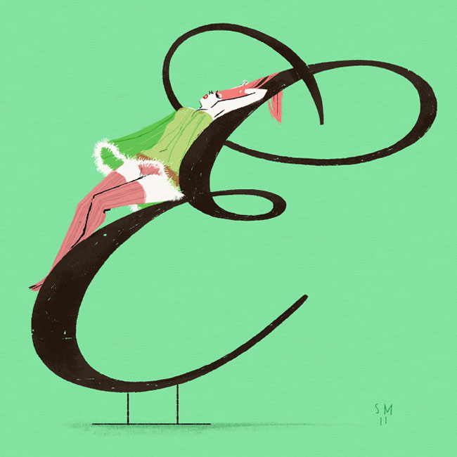
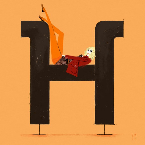
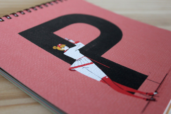
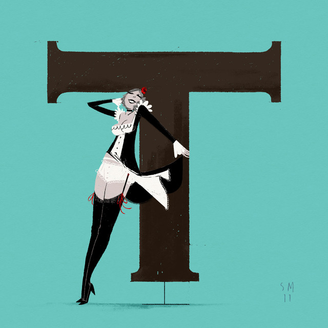
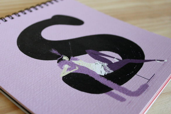
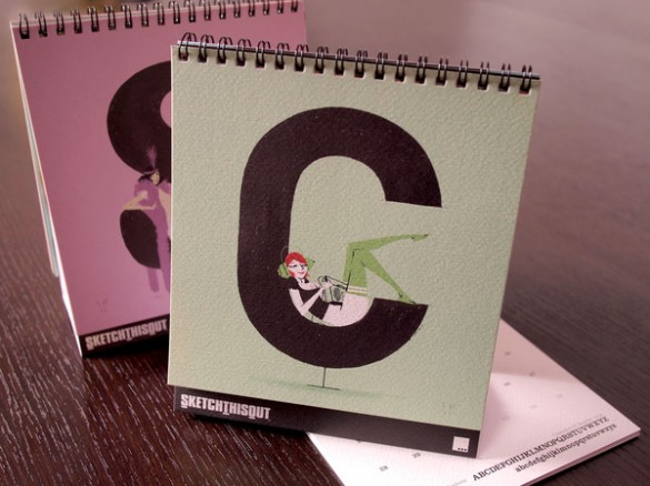
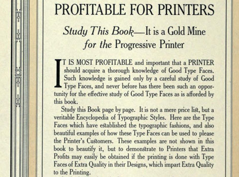
I’ve seen an (often not cited/supported) statistic that graphic design is 95% typography. Scientific or not, I agree with this. Type is important. I like comparing the exploration of lettering to that of music – there’s enough complexity for it to become a lifetime endeavor. And most of what I teach is type, from multiple angles.
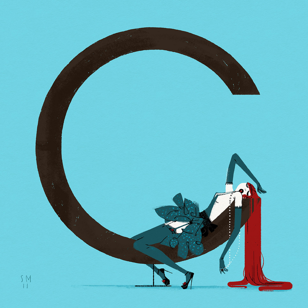
form
Graphic designers are taught to use grids for layout – though relying on ‘grid’ as a catch all way of handling form can be misleading. Grids provide support, a fallback position for dealing with massive amounts of information. Though important, grids have their limitations. Building structure using symmetry, asymmetry, balance, color – some elements obvious, some not – involves continuous practice, a trained eye, instinct.
These three are not formulas, can’t be added together. They need to work in tandem, like cooking a great stew where the ingredients are based on what feels just right.

Click to view/jump
On a related note, the above film – Edward Tufte’s Ingre Druckrey: Teaching to See – found its way into my Twitter feed. It’s about graphic design and beauty. And much more.
In January I’m going to be teaching my first non-type course on Form and Space. I’m starting prep now because I consider form so important – so powerful, so delicate.
And beautiful when done right.
Video found via ayana baltrip
Tags: design, design history, education, illustration, thoughts, typography by steve
Comments Off on Graphic design: Training one’s eye