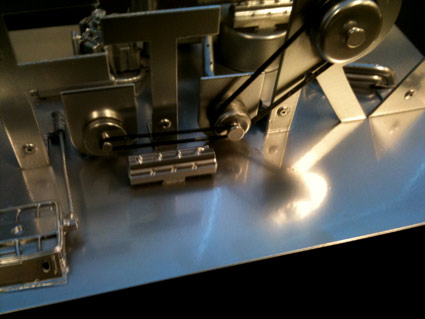
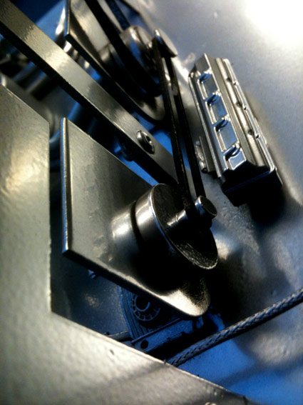
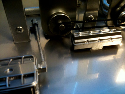
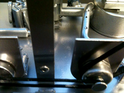
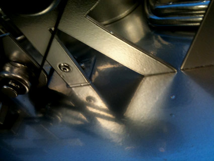
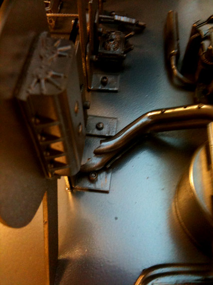
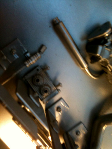
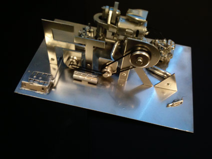
entries Tagged as [education]

Ditto!!

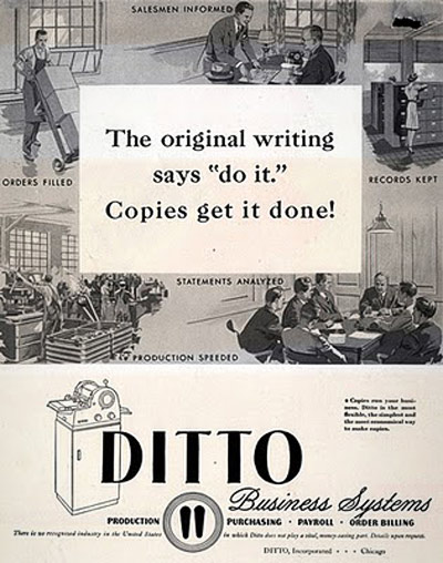
‘Before there were photocopiers, scanners and printers, there was the Ditto Machine (a.k.a. spirit duplicator), produced by the Illinois-based Ditto Corporation; originally introduced in 1923.’ –mnn

Clifford the Big Red Dog was supposed to be red. But in the handout I got in kindergarten, he was purple.

So was my introduction to the Ditto Machine – a device used to replicate most of the paperwork I’d used in elementary school.

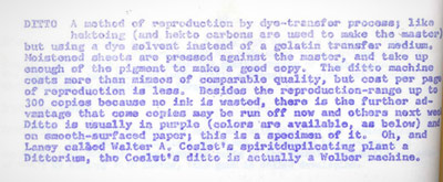
Some of my earliest experiences as a ‘graphics’ guy was playing with one of these machines – seeing what it could reproduce and what it couldn’t. It couldn’t reproduce much. The copies were so smudgy, Dittos were grunge before grunge was grunge.

And the smell of the purple ink was incredible. Fruity and chemically at the same time! Tho it turns out ink ingredients – isopropanol and methanol – are toxic substances. Who knew? [Read more →]

Futura Maschine 2011

‘Paul Renner’s Futura interpreted in metal’

Handmade model with engine. Cesar Santos Perez’s final project from my most-recent experimental typography course at Ai Sacramento.

Summer Studio 2011

‘What I did on my summer vacation’

Last week, I spent four full days with a handful of some really cool teens.

I found myself saying, ‘Yes, I’ll do it. What is it?’ to teaching a week-long Summer Studio workshop at Ai Sacramento.

I called the whole thing ‘Designer Mashup’ – and set about having my students mix contemporary designers with historical luminaries.

Design history, research, handmade collages, form studies and handing work off to other students (to reinterpret) were part of the process.

Pictured, some of the final pieces.

Designers studied included Paula Scher, Georges Braque, Josef Albers, El Lisstizky, Rick Griffin, Jessica Hische, Raoul Hausmann, Marian Bantjes, Hannah Höch, Alvin Lustig, Shepard Fairey and David Carson.

Andrews, 1934

Sybil Andrews’ Speedway (above) is a linotype print commissioned by the London Passenger Transport Board in 1934 to advertise what was a new spectator sport, Speedway Racing.

The final piece – like the famous ‘keep calm’ poster – was never used for its intended purpose.

Found via Gunther Stephan

Metzinger, 1913

‘Metzinger celebrated the salutory effects of exercise on the male population in his ‘Cyclist,’ which focused on a sport that historian Eugen Weber has described as a French creation, and one affordable to the French working class by 1900.’ –Mark Antliff, Patricia Leighten

In 1913, Jean Metzinger (1883-1956) created his Cubist Cyclist to depict audience, participant and the interaction involved.

(Been doing a lot of reading on early modern art)

David Byrne: Architecture affects music

‘Does the venue make the music? From outdoor drumming to Wagnerian operas to arena rock, he explores how context has pushed musical innovation’

Found via Lucy Cook

Letterform learning: Typography Insight

‘For his thesis, Dong Yoon Park, a Masters student at Parsons, built an iPad app designed to teach pros and novices alike the arcane world of typography.’

Details here.

Found via Taxi

Design in use: ‘How Buildings Learn’

Designing for use is something often overlooked by designers. What happens once the design is in the hands of actual people?

Stewart Brand takes a long look at design AFTER it’s implemented – in this case, the design of buildings. Does ‘form follow function?’

6-part, 3-hour BBC Documentary. Based on Brand’s book. Music by Brian Eno. From 1997.

Posted in its entirety on Google. Part one above. For part two thru six, go here.

Coolness: Stippled Conan

‘it took a week to do it’

For anyone who’s taken an intro to typography course with me – there is a fair amount of stippling involved as part of some really complex letterform studies.

And one of my former students – Freya Kiessling – who dotted her way thru letters – has gone national with her work.

Her color Conan O’Brien pointillism illustration (above) was used as a bumper on Conan’s show, April 11, 2011. The drawing was submitted thru their Coco MoCA page (many, many images abound).

And today – per show request – a print hangs in the show’s green room at Warner Bros. in Burbank.

Below, another Freya-produced Conan piece – from a beginning animation class.

Creative secrets: The super obvious

Tonite this link just sort of popped in from former student Campbell BrownKorbel. It’s secrets that every creative – from illustrator (the focus) to designer to comedian to (hell) anarchist – should know.

Phil McAndrew’s Super Obvious Secrets That I Wish They’d Teach In Art School. Read the whole thing here.

Lost in type: Gill Sans

Dmitriy Antropov’s final project was a Gill Sans maze, hand crafted from foam.

After we tried to actually do the maze (and failed), Dmitriy reached down and carefully removed a small partition – near the bottom of the a – and we were able to complete.


Creative Commons License

the work at the mehallo blog. beta. is licensed under a creative commons attribution - noncommercial - no derivative works 3.0 united states license.  if reposting, credit must be given to steve mehallo - and if possible, please provide a link back to the mehallo blog. beta.

i include images for the purpose of critique, review, promotion and inspiration - and always make my best effort give credit/link back to the original source.  if i’ve screwed up, please fire me a note.

page layout based on the wordpress 'darkwater theme' by antbag, adapted and redesigned by mehallo.  valuable php assistance from bill mead.