entries Tagged as [education]

Love Fonts Memo

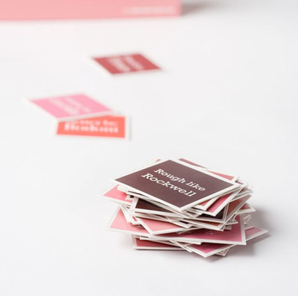
‘Love Fonts Memo is a classic memory game where it’s all about finding a matching pair of cards. At the end the player with most card pairs wins. The cards represent love stories about different kind of type faces.’

The work of Swedish design student/freelance designer Sara Strand.

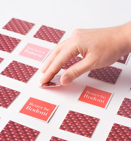
Found via The Dieline

12

The Dirty Dozen: 12 Things Which Kill Creativity. Article here.

Dirty Dozen poster by The Silent Giants. Info here.

The Silent Giants blog here.

10

Steven Snell’s 10 keys to growth as a designer. Article here.

Sketchbook photos found via Design Mom

Trajan: The movie font

‘Try playing the Trajan drinking game’

Meatballs, worms and bugs


NASA Meatball

Here’s a brief history of NASA’s logos, including the ‘meatball’ (above) and the ‘worm’ (below).

The worm was put to rest in 1992. If you wish, condolences can be left here.


NASA Worm

When it comes to official type, NASA is Helvetica, Futura, Times, Garamond and something  . . .  Victorian?

Article here.

Plus
Here’s a look at some goofy names for some other classic ‘bugs.’

‘The Making of a Design Thinker’


Process imagery, click for larger version/jump

Here’s an excerpt from Tim Brown’s new book, Change by Design: How Design Thinking Transforms Organizations and Inspires Innovation.

More about the book here. Order here.

Tim Brown is president and CEO of IDEO

Van Doesburg


‘Raoul Hausmann’s postcard to IK Bonset (van Doesburg’s alter ego) of rival theorist Herwarth Walden’

Theo van Doesburg (1883-1931). Magazine publisher. Artist. Designer. Propagandist. Troublemaker. Dutch. The guy behind de Stijl.

A van Doesburg show just opened yesterday (my birthday, how bout that?) at the Tate Modern. Review here. Another review here.

Runs thru May 16, 2010.


Stained glass composition by van Doesburg

Plus,
Here’s a link to my own low cost, van Doesburg-influenced font, 2491.

Alphabet ears


Sketches by dr. mendez and nurse wickland

I think our lowercase g is our screwiest letter. It evolved into something quite odd. It has parts that other letters do not have. It also has an ear. It’s often drawn just like a dog’s ear.

Two of my students have been pondering (above) other letters that should have ears.

Selected patents 2009

‘For The New York Times Magazine’s annual ‘Year in Ideas’ issue  . . .  Paula Scher illustrated a chart of selected 2009 patents’

Chart compiled by Alexandra Horowitz and Ammon Shea. Click image for larger version/jump.

An ode to the book arts


‘3000 photographs (-ish), 35 books, 2 months’

The Complex of All of These, written by Abigail Uhteg, was letterpress printed at the Women’s Studio Workshop in Rosendale, NY.

Music by Ratatat.

Herbert Matter teaser


Matter Teaser from Herbert Matter on Vimeo

In the hopper right now is a film about the career of graphic designer Herbert Matter (1907-84). Slated for release Spring 2010, The Visual Language of Herbert Matter is a documentary by Reto Caduff.

Documentary info, bio and more here.

Documentary teaser (above), development drawings for Matter’s 1955 redesign of the New Haven Railroad logo (below):


NHRR logo development from Herbert Matter on Vimeo

For more about the New Haven Railroad project, visit here.

Found via twitter.com/saawan


Creative Commons License

the work at the mehallo blog. beta. is licensed under a creative commons attribution - noncommercial - no derivative works 3.0 united states license.  if reposting, credit must be given to steve mehallo - and if possible, please provide a link back to the mehallo blog. beta.

i include images for the purpose of critique, review, promotion and inspiration - and always make my best effort give credit/link back to the original source.  if i’ve screwed up, please fire me a note.

page layout based on the wordpress 'darkwater theme' by antbag, adapted and redesigned by mehallo.  valuable php assistance from bill mead.