entries Tagged as [education]
Stephen Fry on language
It’s interesting how celebrity works.
I’ll often bring up Stephen Fry in the classroom (and mention his incredible Gutenberg documentary for the BBC) but very few students have heard of him. Then I mention Hugh Laurie and House, then draw the connection to Fry and Laurie and – just let things happen.
(I also think Laurie should have played Archer on the Star Trek prequel series, but what do I know)
Designer Matthew Rogers took Fry’s comments on language – which has this wonderful way of evolving – and made it visual (above).
I am currently working on a project where I’m screwing with language for fun. Google Translate is a great video game, no scores or explosions (unless you look them up); but always fascinating results.
Found via Upworthy
Don’t we have enough fonts already?
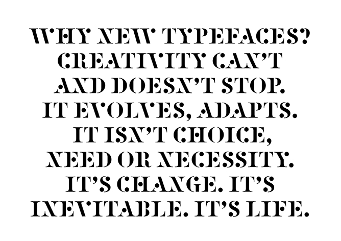
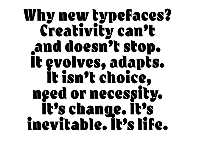
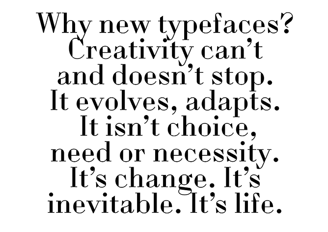
‘So just as we change as we grow up and our bodies, opinions and tastes change. This is Time. This is Life. They are defined by Change. So Change is inevitable, its outside of need or necessity. It just Is.’
The images (and words) are from this wonderful post over at the Alias blog: Why new typefaces? Alias is run by David James and Gareth Hague.
In my opinion/experience, we’ll stop having a need for new typefaces right about the time we stop wanting new music, new food ideas (I’m hooked on detox water right now) and new ways of looking at how we dress ourselves.
Types have personality, just like humans. Take it all away and we become . . . Helvetica. On a Star Trek planet where we all look, think and dress alike.
Type is everywhere. And humans like to mess with shit.
via Alias
FUSE, then TYPO
In 1998 I attended this over-the-top crazy creative conference in San Francisco.
It was called FUSE: Beyond Typography and it was a Neville Brody gig, named for his font magazine. The whole shebang overstuffed itself into San Francisco’s Masonic Center on Nob Hill. And what happened inside was really ‘beyond typography,’ in that the typophiles I knew were complaining where’s the type? It made sense. It was BEYOND.
It was many days. I think a week. Maybe a month, a year? I don’t remember. Nob Hill is up in the clouds, which was fitting. But what I do know is the speakers – which ranged from budding architects Zaha Hadid and Michael Sorkin to author Karrie Jacobs and a slide show from soon-to-pass-on Tibor Kalman – left me recharged about graphic design and what a real creative can do.
Then, turned out the week of FUSE Phil Hartman died.
And
2001 changed everything.
And the economic disaster that followed also put a lot of creative plans on hold. I quit my corporate job right after FUSE and moved on to more meaningful work, eventually landing in teaching. I kept doing the fun work, but bread-n-butter work started to take over. Survival became more important as creativity was pushed aside.
In 2007 I left my position as president of the Art Directors and Artists Club of Sacramento and from a distance, saw it shut down early 2012. BUT I did remember the spark of FUSE (which was a money-loser for the organizers) and kept side projects going. I started this very blog, released a few fonts. [Read more →]
‘Who are modern Russian designers?’
Modern graphic design has roots in Russian Suprematism and Constructivism. Here’s a trailer for a film by Sergey Shanovich that looks at what’s been happening since.
Facebook page here.
Found via Motioncollector
Sunday Rock, analog Cyrillic
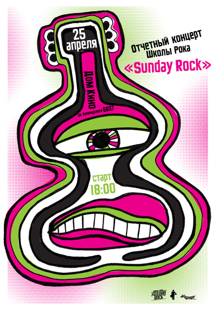
‘Specialization of our school is contemporary music teaching for kids and teenagers’
Modern Dog recently created this poster for Sunday Rock, a music school in Yekaterinburg, Russia.
And I provided Robynne and Co. some quick Cyrillic type the old fashioned way: Scanned in from early 20th Century sources, pieced together letter by letter.
Four different scripts combined to have similar weight, rough edges, heavy caps. I’ve been doing a bunch of work this way lately – sometimes one has to go back to basics.
And on weathered days (like today) vinyl sounds better than digital.

Bauhaus. World Changing. Education. Media.

I will be giving a talk on April 19 at American River College. Covered will be the history of the Bauhaus (1919-33).
And as an add-on, I’ll be subtly previewing how the Bauhaus, Futurism and early Modern Art has inspired my new educational project, FLomm: THE BATTLE For MODeRN 1923 (which already has a tumblr presence here and twitter here).
For additional information, please visit the Art New Media at American River College Facebook page here.
Monty Python moves
‘The whole point of animation to me is to tell a story, make a joke, express an idea. The technique itself doesn’t really matter. Whatever works is the thing to use.’
Terry Gilliam on animation. From 1974.
Found via Cartoon Brew
Modern Dog takes on Disney, Target: and needs your help!
If there were in the world today any large number of people who desired their own happiness more than they desired the unhappiness of others, we could have paradise in a few years. –Bertrand Russell (1872-1970)
Years ago I knew a head general counsel who worked for a legal department for a rather large corporation.
When it came to lawsuits, he explained to me that their approach was they ‘never settled’ and ‘would use all of our resources – millions of dollars at our disposal’ to fight any suit that came in. Whether they were right or wrong. “If they’re going to go up against us, that’s what they’re going to get.’
Years later I sat in on a ‘business ethics’ class where this ethic was explained in detail: ‘it is okay to destroy the competition. That’s good business ethics.’ And throw in that businesses today operate to ‘keep shareholders happy’ over everything else – we live in a very frightening world. One that squashes innovation and creativity in favor of ‘good competition.’
Good competition is fantastic – when the tables are ‘fair and balanced,’ a term – even today – that’s not used for what it actually means. There’s a lot we CAN be doing as a race – in terms of social, political and humanitarian causes – but we don’t. There’s a great scene in An Inconvenient Truth where Al Gore points to an illustration of a pot of gold. It’s our motivation. It’s what we live for. A pot of gold. A shiny pot of gold we can hide from others, shower with, rub on our bodies if it makes us feel better.
the battle
Right now there’s a David v. Goliath lawsuit going on. It seems simple open and shut: Large corporations profit from stolen artwork. So artists who created artwork get a lawyer and take on the corporations.
In this situation, the corporations are our darlings: The fantastically wonderful Disney and the ‘god I love what they do for design’ Target. And I spent an afternoon recently going thru the case files – which are posted at Friends of Modern Dog – and to me it seems it’s another bury the little guy response.
You’d think it would be Urban Outfitters doing this – it IS their modis operandi – but no. It appeares Disney and Target are poised to destroy Seattle’s very own Modern Dog.
Ashamed is not a word I use much. Though I think it applies here: BOTH Disney and Target should be ashamed. They are BOTH corporations that benefit from creative innovation. BOTH should be working WITH Modern Dog, not – as this lawsuit seems to be doing – putting them out of business . . . [Read more →]

handpicked posts

a piano falls in old manhattan
tetro and typography
it’s typography: film, song and dance
ghosts of gustov klimt
the great times new roman controversy
picking fonts
kapitaal
defining terms: design is not decoration
garcia's 'pure design'
'enhance that image!'
magic highway remixed
the cynic
rad anthem
Brought to you by man dom-


buy my fonts
go shopping
mehalloreads

Divinely Elegant: The World of Ernst Dryden
Jozsef Pecsi: Photo and Advertising
Color: A Natural History of the Palette
Collage: Assembling Contemporary Art
Modern Dog: 20 Years of Poster Art
Gaberbocchus Press: An Experiment in Publishing, 1948-1979
Advertising Art in the Art Deco Style
Googie Redux: Ultramodern Roadside Architecture
Hot Sour Salty Sweet: A Culinary Journey Through Southeast Asia
now playing


the work at the mehallo blog. beta. is licensed under a creative commons attribution - noncommercial - no derivative works 3.0 united states license. if reposting, credit must be given to steve mehallo - and if possible, please provide a link back to the mehallo blog. beta.
i include images for the purpose of critique, review, promotion and inspiration - and always make my best effort give credit/link back to the original source. if i’ve screwed up, please fire me a note.
page layout based on the wordpress 'darkwater theme' by antbag, adapted and redesigned by mehallo. valuable php assistance from bill mead.


