Eric Gill: The wine
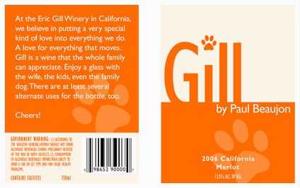
Wine label inspired by the work (and life) of font designer Eric Gill (1882-1940). Student-designed project.
Wine label inspired by the work (and life) of font designer Eric Gill (1882-1940). Student-designed project.
Like Helvetica? Like the Swiss International Style?
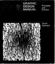
Armin Hofmann’s Graphic Design Manual (1965) is what I learned out of – and if it weren’t out of print, I’d be using it in my basics classes. (right now, I have a few slides made from my dog eared edition as part of a form lecture)
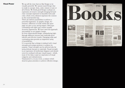
Graphic Design Manual breaks composition into basics: dot, line, confrontation, plus letters and signs. And it shows by example how these basics can be applied to good, clean graphic design: form, composition, typography.
I’ve seen it going for upwards of 90 bucks in some listings. As I write this, there are 22 used available at Amazon starting at $4.10.

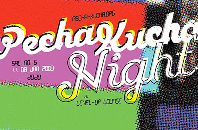
Found via Reserves on TwitPic
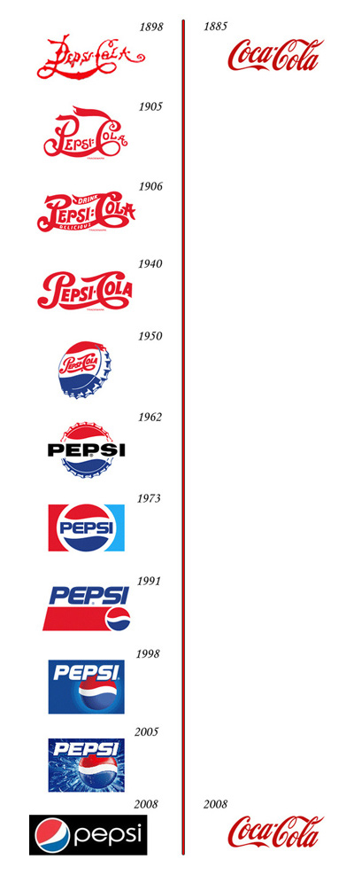
Plus, there’s some more Evolution of Logos charts at the Best Ad blog.
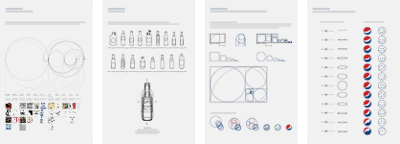
And, here’s a link to the ‘official’ Pespi rebrand strategy proposal [pdf]. The most involved snow job in the history of brand design. Worth downloading and . . . reading with awe!
i’m digging all this
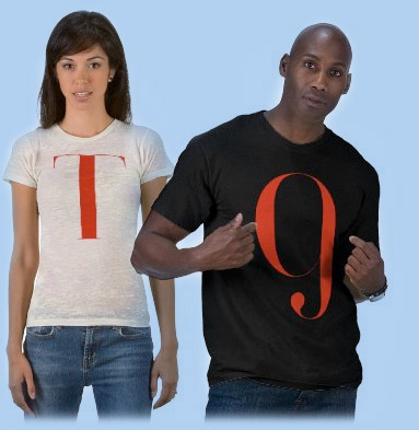
I’ve had these merchandise ideas for a few years and just never got around to building them until recently. Production issues always held me up . . . so did fulfillment, pricing . . . inventory . . . [Read more →]

Image via dvisible magazine
Graphic designer Reid Miles and the Blue Note label – incredible album cover design. Here’s a great article on Miles.
And here’s the Wu-Tang albums as Blue Note releases. Found via Twitter.com/Sandoer.
Good graphic designers are trained to do amazing things in the realm of communication. And many clients just see the surface: make me a logo, I like yellow, so you should use yellow.
This article really nails it:
How to (and not to) work with a designer by Daniel Will-Harris
(Nails it so well, I’ve posted it as a link as part of the Manifesto at my website)
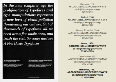
Swiss International Style guru Massimo Vignelli has released a new book on using type in graphic design. In it he explains in concise detail how it’s done. And as with all his work, it’s precise, clean, neat. Also, it’s free.
Download here: The Vignelli Canon [PDF]
History of the Internet from PICOL on Vimeo
Plus, check out The National Science Foundation’s official Birth of the Internet page.
I keep meaning to add a short web history component to my graphic design history class – and found some great classroom-friendly sound bytes in NSF’s collection.
Also found this fun little history of Twitter ditty.

Found via Apartment Therapy
IKEA sets up a mock Oval Office in Union Station – bringing a touch of low cost Sweden to the White House. (or to make a Carter reference: Looks like IKEA is bringing ‘Billy’ back to the White House.)


the work at the mehallo blog. beta. is licensed under a creative commons attribution - noncommercial - no derivative works 3.0 united states license. if reposting, credit must be given to steve mehallo - and if possible, please provide a link back to the mehallo blog. beta.
i include images for the purpose of critique, review, promotion and inspiration - and always make my best effort give credit/link back to the original source. if i’ve screwed up, please fire me a note.
page layout based on the wordpress 'darkwater theme' by antbag, adapted and redesigned by mehallo. valuable php assistance from bill mead.