It’s not all about fonts
![]()
Shirley-Ann Dick’s There’s more to life than Helvetica tee
Designed in under 10 minutes.
Found via Whitezine
![]()
Shirley-Ann Dick’s There’s more to life than Helvetica tee
Designed in under 10 minutes.
Found via Whitezine

Fonts can’t handle being stretched, they end up looking awkward/slows down reading
Fonts require a lot of massaging in order for them to work for you. Here’s a list of some fairly common mistakes – posted over at The Design Cubicle.
Robyn Waxman’s FARM project broke ground Saturday March 28, 2009 – with the goal to build a 66 foot long community-servicing/maintained farm on a toxic strip of land in San Francisco. FARM is in full swing on Hooper Street, which segments the SF campus of California College of the Arts. The project now has plans to branch out into Davis and Sacramento.
Find out more about FARM here.
Introducing Stephen Coles’ new Fontstruct: WPA Gothic. Based on the posters of the Works Progress Administration.
Click here for free download and more info.
For more about Fontstruct, go here.
And here’s some highlights from the Library of Congress’ WPA collection . . .
Google conspiracy theory animation by Ozan Halici & Jürgen Mayer. Bachelors’ Thesis at the University of Applied Sciences, Ulm, Germany.
From 2003: What Barry Says by Simon Robson & Barry McNamara. Short anti-US fascism animation. This controversial film won Best Animation at the Brooklyn International Film Festival in 2004.
Pictorial Webster’s: Inspiration to Completion from John Carrera on Vimeo
‘as a source for creativity in the human brain’
Yesterday, I thumbed thru Chronicle Books’ trade edition of Johnny Carrera’s Pictorial Webster’s: A Visual Dictionary of Curiosities. The video (above) details the inspiration for the project, historical cataloging, Linotype setting, as well as the design and hand binding of the fine press editions.
More detailed details are posted here. Also, check out the very Victorian Wall Cards and Stamp Set.
Carrera is the proprietor of Quercus Press, based in Waltham, Massachusetts.

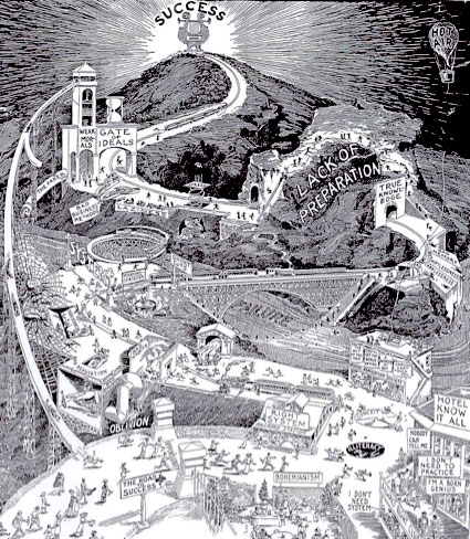
Click on image to jump/view larger version
Hm. Starting to see problems with approaching life as a bohemian.
Found via Strange Maps