Barradas 1927
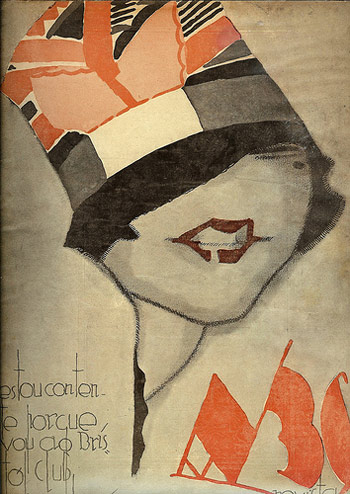
The work of Jorge Barradas, from ABC Illustration No. 362, June 23 1927.
Baron Von Luxxury: The Lovely Theresa
Found via Gatochy

The work of Jorge Barradas, from ABC Illustration No. 362, June 23 1927.
Baron Von Luxxury: The Lovely Theresa
Found via Gatochy
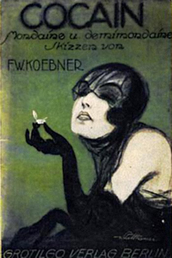
Illustration for F.W.Koebner’s original Das Magazin, Berlin 1921.
Soundshaperz: Cocaine (Original Mix)
Found via Susanlenox
Art Nouveau meets Russian Constructivism. Motion design by Matt Duplessie.
‘A typeface designed to reflect the aesthetic qualities of Soviet Union product design and manufacture. The typeface uses a unilateral x-height, cap height and faux Cyrillic to create a blocky, angular and awkward response. To allude to the dated methods of production, I produced the entire face as printing blocks.’
Andy Barnes’ Eastern Block typeface. Website here.
Found via Arts Thread
Stefan Bürke’s Airplane Flying
Two short interpretations of the work of Suprematist Malevitch and Constructivist Lissitzky.
Jostein Finnekaasa’s Suprematism/Constructivism
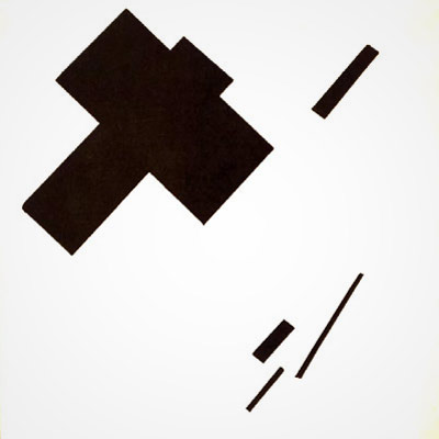
‘Suprematism, considered ‘the first systematic school of abstract painting in the modern movement,’ was developed by Kazimir Malevich in 1913 and introduced at the 1915 0-10 exhibition in St. Petersburg.’ –Alexander Boguslawski
This is my favorite Suprematist piece, Malevitch’s Sensation of Flight, c. 1914-15. Pure objects, any meaning comes from the viewer’s own interpretation.
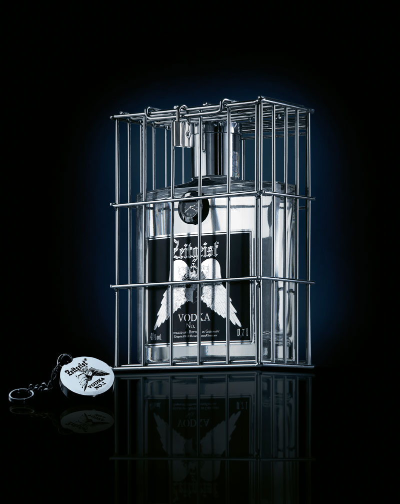
‘The vodka is ‘onstage’ in a chromium-plated cage to match its cool, argentiferous look which is reflected all around it. A silver lock secures the cage.’
Package design for Zeitgeist Vodka, made in Germany. Website here.
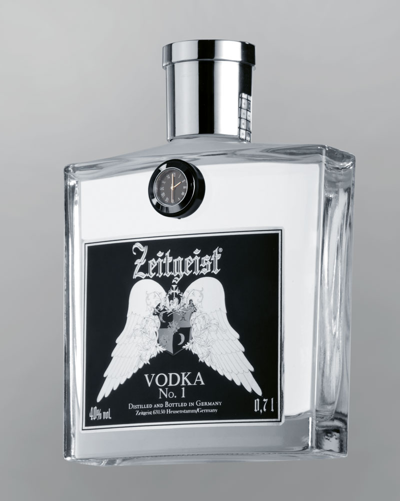
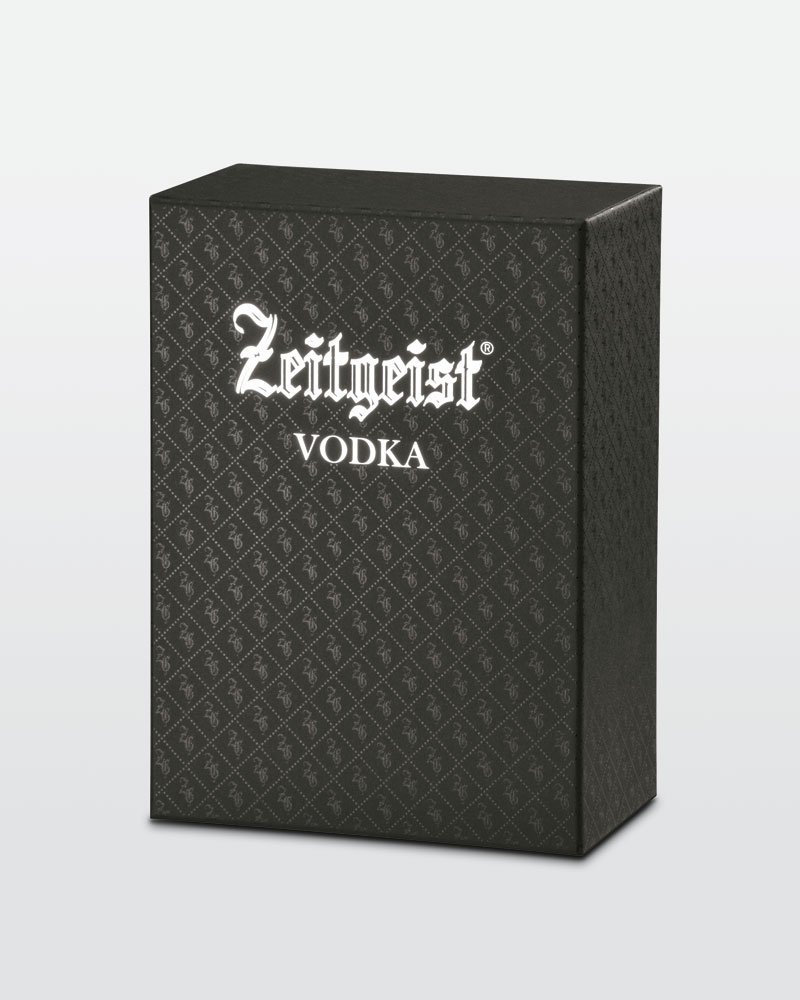
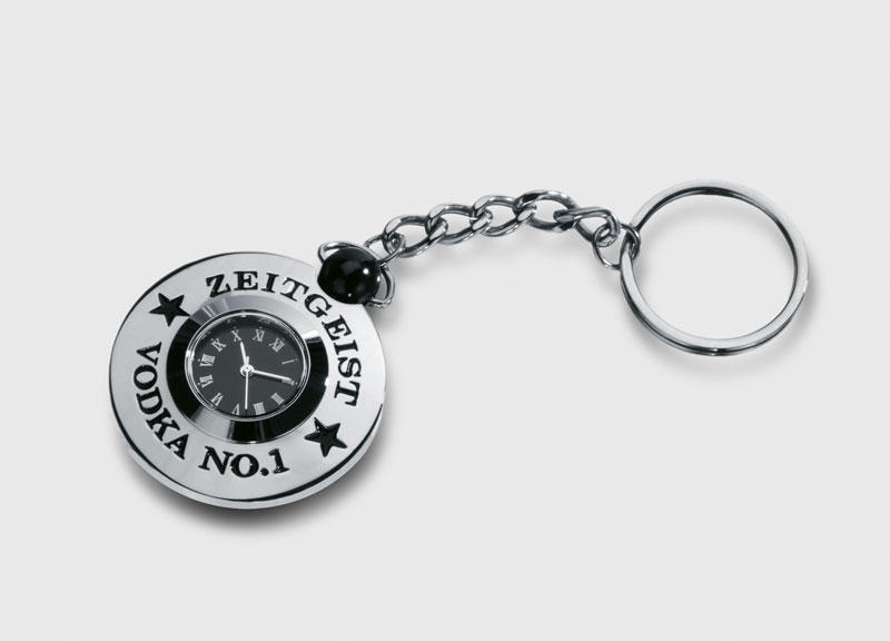
Found via Design made in Germany
‘In an extended metaphor, Manson compares his own often-criticized music to the entartete Kunst banned by the Nazi regime’
Videos for Marilyn Manson’s Mobscene and This Is The New Shit. Made in collaboration with Gottfried Helnwein. From 2003.
Ever wonder what Germany may have looked like if the Weimar Republic kept going?
I like to think answers to this question could be found in the wonderful image sets posted over at kraftgenie’s Weimar blog. Each post is a collection of seemingly related imagery that is simply . . . Weimar.
Niedermann Grotesk is my newest font and it’s been sitting in the hopper for awhile.
It became a side project that appeared while I’d been working on my update to Jeanne Moderno (which is Jeanne Texte, which has been in a little limbo due to other projects) (I plan on getting back to it next month).
Along the way I fell in love with types that were part of the German Sachplakat (object poster) style pioneered by the great Lucian Bernhard – a lot of which can be seen (as backgrounds) in their original zeitgeist settings in the 1927 Ruttmann film I posted on Sunday.
Plakat lettering was drawn as needed, typically painted. For my adaptation, I went back to brush – and included a handful of alternative characters, ligatures, plus a few dingbats.
Grab your copy here.
And . . . Save 31%! Niedermann Grotesk is on sale right now at MyFonts. Sale ends September 22, 2011.