entries Tagged as [design]

Kolb’s Space Oddity

‘The tale of doomed Major Tom plays out in Kolb’s bright and retro animation style, giving a face to the legendary Bowie character and making the conclusion that much sadder’

Illustrated just for fun. The work of Andrew Kolb.


David Bowie: Space Oddity

Found via ComicsAlliance and Badass Digest

Chewbacca the Bear!

More posters from my room.

In early 1977, Marine World Africa USA was giving away these Coca-Cola promo posters. Their elephants were used in the first Star Wars movie as the banthas – and I ended up with some free wall hangings.

Knew nothing about the movie and I knew nothing about droids, the old guy with the Jesus circles around his head or why something was called a ‘SEE-THREEPIO.’ Also thought Chewbacca the Bear seemed a bit odd.

A few months later, went to the drive in and saw Star Wars. The previous year, saw Logan’s Run at the drive in. Star Wars was something much different.

‘They’re so small they’re evading our terrible lizards’

In 1977, this poster hung on my bedroom closet door – and was eventually eaten up by use of that same door.

It came as an extra large ‘freebie’ in the Star Wars soundtrack, which I bought thinking it was this album. It wasn’t. It was the symphonic score; for me, an introduction to classical music. What I learned from the free poster – as a young impressionable creative – is abstraction, when done right, looks great.

It was painted by artist John Berkey – who used quick brush strokes that up close were a gloopy mess, but at a distance create energy and implied motion.

Berkey’s work influences me to this day.

And for my iTunes-loaded tracks of the Star Wars radio program, I’m using some of his art as my ‘album covers,’ below.

As for Star Wars’ ‘terrible lizards,’ these are them.


Poster found via KlaatuCarpenter

‘Hanging Loose’

Illustration by the great Bob Peak. From 1972.

Found via Martin Klasch

Third Mind, ManiaMania

‘The range moniker pays homage to The Third Mind, a 1978 book and concept by William Burroughs and Brian Gysin, which showcased the ‘cut ups’ technique originating from the Surrealists – a form also adapted to film making by Kenneth Anger and Maya Deren. In this mode, unrelated texts and images where literally cut up and rearranged to form radical narratives and vistas.’

Abbey Lee Kershaw, shot by Elle Muliarchyk for ManiaMania. Info here.

Found via Fashionising

Decabet

The posters art of the Jason Malmberg.

New portfolio website here.

More Occupy visuals

As more of the world finds itself occupied, additional visuals are showing up on the interwebs.

Above, OCCUPY U poster created by an anonymous designer friend, whose name is left off for fear of losing another job (click to download printable PDF).

Below, statistical poster from new website Occupy Design. And at bottom, Shepard Fairey does his thang.

Click on images to download and/or jump to respective websites.

Occupy Design found via GOOD

Good 50×70


‘It’s a competition to raise awareness amongst the creative community of the power we have to be a force for good.’

Posters from the Good 50×70 Competition.


Found via Robert L. Peters

Tibor, trubblemaker

‘What role we are playing. Making the filthy oil company look ‘clean,’ making the car brochure higher-quality than the car, making the spaghetti sauce look like it’s been put up by grandma, making the junky condo look hip. Is all that okay, or just the level to which design and many other professions have sunk?’ –Tibor Kalman

I first discovered Tibor Kalman’s work sometime around 1990.

He was doing something that most everyday graphic designers seemed to be avoiding. Questioning things.

His adeptness at social change – being a responsible human being, helping others – happened by working within the system. First at Barnes & Noble, M&Co., then Interview, Colors magazines. And as a teacher.

Before he passed in 1999, Kalman was the facilitator of what I see as a great awakening in our industry. And those who were part of his circle – such as his wife Maira, Stefan Sagmeister, Scott Stowell, Alexander Isley – have made graphic design much more than pretty brochures and generic logotypes.

Good design for good purposes is good. Making shitheads lots of money thru questionable practices is bad. Seems simple, right?

It isn’t.

I posted this because the rest of the world is waking up just about right now. And this past week, Steven Heller wrote up a great piece on Kalman.

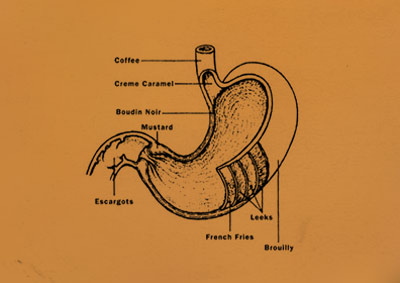
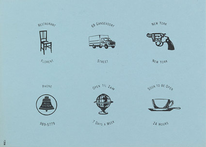
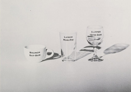
Pictured from top down, advertisements and promotions for NYC’s Restaurant Florent. With Alexander Isley, from 1985–88. Found via Tibor Kalman: Design and Undesign and MoMA

‘After Hours’

‘Karlie Kloss lives up to her reputation as the all-American girl as she dons glitter, sequins and Lurex to revisit New York’s Seventies disco heyday’

Editorial for the November 2011 British Vogue photographed by Terry Richardson.


Donna Summer: Hot Stuff

Found via Fashion Indie

Make change

The work of Evan Huwa.

Found via Carole Guevin


Creative Commons License

the work at the mehallo blog. beta. is licensed under a creative commons attribution - noncommercial - no derivative works 3.0 united states license.  if reposting, credit must be given to steve mehallo - and if possible, please provide a link back to the mehallo blog. beta.

i include images for the purpose of critique, review, promotion and inspiration - and always make my best effort give credit/link back to the original source.  if i’ve screwed up, please fire me a note.

page layout based on the wordpress 'darkwater theme' by antbag, adapted and redesigned by mehallo.  valuable php assistance from bill mead.