entries Tagged as [design]
Rethinking food labels
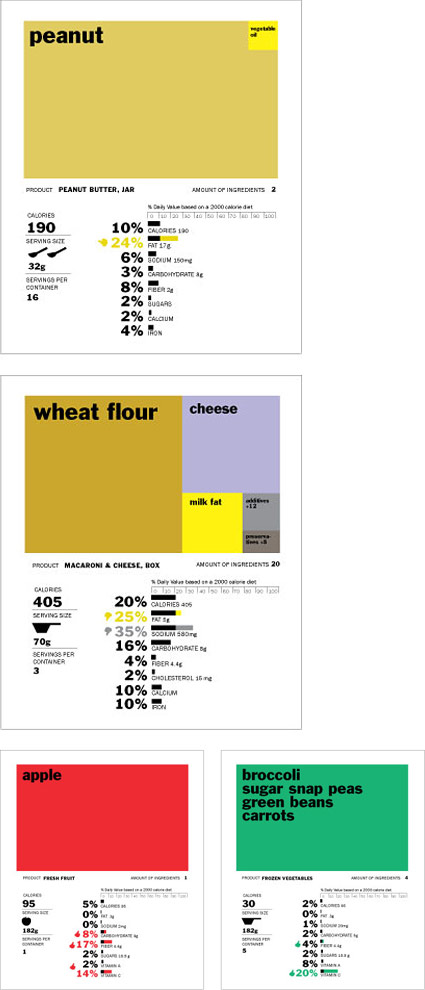
‘The rectangles on top of each label represent main ingredients, and bars on the bottom provide a quick thumbs or thumbs down for a breakdown of fat content, carbohydrates, etc. Icons of spoons and scoops are used to supplement serving size since no one knows what 182 grams looks or feels like.’
Above, Renee Walker’s food nutrition label redesign, winner of UC Berkeley School of Journalism’s Rethink the Food Label competition.
Her work was originally part of an interdisciplinary topic studio focused on contemporary health issues; she has her original versions posted here.
Below, a few of my favorites from the competition:
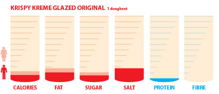
Corinne Pritchard
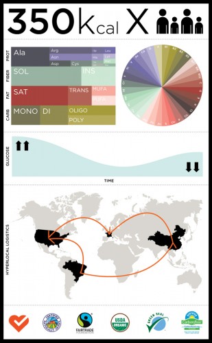
Fabius Leineweber
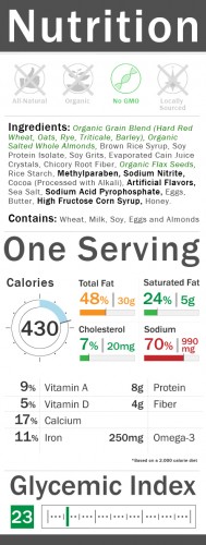
Bradley Mu
Found via FlowingData
Coffee, bauhaus, shirt
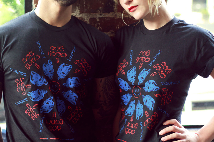
One of these days I’m gonna make it up to Seattle and visit bauhaus books + coffee. Just because I have to.
And available now thru them is the Bauhaus + I Want You shirt, designed by Christian Petersen of DUMB EYES – as a cross promotion with I Want You magazine.
Coffee, shop
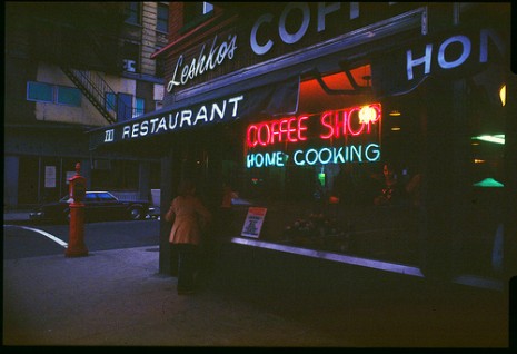
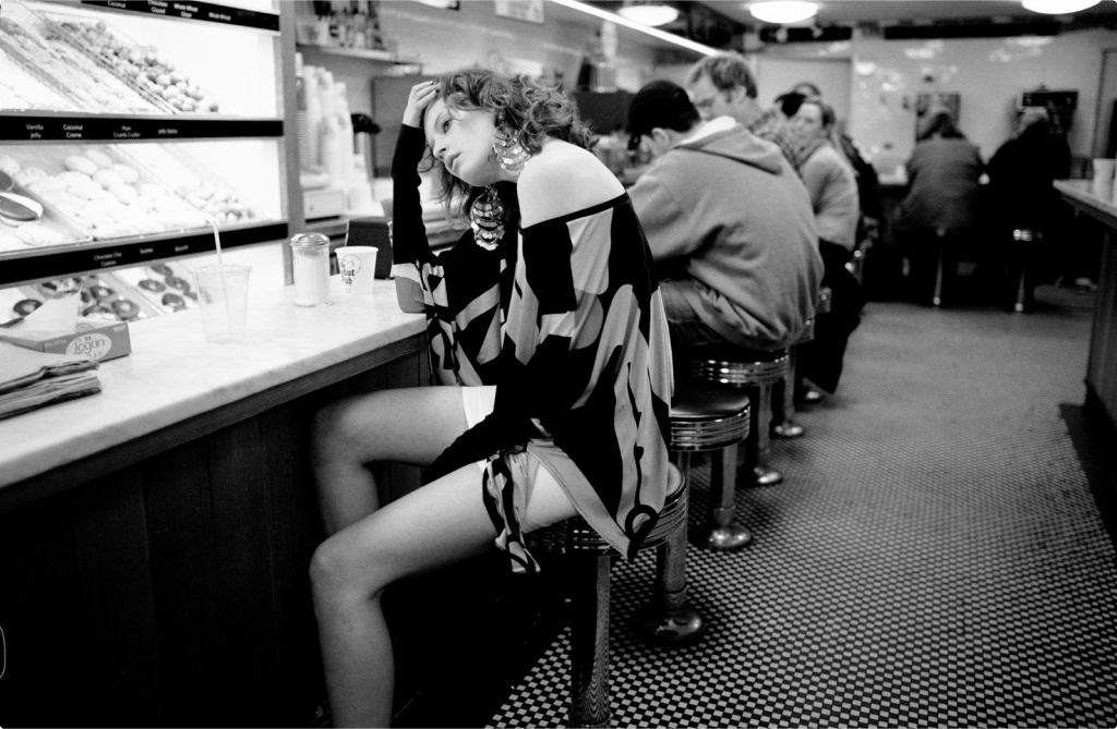
Leshko’s Coffee Shop, Ave. A. NYC 1979.
The photography of Michael Sean Edwards. Flickr here, website here.
Found via Dangerous Minds
Coffee mugs, on sale
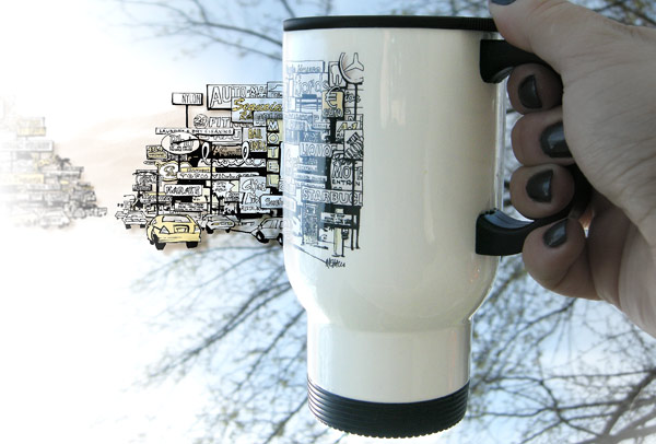
Zazzle’s been running daily specials – and today all my mugs are 50% off.
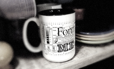
This includes the one pictured above (in its travel option); as well as my best-selling Font Me Typography mug, below.
Input code HOLIDAYSALE4 at checkout. Plus, free shipping on orders over $50. Visit my store here. Zazzle has a new special every day for the holidays, some limitations apply (of course).
