entries Tagged as [cinema]

A couple of Saul Bass mashups


Star Wars vs. Saul Bass (2007)

Star Wars vs. Saul Bass (above) is described as ‘If Star Wars was filmed two decades earlier and Saul Bass did the opening title sequence, it ‘might’ look like this.’ The animation was created as part of a school project.

A more recent mashup is Tron vs. Saul Bass (below).


Tron vs. Saul Bass (2009)

The designer has also made a bunch of matching posters, sort of how Bass used to.
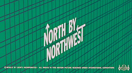
Chatting with Saul Bass


Intro

Here are some highlights from a candid documentary (shot in 1986) on Saul Bass. The doc is available as a 2-DVD set here.


On making money vs. quality work


Advice to design teachers


Advice to students


Thoughts on his legacy

Saul Bass, frame by frame

Rumsey Taylor’s 2005 Saul Bass site features detailed interactive, frame-by-frame analysis of Bass’ movie title work; as well as some movie reviews.

View em in detail here.


Bass on Titles

‘Bass on Titles presents a comprehensive, well-rounded retrospective of Academy Award-winner, Saul Bass’ film title sequence design.’

With really bizarre dialog screwy sound looping fx. Watch it above. From 1977.

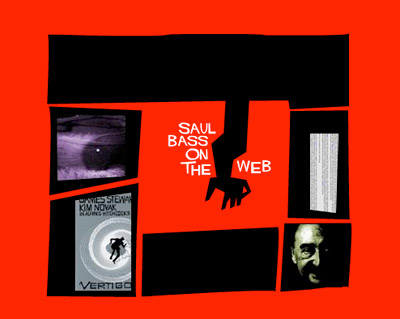
Saul Bass on the Web

Brendan Dawes’ cool little tribute to graphic designer Saul Bass.

How to set type the Linotype way


Typesetting: Linotype, 1 of 2

Typesetting using the Linotype caster. Film produced sometime around 1960 by Salesian Vocational and Technical Schools, Italy.

I love how he refers to ‘matrices’ as ‘mattresses.’


Typesetting: Linotype, 2 of 2

Found via Linotype

Your Life Work Series: Printing

‘Hand compositors usually set the large type called ‘display line,’ used in advertisements and other printed matter. Hand composition offers opportunities for artistic expression. Compositors who have the ability to create original ideas are highly-paid craftsmen. The work requires manual dexterity, good eyesight and thoroughness.’

Vocational documentary on printing and typesetting. From 1947.

I like how he pronounces ‘ad-verr-tiz-mints.’

New chill

Here’s some old chill. And (above) some new chill. Bird n cat.

Chat Noir music video. Music composed by Christoph Irniger, animation by Ralph Sonderegger.

Found via Monsieur Bandit

Kapitaal

‘Award-winning Typo-Animation that gives you a clear impression of the enormous amount of visual stimuli that plague us every day.’

Grab a Heine and look around. Type is everywhere.

Kapitaal is a film by Ton Meijdam, Thom Snels, Béla Zsigmond of Netherlands-based Studio Smack. Music by The Exploding Shetland Ponies.

The Bunnies

Playboy Bunnies everywhere!

Above, scene shot in the London Playboy Club, from the film Purab Aur Pachhim (1970). Love the guy’s glasses, tho subtitles would be helpful (long conversation at the end, no idea what they’re saying).

Pink Lady and Jeff (1980) was (yet another) ill-conceived variety show on NBC. And in one episode, Hef showed up with Bunnies and walked his way thru a musical number:

And
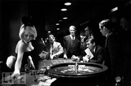
Below, Rabbit Roulette: At a Playboy Club, from LIFE magazine, 1967.

Click on the image for a vintage Playboy Bunny photo gallery.

Experimental typographic films

A bunch of short typographic experiments by Teenocide. More at the website.

Found via Vimeo


Creative Commons License

the work at the mehallo blog. beta. is licensed under a creative commons attribution - noncommercial - no derivative works 3.0 united states license.  if reposting, credit must be given to steve mehallo - and if possible, please provide a link back to the mehallo blog. beta.

i include images for the purpose of critique, review, promotion and inspiration - and always make my best effort give credit/link back to the original source.  if i’ve screwed up, please fire me a note.

page layout based on the wordpress 'darkwater theme' by antbag, adapted and redesigned by mehallo.  valuable php assistance from bill mead.