Kurt Schwitters’ Primiti Too Taa
‘an excerpt from the poem Ursonate (Sonata in primitive sounds) by Kurt Schwitters (1887-1948)’
Created by Ed Ackerman and Colin Morton, 1986.
Found via Typophile
‘an excerpt from the poem Ursonate (Sonata in primitive sounds) by Kurt Schwitters (1887-1948)’
Created by Ed Ackerman and Colin Morton, 1986.
Found via Typophile
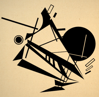
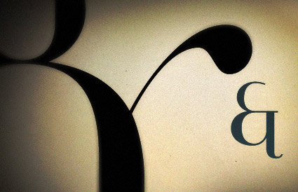
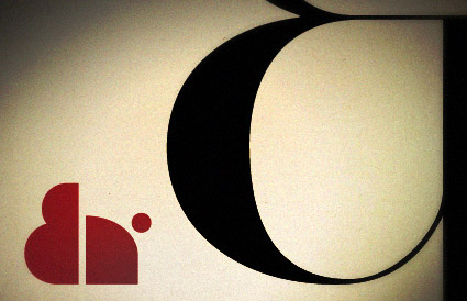
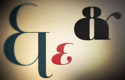
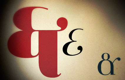
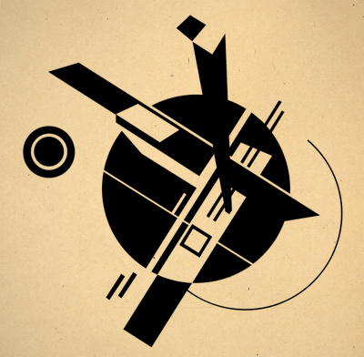
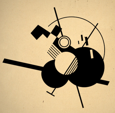
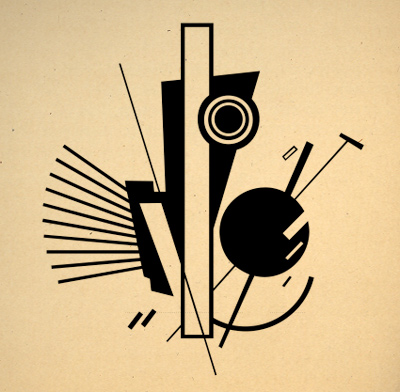
Here’s a sneak peek of some of the PROUNS-inspired dingbats that will be part of my upcoming Jeanne Texte font package.
The basic letterforms are now in technical review at Psy/Ops and I hope to have the new fonts completed and available by end of year. Crossing fingers.
Jeanne Texte is my sequel to Jeanne Moderno, which is available thru Psy/Ops, MyFonts and Ascender. Webfonts via Typekit.
Short animated film produced in 2004 by Paris8 University masters student Stéphane Evezard. Based on Bowie’s Pablo Picasso; from the album Reality.
Visit Stéphane’s site here.
Found via Jeanne Mehallo

‘The ‘twittering’ in the title doubtless refers to the birds, while the ‘machine’ is suggested by the hand crank’
Paul Klee’s Twittering Machine (Die Zwitscher-Maschine). Oil transfer drawing on paper with watercolor and ink on board with gouache and ink borders. 1922.
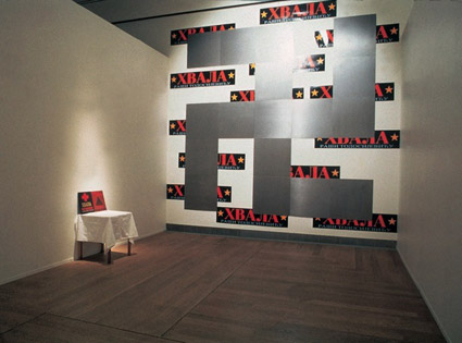
No symbol polarizes more.
The swastika – originally an icon for well-being – was perverted into something profane by Adolf Hitler and the Nazi party.
Controversial artist Raša Todosijević took the form and turned it on its ear – with different interpretations, it creates other contexts. Raša was born in Serbia in 1945, after World War II. More of his work is posted here.
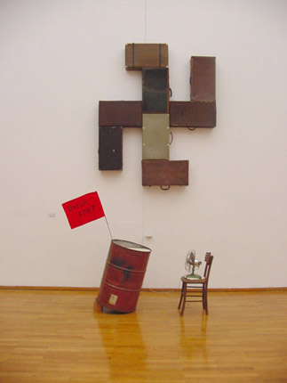
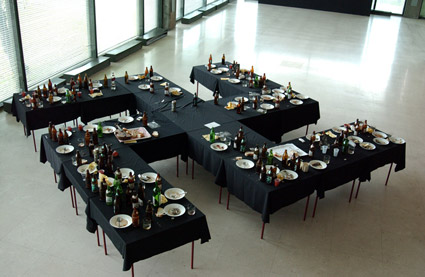
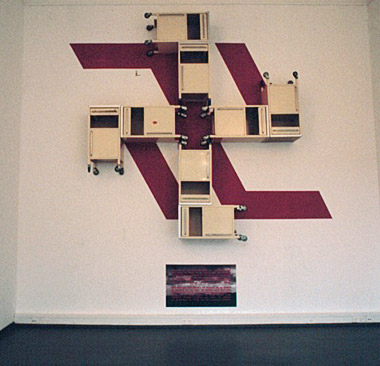
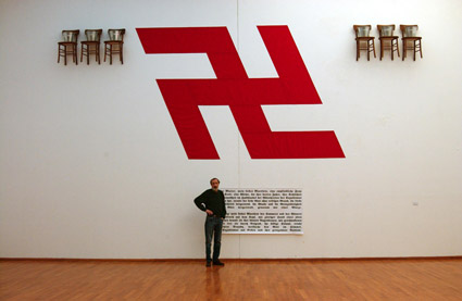
Found via Marko Davidovic
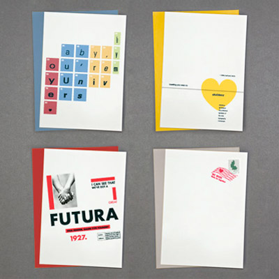
‘Baby, you’re my Univers. Meeting you was no Akzidenz. I can see that we‘ve got a great Futura. We were Meta be together.’
Handmade by Machine’s Just My Type greeting cards. Details here. Unfortunately, only UK-shipping is available for now.
Found via cebe design
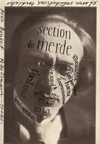
‘Raoul Hausmann’s postcard to IK Bonset (van Doesburg’s alter ego) of rival theorist Herwarth Walden’
Theo van Doesburg (1883-1931). Magazine publisher. Artist. Designer. Propagandist. Troublemaker. Dutch. The guy behind de Stijl.
A van Doesburg show just opened yesterday (my birthday, how bout that?) at the Tate Modern. Review here. Another review here.
Runs thru May 16, 2010.
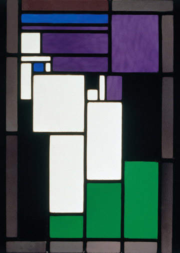
Stained glass composition by van Doesburg
Plus,
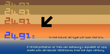
Here’s a link to my own low cost, van Doesburg-influenced font, 2491.
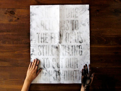
Dirt Poster by Roland Reiner Tiangco
One can’t see the message in the poster unless one’s hands are dirty. See how it works here.
Line art by Steve Masseroni
gurus plant ideas
Steve Masseroni is an incredible artist I knew in high school. He was dabbling with working for Marvel Comics at the time, but set out in his own direction. In a afternoon critique in 1985, he gave me his favorite brush and a few tips on being an illustrator. [Read more →]
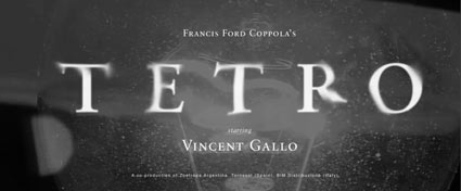
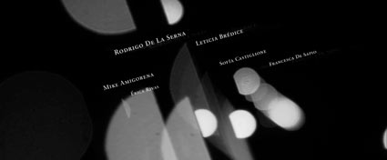
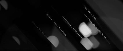
Watch this beautiful title sequence for Francis Ford Coppola’s TETRO. Designed by SFAUSTINA. Both avant garde and not at the same time.
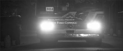
And . . . I’ve always wondered why so many motion picture title sequences end with a shot of a bus.
Found via Twitter.com/Typegirl


the work at the mehallo blog. beta. is licensed under a creative commons attribution - noncommercial - no derivative works 3.0 united states license. if reposting, credit must be given to steve mehallo - and if possible, please provide a link back to the mehallo blog. beta.
i include images for the purpose of critique, review, promotion and inspiration - and always make my best effort give credit/link back to the original source. if i’ve screwed up, please fire me a note.
page layout based on the wordpress 'darkwater theme' by antbag, adapted and redesigned by mehallo. valuable php assistance from bill mead.