entries Tagged as [avant garde]

El Lissitzky: ‘Frankreich’

Cover design by El Lissitzky for Roget Ginzburger’s Frankreich (France) 1929.

From Neues Bauen in der Welt, a book series on modern architecture published in Vienna.

Below, recent release by Brooklyn-based Dream Diary, El Lissitzky.


Dream Diary: El Lissitzky

Alexey Brodovitch, good layout

‘There is no recipe for good layout, but what must be maintained is a feeling of change and contrast.’ –Alexey Brodovitch (1898-1971)

Photo by Man Ray, layout by Brodovitch for Harper’s Bazaar, 1934.

Tavi, hats

‘decades worth of the milliner’s designs and to get inside the head behind the hats.’

Fashion blogger Tavi headed to Antwerp in September to review Stephen Jones’ career retrospective exhibition, Accent of Fashion.

Review (with more photos) here. Monograph available here.

Shadows, diamonds, black salt

The work of Justin M. Maller.


Found via Cretique

Metropolis reinterpreted 2

Metropolis poster by Pietari Posti and Underware. 6-layered silkscreen print, 2008. Run of 100.

With glow-in-the-dark lettering.

Metropolis reinterpreted 1

Posters for Metropolis by Maelle De Bernardini. From 2002.

Metropolis visuals

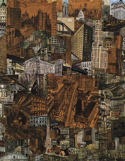
Cinematography for Fritz Lang’s Metropolis (1927) was inspired by Paul Citroen’s 1923 Metropolis photomontage (above).

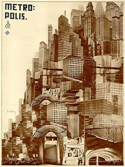
And so was Boris Bilinsky’s poster for the film (below).

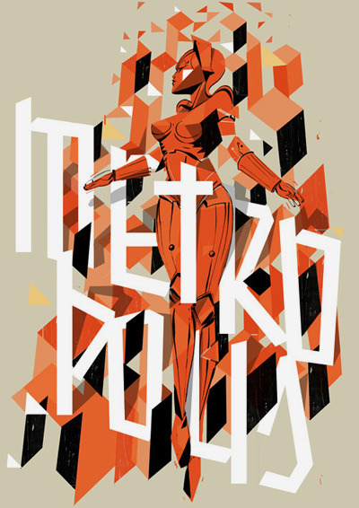
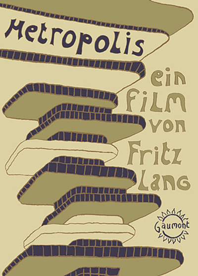
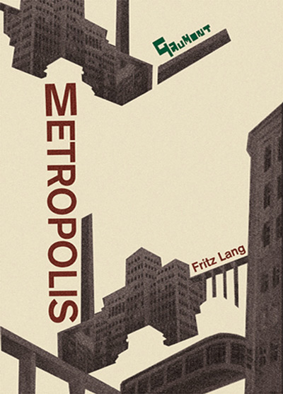
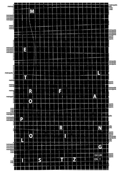
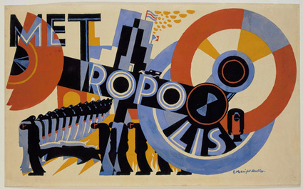
Commercial artists took some liberties with how they created visual promotion for Metropolis – redrawing or recreating the ‘maschinenmensch’ (machine-man) and the modernist cityscapes. [Read more →]

McKnight Kauffer’s Metropolis

Metropolis by E. McKnight Kauffer. Gouache on paper, 1926.

Foreshadows Depero’s compositions, such as his view of New York – and his work for Campari.

Rémanence#4

‘Film silencieux couleur, 2010 – 5mn. Art numérique et vidéo’

The work of Isabelle Dehay.

Found via Maggie Estey

Free Conqueror fonts!

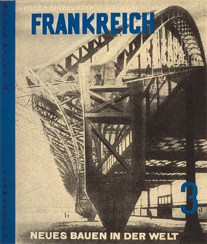
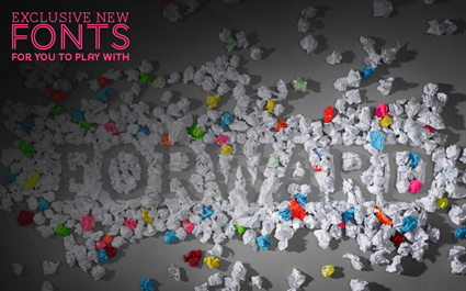
‘Jean François Porchez was approached at the end of 2009 to create a set of typefaces to relaunch the Conqueror papers collection.’

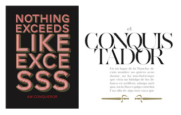
Jean François Porchez’s beautiful Conqueror fonts are based on some great historical design eras – and are available free via Arjowiggins Creative Papers thru end of March 2012.

The fonts themselves are mostly caps and missing a few punctuation marks – but they also have similar widths, cool alternate characters (such as swashes) and 3D carved versions (as extras) – making them vastly interchangeable. And who knows, since they’re free, maybe they’ll conqueror the design world.

A standard commercial font license applies. Grab em here.

More details here.

Banned masterpieces: Desert of Forbidden Art

‘How does art survive in a time of oppression? During the Soviet rule artists who stay true to their vision are executed, sent to mental hospitals or Gulags. Igor Savitsky  . . .  pretends to buy state-approved art but instead daringly rescues 40,000 forbidden fellow artist’s works and creates a museum in the desert of Uzbekistan, far from the watchful eyes of the KGB.’

Trailer for The Desert of Forbidden Art (above). More info about the film here.

my take
In my design history class, it’s always a shock when I show how strongly the Nazis reacted to modern art. Just the concept that ‘art can be dangerous’ – so dangerous that the artists must be killed – seems so distant. Yet in the news today, book burnings have become a common topic. Just like the Nazis. Again.

Art and ideas are often dangerous to individuals who have the intense need to control other people. What they say and do. Who they associate with, what they read, how they think, or love.

As someone who champions free speech – I find the concept of book (or art) banning (or burning) thoroughly disgusting.

Not looking forward to election day this year.

Trailer found via Ai Buenafe


Creative Commons License

the work at the mehallo blog. beta. is licensed under a creative commons attribution - noncommercial - no derivative works 3.0 united states license.  if reposting, credit must be given to steve mehallo - and if possible, please provide a link back to the mehallo blog. beta.

i include images for the purpose of critique, review, promotion and inspiration - and always make my best effort give credit/link back to the original source.  if i’ve screwed up, please fire me a note.

page layout based on the wordpress 'darkwater theme' by antbag, adapted and redesigned by mehallo.  valuable php assistance from bill mead.