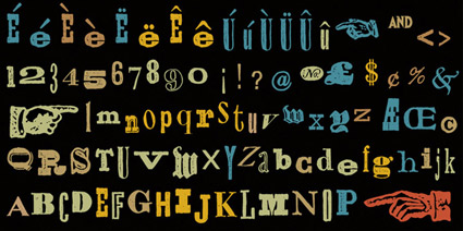
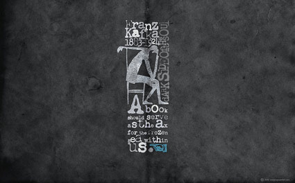
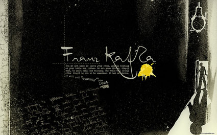
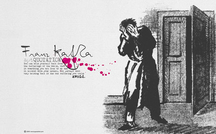
Kafka Chandler 42
Even more free wallpapers by Arno Kathollnig . . .
Franz Kafka Trilogy – featuring my own Chandler 42 fonts (with some pointing hands from Alta California).
Even more free wallpapers by Arno Kathollnig . . .
Franz Kafka Trilogy – featuring my own Chandler 42 fonts (with some pointing hands from Alta California).
Rare Jan Tschichold book design, featuring his use of an early prototype of the Alta Calfornia font.
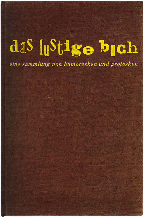
Cloth cover for Das lustige Buch (The Funny Book), Verlag der Bücherkreis GmbH, Berlin, 1931.
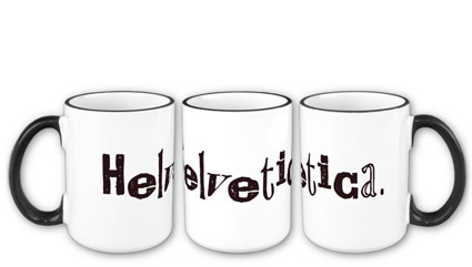
Helvetica on a mug, set in my Alta California font.
Dark brown text, vintage baked enamel-like styling. Great for sweet tea, moonshine, or hell, even prison-grade pruno.
Snag it here.
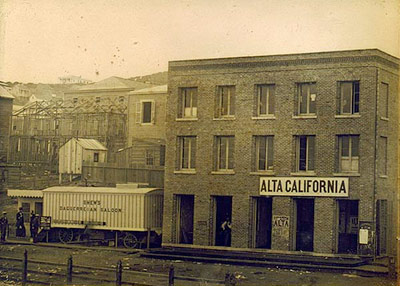
Alta California office, San Francisco 1851; found via Flickr
At one point in my life, I was going to be a journalist. So folly along . . . .
I love history, so every one of my fonts falls into some historical category (or categories, if you look at Jeanne Moderno).
Alta California is my artist’s response to Susan Kare’s early Macintosh font, San Francisco. And it was a tricky build, as I was literally going thru book after book after book of old types – then messing them up, then messing them up more; and redrawing the edges until I had what I wanted.
(Please note, when it comes to ‘grunge typography’ – I don’t trust anything automatic; I’ve always gone in and tweaked the edges until I have something that looks – printed. Printed poorly, but printed.) [Read more →]

Typography on the web is about to change dramatically. Several entities are involved. I have a bunch of my fonts about to launch with Typekit.
And here’s a really good rundown by Elliot Jay Stocks, posted on the i love typography blog.
What was going through your mind during your last kiss?
Oh baby yeah baby that’s it yeah oh baby yeah you know yeah you know baby yeah drink Coca-Cola yeah baby that’s it yeah baby oh yeah a Big Mac would be good right now oh baby yeah you know it baby yeah baby yeah yeah yeah
How did you do on the last test you took?
Completely bombed it, and it was important. and now I’m sort of screwed. ended up with a drinking problem, drug use, joined the army, get to see the world and they’ve promised me I get to be in the marching band. [Read more →]


the work at the mehallo blog. beta. is licensed under a creative commons attribution - noncommercial - no derivative works 3.0 united states license. if reposting, credit must be given to steve mehallo - and if possible, please provide a link back to the mehallo blog. beta.
i include images for the purpose of critique, review, promotion and inspiration - and always make my best effort give credit/link back to the original source. if i’ve screwed up, please fire me a note.
page layout based on the wordpress 'darkwater theme' by antbag, adapted and redesigned by mehallo. valuable php assistance from bill mead.