entries Tagged as []

The theft: Degenerate Art

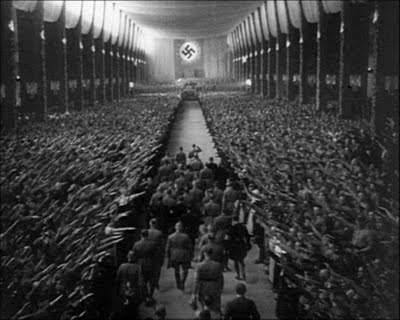
‘Avant-garde German artists were now branded both enemies of the state and a threat to German culture.’

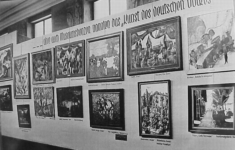
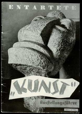
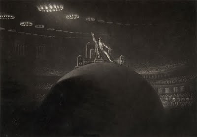
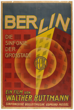
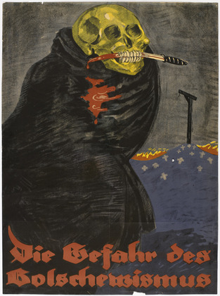
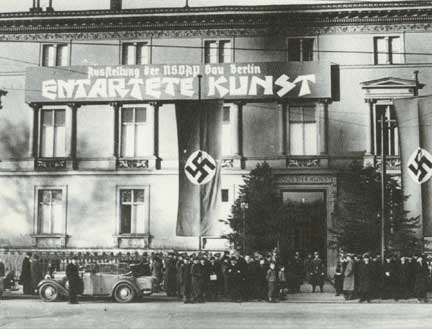
In 1937, the Nazi party hosted ‘Entartete Kunst.’ This traveling exhibition showcased modern art as the work of madmen, ‘degenerates’ out to destroy the world.

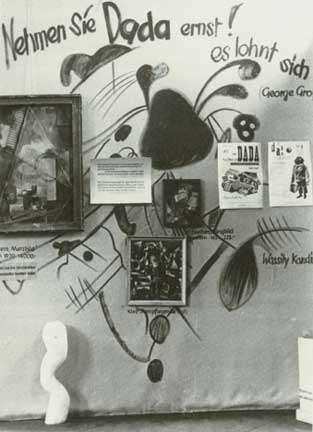
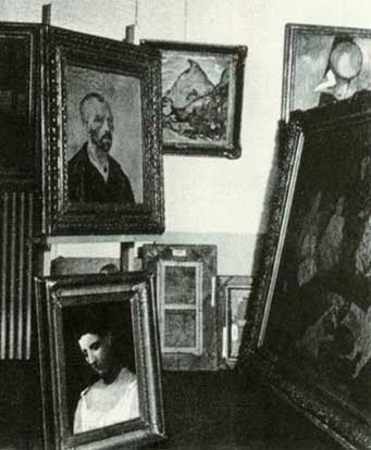
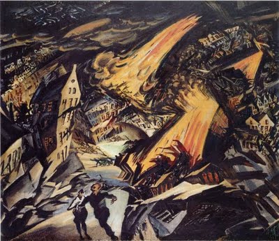
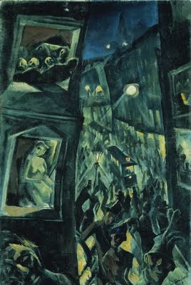
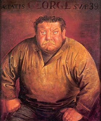
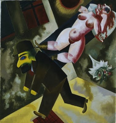
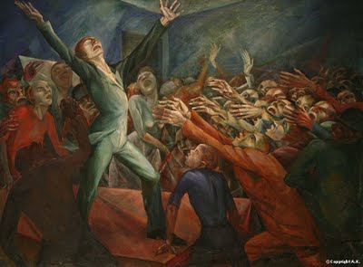
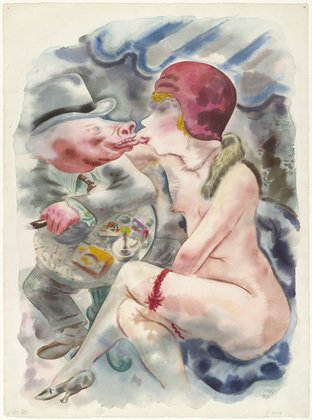
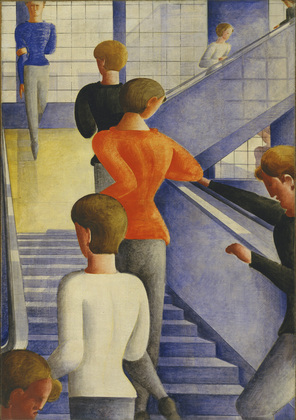
Confiscated art – works of Kirchner, Nolde, Beckmann, Ernst, Chagall, Matisse, Picasso, Van Gogh, Dali, Klee, Kandinsky, Lissitzky, Grosz and many others – filled the show. After, the pieces were either destroyed or auctioned off.

For more about Entartete Kunst, watch David Grubin’s powerful 1993 Degenerate Art documentary here. Read more here and here. The show’s exhibition catalog is posted here.

Art, ideas, original thoughts: All dangerous.

This past weekend I saw a documentary on The Inquisition. Things such as inquisitions, persecutions – Entartete Kunst, McCarthyism – cycle throughout history.

What beliefs, doctrines and laws exist today that limit freedom, individuality and progress?

‘From Calgari to Hitler’


Ludwig Meidner, Apocalyptic Landscape, 1912

Images from the Weimar blog post ‘From Calgari to Hitler,’ named for Siegfried Kracauer’s book on German cinema (1910-40).


Jakob Steinhardt, The City, 1913


Robert Wiene, Das Kabinett des Dr. Caligari, 1919


Original sketch for a scene in The Cabinet of Dr Caligari from Lotte Eisner


Erich Godal, Die Straße (The Street), 1923


Louise Brooks in “Pandora’s Box” (G.W.Pabst, 1929)


Rudolf Klein Rogge in Lang’s The Testament of Dr. Mabuse, 1933


Otto Dix, The Actor Heinrich George, 1933


George Grosz, John, the Lady Killer, 1918


Art director Erich Kettelhut & crew create the futuristic city set of Metropolis


Raoul Hausmann, Mechanical Head (Spirit of Our Age), c. 1920


John Martin, Illustration to Paradise Lost, 1825


Magnus Zeller, The Orator, 1920


Leni Riefenstahl, Triumph of the Will, 1934

Weimar, images


Yves Lecoq

Ever wonder what Germany may have looked like if the Weimar Republic kept going?

I like to think answers to this question could be found in the wonderful image sets posted over at kraftgenie’s Weimar blog. Each post is a collection of seemingly related imagery that is simply  . . .  Weimar.


Eugenio Recuenco


Yuval Yairi


Sabine Pigalle


Chantal Michel


Mikel Uribetxeberria


Bill Brandt


Madame Peripetie


Brooke Shaden


Brooke Shaden


Marilyn Minter


Inez van Lamsweerde


Tamara Lischka


***

Niedermann Grotesk: My new, old font

Niedermann Grotesk is my newest font and it’s been sitting in the hopper for awhile.

It became a side project that appeared while I’d been working on my update to Jeanne Moderno (which is Jeanne Texte, which has been in a little limbo due to other projects) (I plan on getting back to it next month).

Along the way I fell in love with types that were part of the German Sachplakat (object poster) style pioneered by the great Lucian Bernhard – a lot of which can be seen (as backgrounds) in their original zeitgeist settings in the 1927 Ruttmann film I posted on Sunday.

Plakat lettering was drawn as needed, typically painted. For my adaptation, I went back to brush – and included a handful of alternative characters, ligatures, plus a few dingbats.

Grab your copy here.

And  . . .  Save 31%! Niedermann Grotesk is on sale right now at MyFonts. Sale ends September 22, 2011.

Cabaret-Berlin: Die wilde Bühne 1919-33

‘In her 2010 documentary about the Berlin cabaret scene of the interwar period, Fabienne Rousso-Lenoir includes archival material, excerpts from German cinema classics, rediscovered promotional and institutional films, rare modern art experiments as well as documentaries of the time – all restored in high-definition.’

Above, the first five minutes of Fabienne Rousso-Lenoir’s Cabaret-Berlin: Die wilde Bühne (The Wild Stage) 1919-33. This 2010 documentary is loaded with incredible images from an era that went away in the 1930s.

Watch the entire untranslated film here. (Note: Veoh player download required)

‘Life was a cabaret’

Berlin of the 1920s was considered by many to be the cultural center of Europe; home to innovative art, music and a bawdy nightlife – all squashed when the Nazis came to power in 1933.

Above, Walther Ruttmann’s silent (add your own music) Berlin: Symphony of a Great City (1927), which ‘portrays the life of a city mainly through visual effects and music, not narrative content. The impression it conveys of daily life in Berlin is dynamic, anxiety-ridden, cacophonous – and a helluva lot of fun!’ -Jessica Glaser, MoMA

Below, visual highlights from MoMA’s recent exhibition, German Expressionism: The Graphic Impulse. Additional commentary here.

Willkommen

‘Kit Kat Klub, Berlin 1931  . . . .’

The great Joel Gray. From Bob Fosse’s Cabaret (1972).

Muppet version, below.

Berlin: ‘No More Words’

Berlin performing No More Words. From the Love Life tee vee special, 1984.

Original music video here. Dance mix below.


Berlin: No More Words (Extended Dance Mix)

Salad dressing

The concept of salad dressing – oil and water – is the basis for the magic we call printing. I learned this a long time ago, in a class. Or something.

Also, years ago, learned that this stuff is pretty much one of the few things that will remove printing ink from skin.

Pictured, the typographic work of UK-based Craig Ward.

Off Book: Type

‘Type is universal’

Typography is everywhere – and as an art form is often overlooked.

There are very few actual documentaries about type – and PBS decided to take on the task of making one. Or in this case, remaking one. Off Book: Type premiered this week as sort of a seven minute version of Gary Hustwit’s Helvetica. Sort of. It IS a new doc, tho it does cover some ground already treaded.

Off Book is PBS’ new online series focusing on ‘experimental and nontraditional art forms.’ For more information, read here. Website here.

More lost type: PLINC is back!

Back in the day, Photo-Lettering Inc. was THE resource for custom set hedline typography, odd letter distortions and other custom font creations that were made possible by the new technology of the time, phototypesetting.

Since, PLINC’s original stock has been sitting in a warehouse. Just sitting. With the elements of time eating up the original negatives.

Several years ago, House bought rights to the collection and set about building an online version of PLINC’s original services – where type is sold one custom set headline at a time. PLINC fonts – which included a lot of ligatures and alternate characters – needed a professional typesetter at the helm.

Today, after years in development, low cost custom hedline type is now available digitally at the new PLINC website. One hed at a time  . . . . [Read more →]


Creative Commons License

the work at the mehallo blog. beta. is licensed under a creative commons attribution - noncommercial - no derivative works 3.0 united states license.  if reposting, credit must be given to steve mehallo - and if possible, please provide a link back to the mehallo blog. beta.

i include images for the purpose of critique, review, promotion and inspiration - and always make my best effort give credit/link back to the original source.  if i’ve screwed up, please fire me a note.

page layout based on the wordpress 'darkwater theme' by antbag, adapted and redesigned by mehallo.  valuable php assistance from bill mead.