entries Tagged as []
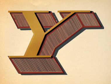
‘When (were you born)?’

Leo in Lanvin
British Vogue takes a look at astrology.
Photography by Tim Gutt, styling by Kate Phelan, sets built by Shona Heath and at the center of it all, model Siri Tollerod.
More signs here.

Virgo in Christopher Kane

Aries in Alexander McQueen
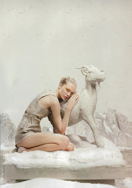
Capricorn in Chloe

Sagittarius in Givenchy

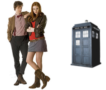
‘Who?’
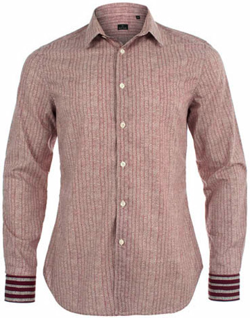
The Paul Smith-designed Dr. Who shirt.
Re-issued last month, snag it here while it’s still available.
Or you can take your chances on Ebay. Or try to find something close.

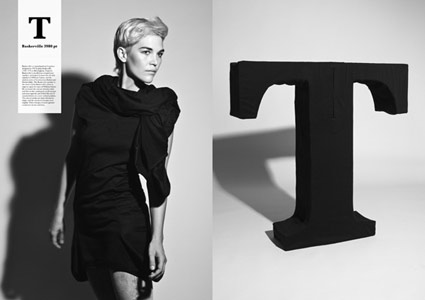
New W
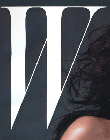
‘The last logo ran for 20 years’
A few months back, Stefano Tonchi jumped over from singular letter T magazine to reboot singular letter W magazine. And the results are quite elegant. [Read more →]
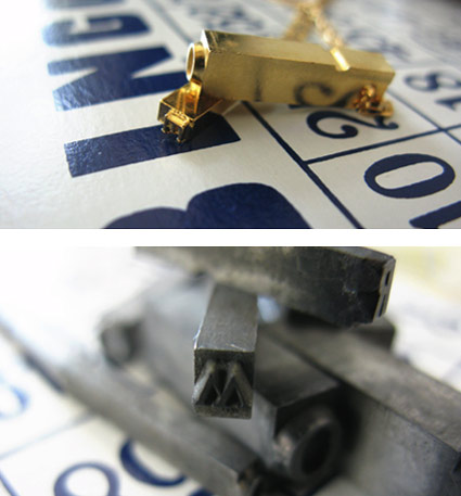
Typographic accessories
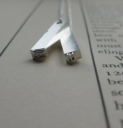
‘Originally used on hand-cranked Vandercook Proof Presses, each piece of type used in these necklaces were worn out ever so slightly by normal printing use . . . These obsolete pieces (each measures a little under 1 inch long) have been rescued, plated in silver, and hung from a 22 inch silver-plated brass figaro chain.’
Erica Weiner’s Double Letterpress Necklace.
Also available in Gold. And brass chain options [Silver and Gold].
Kawamura’s Typographic Ts
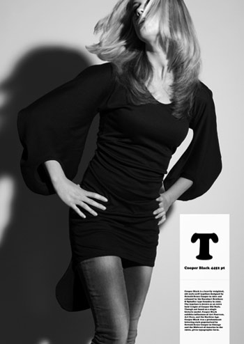
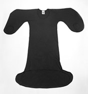
‘T shirts that were designed to have the silhouette of 5 famous typefaces; Helvetica, Caslon, Baskerville, Courier and Cooper Black.’
Masashi Kawamura makes type into clothing. Details here.


Found via Tiffany Valdez
Connect/Disconnect
Video for The Action Design’s Connect/Disconnect.
Look
Video by Petra Mrzyk & Jean-François Moriceau for Sébastien Tellier’s Look.
Found via Ai Buenafe
Orzechowski letters Star Wars
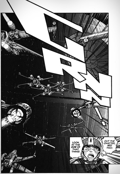
‘Orzechowski modeled his lettering on the Flash Gordon newspaper strips of the 1930s. Another influence was Robert Crumb’s Zap Comix: Orzechowski recognized that Crumb’s title work was clearly derived from the brush techniques of that same era, the 1920s and 30s.’ –Wiki
One of the first times I really became aware of hand lettering in comic books came with Marvel Comics’ 1977 Star Wars movie adaptation. From issue #2 thru #5, the lettering had this smooth, compact quality to it. With cool titles up top.
Behind the scenes was lettering artist Tom Orzechowski – working for the Mighty Marvel Bullpen. [Read more →]

handpicked posts

a piano falls in old manhattan
tetro and typography
it’s typography: film, song and dance
ghosts of gustov klimt
the great times new roman controversy
picking fonts
kapitaal
defining terms: design is not decoration
garcia's 'pure design'
'enhance that image!'
magic highway remixed
the cynic
rad anthem
Brought to you by man dom-


buy my fonts
go shopping
mehalloreads

Divinely Elegant: The World of Ernst Dryden
Jozsef Pecsi: Photo and Advertising
Color: A Natural History of the Palette
Collage: Assembling Contemporary Art
Modern Dog: 20 Years of Poster Art
Gaberbocchus Press: An Experiment in Publishing, 1948-1979
Advertising Art in the Art Deco Style
Googie Redux: Ultramodern Roadside Architecture
Hot Sour Salty Sweet: A Culinary Journey Through Southeast Asia
now playing


the work at the mehallo blog. beta. is licensed under a creative commons attribution - noncommercial - no derivative works 3.0 united states license. if reposting, credit must be given to steve mehallo - and if possible, please provide a link back to the mehallo blog. beta.
i include images for the purpose of critique, review, promotion and inspiration - and always make my best effort give credit/link back to the original source. if i’ve screwed up, please fire me a note.
page layout based on the wordpress 'darkwater theme' by antbag, adapted and redesigned by mehallo. valuable php assistance from bill mead.


