Junk food, painted
‘Each one of these paintings is five or six feet tall and takes Pamela two months to finish.’
The work of Pamela Michelle Johnson. Interview here. Website here.
Found via Bit Rebels
‘Each one of these paintings is five or six feet tall and takes Pamela two months to finish.’
The work of Pamela Michelle Johnson. Interview here. Website here.
Found via Bit Rebels
Vintage architectural renderings of storefronts by an anonymous artist. These were found in a photo album.
It’s amazing how many of these appear to be prototypes for stores that did exist. Wonder what the story is behind them (one agency created facades for many major chains)??
More here.
Sir Julian Gould: Movin At Midnight
Found via Justin Panson
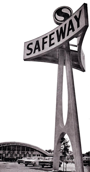
‘the ‘Marina’ type, named after San Francisco’s Marina Boulevard store . . . The mosaic murals were created by John Garth. They depict food being transported from the four corners of the globe.’
Though abandoned by the company, this ‘googie-style’ seabird facade (above and below) was THE brand for the Safeway supermarket chain.
The Marina market even made an appearance in one of my favorite films, Bullitt (1968). It was part of the famous car chase thru San Francisco (clip below).
More on the ‘Marina’ style here.
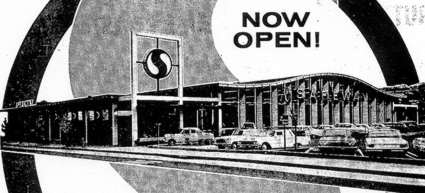
Marina-style Safeway in Millbrae, 1963; click for larger image/jump

Millbrae Safeway interior, 1963
The chase from Bullitt; Safeway at 5:02 and (closeup) 4:45
Images found via Pleasant Family Shopping, Romleys, Grocetria
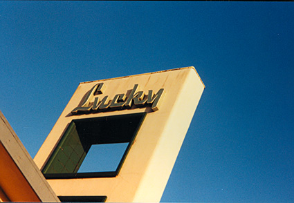
The final Lucky store that bore the Raymond Loewy facade was located in Palo Alto.
There was a strong preservation effort for this location. Palo Alto is quite picky about big boxes invading.
Now abandoned, the store saw its last customer in 2005.
Photo by mehallo, taken 1998
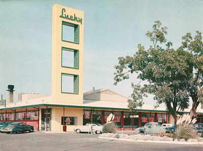
Design legend Raymond Loewy (1893–1986) came up with the look – and façade – for the Lucky Supermarket chain – now owned by Savemart of Modesto. Yellow and green were part of the brand. And the type: An art deco script.
Somewhere along the way, as Lucky found itself sold and passed around, the original design vanished into history.
Today’s version of the Lucky logo, unfortunately, looks like a rough Adobe Illustrator live trace – just to keep the name afloat. Brand equity and all that.
More on Loewy and Lucky here.
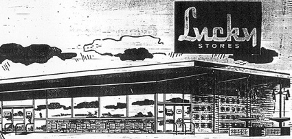
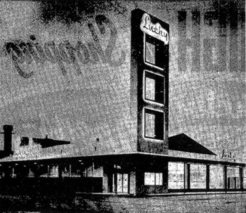
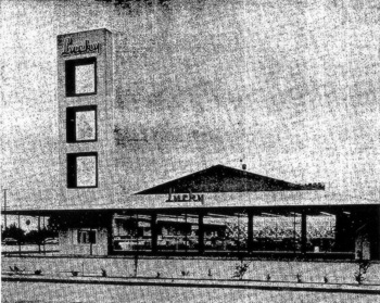
Images found via Pleasant Valley Shopping, Romleys
I designed a postcard series in 1999 called, 20th Century Obsolete. It was about things unique to the 20th Century, things that no longer exist. They’re now available as notecards and prints. Snag your own here.
And,
In my opinion, Lucky today isn’t quite the Lucky it once was. (Read my next post, I’ll have it up by early evening)
‘Even in the early days, Trader Joe’s appeal was its narrow but zany selection and loyal customers’
Fortune takes a look at the Secret World of Trader Joe’s. How it works and how they’re trying to stay small.
The formula doesn’t always work. Back in the 1990s, TJ founder Joe Coulombe purchased one of my favorite food places: the Bay Area Petrini’s grocery chain, only to make changes that confused customers. Since the store was a full size supermarket, the odd ‘less is more,’ Trader Joe’s approach – which resulted in less merchandise and a drastic change in shopping experience – alienated regulars. Petrini’s changed hands one more time and was gone by 1999.
Photo of a reusable TJ shopping tote by mehallo
Film by Run Wrake. Made with official CSA ‘bonehead’ images!
And sort of featuring Steven Heller. Sort of.
Wish cartoons were as cool when I was a kid.
From Steve Ditko, co-creator of Spider-man.
Read it here. And wonder forever!
Found via Martin Klasch