entries Tagged as []

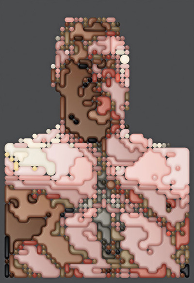
Ppi Ri Ppa Ppa Bbi Ri Bba Bba Bbi Ri Bop

‘Narsha is a member of the South Korean girl group Brown Eyed Girls  . . .  her self-titled debut mini-album was released on July 8th, 2010. A mainly uptempo collection of electropop and dance tracks, she released a music video for the main promotional track, showing a nightmarish concept. The video for this song immediately sparked religious controversy.’

Found via Rikki Morehouse

AT-AT Day Afternoon

‘When I was a kid, there are two things I wanted badly and never got  . . .  A real dog and a Kenner AT-AT Walker.’

Short film by Patrick Boivin. Music by Blithe Field.

Found via Rachel Wells

35mm

‘We picked 35 of our favorite movies and tried to simplify them as far as possible. The outcome is a 2 minute journey through the history of film.’

Pascal Monaco’s short film, 35mm.

Found via David Rosales

Arial: ‘Bullshit’

Did Arial kill Helvetica? Or is it just bullshit?

Australia-based Hungry Beast correspondent Marc Fennell thinks it’s an ‘usurping bitch.’

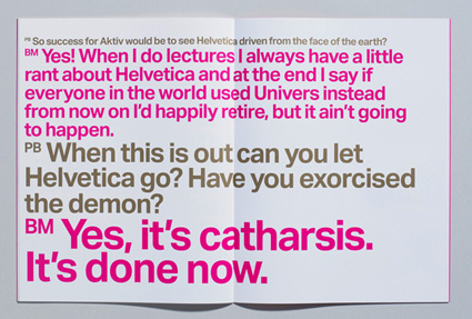
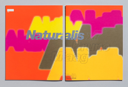
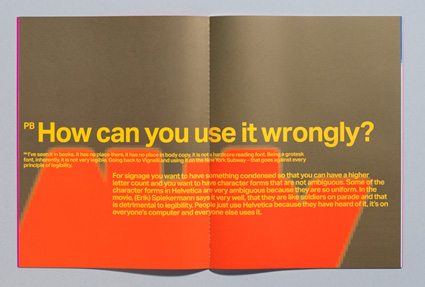
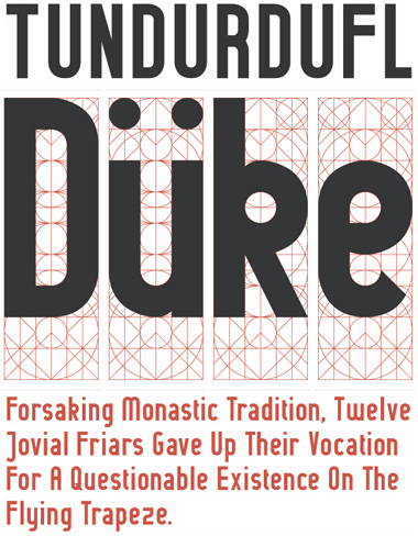
Aktiv Grotesk: The ‘Helvetica killer’

‘Bruno Maag is so enraged by Helvetica that he has designed a typeface aimed specifically at wiping it off the face of the planet.’

Details here. Snag Maag’s Aktiv Grotesk fonts here.

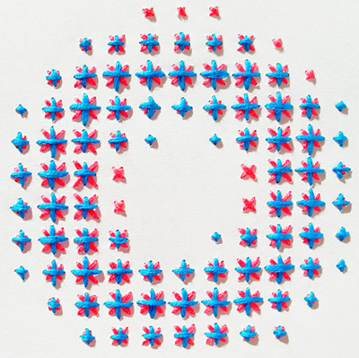
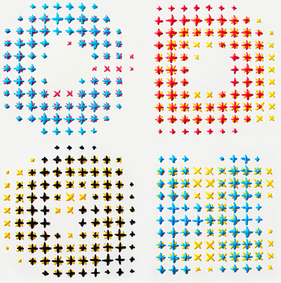
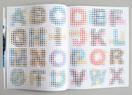
CYMK Alphabet: Process color via thread

‘CMYK Alphabet is a typographic experiment  . . .  Each letter is hand embroidered using a combination of two overlapping CMYK colours.’

Evelin Kasikov recreates a process color rosette using thread. Details here.

Between Bears

‘a debt to my childhood and other lives i hope i lived. inspired by words of songs that i admire.’

The work of Eran Hilleli. With climate change, the bears are losing.

Found via Monsieur Bandit

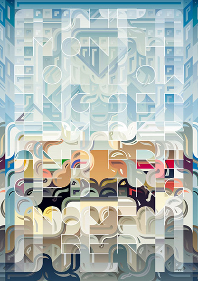
Siggi’s vectors

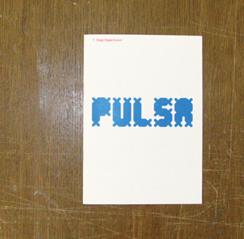
The illustration and typography of Siggi Eggertsson. Website here.

Found via Justin Timberlake

Edward Johnston, reinterpreted

Edward Johnston (1872-1944) developed the ‘look’ of the London Underground – thru type and image.

These are snaps of the work of student Grady Fike. Grady spent eleven weeks jumping thru many hoops in my experimental typography course at The Art Institute of California Sacramento.

For the class, I’ve set up an evolving work process – where students are assigned a ‘famous typographer’ (one that I pick, so they have to work within these limitations) and interpret their work thru both loose and strict design iterations.

It’s similar to Project Runway, but for much of it, students often only have about an hour to produce their work. And based on the outcome, their solutions dictate what the next homework assignment will be. It’s all very fluid. [Read more →]

Red and blue: The London Underground ‘bullseye’

One of the first modern icons of the 20th century, The London Underground’s ‘bullseye’ passed the 100 year mark recently – and to celebrate, 100 artists were brought in to interpret the symbol and its legacy. [Read more →]

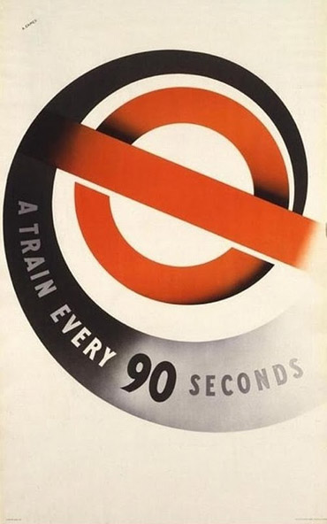
Red, in 90 seconds

Vintage poster by Abram Games for The London Underground.

Found via Martin Klasch


Creative Commons License

the work at the mehallo blog. beta. is licensed under a creative commons attribution - noncommercial - no derivative works 3.0 united states license.  if reposting, credit must be given to steve mehallo - and if possible, please provide a link back to the mehallo blog. beta.

i include images for the purpose of critique, review, promotion and inspiration - and always make my best effort give credit/link back to the original source.  if i’ve screwed up, please fire me a note.

page layout based on the wordpress 'darkwater theme' by antbag, adapted and redesigned by mehallo.  valuable php assistance from bill mead.