entries Tagged as []
‘what i learned in school today’
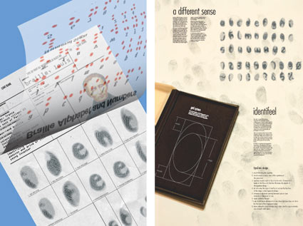
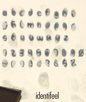
Ever wonder what goes on in a creative classroom?
There is play, but it’s also a lot of hard work. Ask anyone in my Typography 3 course – this quarter, I’ve been doing Project Runway-like timed challenges every single week. Difficult, grueling – but students’ results have been incredible. [Read more →]
Garcia’s ‘Pure Design’
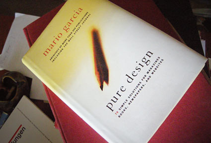
‘Included are insights into designing covers, formatting pages, selecting photos, using content, choosing a color palette, and picking type for newspapers, magazines, books, and websites’
Another great read. One of my favorites, Mario Garcia’s Pure Design is simple, to the point. A great overview of how to design for publications – from someone’s who been doing it a helluva long time. My copy is maimed by highlighter pen, my own notes and scribbles.
And it’s out of print. But one can easily peruse the free online reader version at issuu.
Follow Garcia’s blog here.
Type specimens galore!
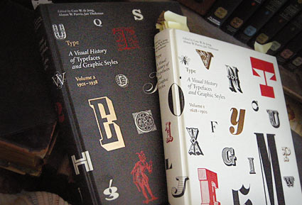
These two oversized coffee table books – which were published in the past year or so – are an odd sort.
Both volumes of Type A Visual History of Typefaces and Graphic Styles sell themselves as design history books.
They have the current editor of Meggs (and similar cover design), but the history is really just a backdrop (with, unfortunately, poorly annotated notes) to what the books are all about: They’re actually an incredible collection of rare typography specimens dated c. 1830-1930. [Read more →]
My take: Graphic design history fu
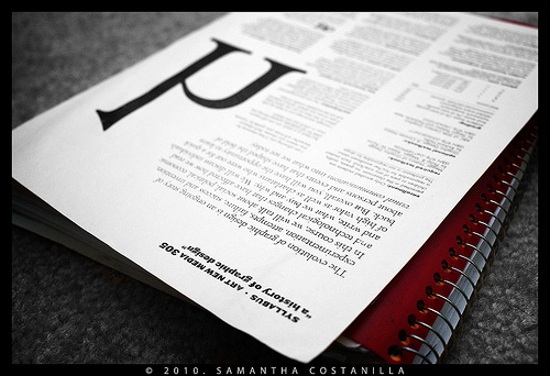
My syllabus, photographed by student Samantha Costanilla
So I’ve been teaching my version of ‘a history of graphic design’ for several years now. Just finished up my 9th session.
As a text, Philip B. Meggs’ landmark research book – History of Graphic Design, first released in 1984 – is the bible on the subject. Even the ‘making of’ has its own edition.
It’s the most thorough analysis, and one of the best graphic design reference books I own. But as Meggs points out in his introduction, it’s only the tip of the iceberg. There is so much more to discover, find, research and incorporate into one’s own view.
Finally, there is another book that just hit the market – The Story of Graphic Design by Patrick Cramsie. It tackles similar ground, but from another angle. A refreshing find. And from what I could tell so far, it syncs with my own classroom take on ‘The Story’ . . . [Read more →]
Anderson: Cooper Black
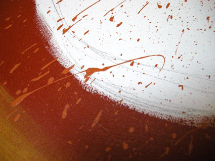
David M. Anderson’s Chaotic Times of Cooper Black, 2008. Mixed media on canvas.
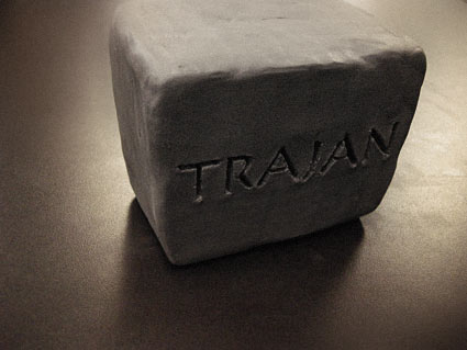
Based on the type of Ozwald Cooper (1879-1940). From my Typography 3 course at Art Institute of California Sacramento.
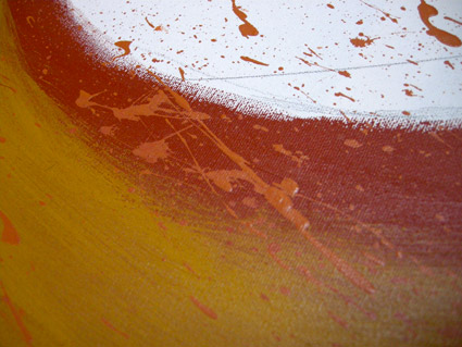
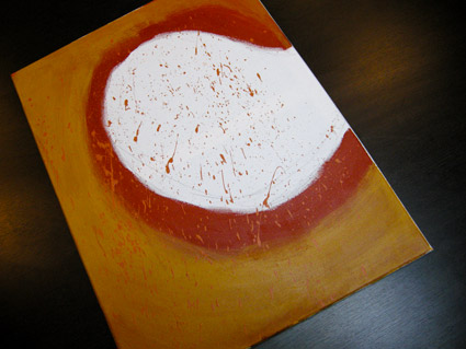
Stefon is back!
God, I know this character. Here’s his last appearance, latest is above.
Design manifestos
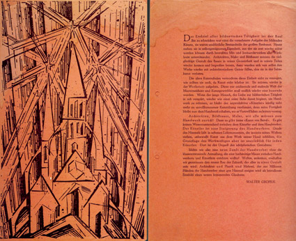
“Gropius’ Bauhaus manifesto, 1919; woodcut by Lyonnel Feininger
Everyone needs a good manifesto. I have one.
Here’s 100+ years worth of em.
‘What’s Next?’ for Jim Coudal
‘I don’t know what’s next! It’s kind of a joke, but we’re proudly ‘without business plan’ in our 13th year. We’ve had a lot of things not work, and that’s OK too. If it’s a good idea and it gets you excited, try it, and if it bursts into flames, that’s going to be exciting too. People always ask, ‘What is your greatest failure?’ I always have the same answer – We’re working on it right now, it’s gonna be awesome!’
Interview with Jim Coudal here.
Found via Swiss Miss

