entries Tagged as []

Fontcase contest

Need good font management for your Mac? Fontcase is pretty damn cool. The interface is a lot like iTunes or Adobe Bridge.

And this week only, Fontcase is giving away 3 free licenses. To enter, just go here and follow the directions. Contest ends April 14, 2010.

(And I’m entering too – I just haven’t gotten around to paying for my own license.)
How to set type the Linotype way


Typesetting: Linotype, 1 of 2

Typesetting using the Linotype caster. Film produced sometime around 1960 by Salesian Vocational and Technical Schools, Italy.

I love how he refers to ‘matrices’ as ‘mattresses.’


Typesetting: Linotype, 2 of 2

Found via Linotype

Your Life Work Series: Printing

‘Hand compositors usually set the large type called ‘display line,’ used in advertisements and other printed matter. Hand composition offers opportunities for artistic expression. Compositors who have the ability to create original ideas are highly-paid craftsmen. The work requires manual dexterity, good eyesight and thoroughness.’

Vocational documentary on printing and typesetting. From 1947.

I like how he pronounces ‘ad-verr-tiz-mints.’

Stefan Sagmeister on life, design and time off


From 2007

TED videos featuring Stefan Sagmeister.


From 2008


From 2009

Case for type design education


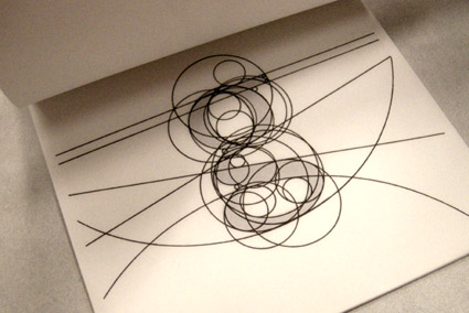
Lowercase ‘g’ study by Matthew Valentine from mehallo’s beginning type course

Here’s a great opinion piece on typographic education by Patrick Griffin.

Found via Oded Ezer

Peeeking at de iPad  . . . .


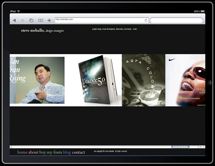
Mehallo.com, as seen on the iPad

Developing websites for the iPad? What are they going to look like? Here’s a preview engine: iPad Peek.

Note: Even though Flash animations will run in Peek, they won’t run on an actual iPad. You’ll just have to pretend any Flash is kinda not doing its thing.

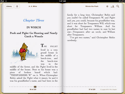
Type on the iPad: (Unfortunately) not so good

‘This is only conjecture, but it feels like Apple decided to save some cash on font licensing by relying on the same old Linotype fonts they’ve bundled with their machines for years. If that’s the case, why not go with Hoefler Text which is already installed on the iPad? And the strangest omission of them all: Georgia, the father of all screen serifs and far better than any of the iBooks options.’

FontShop’s Stephen Coles takes a look at type problems on the iPad. Read more here.

Disappointing to note because Steve Jobs was always an advocate for good typography. Hope there’s some (good typographic) upgrades coming.

The Panic Mark

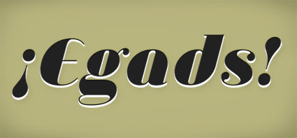
‘Exclamation points are great for things that are exciting and fun, but I’ve always felt they fell a little short when I wanted to express real anger, frustration, or panic.’

Jessica Hische’s proposal for a slight addition to the English Language. Read here.

¡Egads! set in Jeanne Moderno Ultra Italic

Bienal Tipos Latinos and Sudtipos


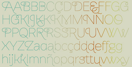
Brownstone Sans

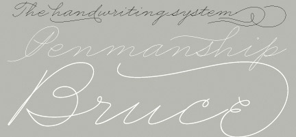
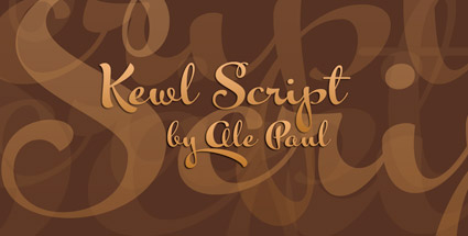
‘The list includes the unpublished Brownstone Sans (Certificate of Excellence), Business Penmanship, Calgary Script, Kewl Script and Semilla by Ale Paul and RadioTime by John Moore. Two more works were selected under the “in use” category.’

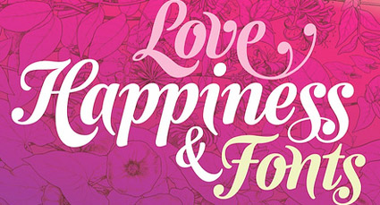
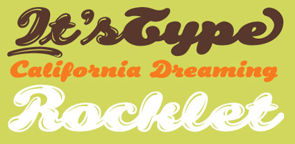
The Bienal Tipos Latinos have announced their 78 picks for 2010. Included are works from Sudtipos (pictured).

Official list here (Bad English translation here).


Business Penmanship


Calgary Script


Kewl Script


Semilla


RadioTime

Typo Tofu

‘Move over fun, there’s a new sheriff in town, and his name is Typo Tofu. Typo Tofu is also the funnest way to stay healthy and learn to read at the same time. Quite the double whammy.’ -Michael Hines

Designed by Uqam design student Jean-Maxime Landry. Details here and here.

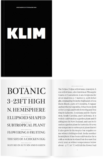
Klim specimen

‘Limited edition 2009 Klim Type Foundry specimen book. 210 × 140mm 96 page book, printed black on 118gsm Mohawk Navajo. Sewn-sections, Otabind binding.’

Great fonts by Kris Sowersby, great specimen book.

(Tho: I always knew Klim as Milk spelled backwards)

Go here.

Found via Stefan Hattenbach


Creative Commons License

the work at the mehallo blog. beta. is licensed under a creative commons attribution - noncommercial - no derivative works 3.0 united states license.  if reposting, credit must be given to steve mehallo - and if possible, please provide a link back to the mehallo blog. beta.

i include images for the purpose of critique, review, promotion and inspiration - and always make my best effort give credit/link back to the original source.  if i’ve screwed up, please fire me a note.

page layout based on the wordpress 'darkwater theme' by antbag, adapted and redesigned by mehallo.  valuable php assistance from bill mead.