Type on the iPad: (Unfortunately) not so good
Posted on April 9th, 2010 by steve
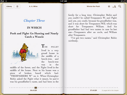
‘This is only conjecture, but it feels like Apple decided to save some cash on font licensing by relying on the same old Linotype fonts they’ve bundled with their machines for years. If that’s the case, why not go with Hoefler Text which is already installed on the iPad? And the strangest omission of them all: Georgia, the father of all screen serifs and far better than any of the iBooks options.’
FontShop’s Stephen Coles takes a look at type problems on the iPad. Read more here.
Disappointing to note because Steve Jobs was always an advocate for good typography. Hope there’s some (good typographic) upgrades coming.


[…] This post was mentioned on Twitter by steve mehallo. steve mehallo said: new blog post: Type on the iPad: (Unfortunately) not so good – http://mehallo.com/blog/archives/15139 […]