entries Tagged as []

Tschichold: distinguisted typographer

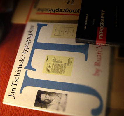
When I want to design something that calls for sophistication, I thumb thru the work of Jan Tschichold (1902-1974).

Modernist and  . . .  Classicist. This contrast leads to some interesting thinking that informs my own ability to design for different industries.

Tschichold put The New Typography on the map by publishing the book on the subject and helped spread the idea of the bauhaus – and modernism – worldwide.

The largest project of his career took place in the late 1940s – the redesign of Penguin’s line of paperbacks (below). As a whole, Penguin’s quality hasn’t wavered since.

Here’s an overview of the work of Tschichold at retinart – with some good links for additional info.

And I’m still looking for a decent (inexpensive) replacement text for my beginning type courses since Tschichold’s Treasury of Alphabets and Lettering is now out of print. Nothing I’ve found so far comes close to showing well-drawn – and well selected – metal specimens.


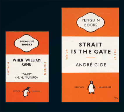
Penguin redesign, an exercise in subtlety: before (1941) and after (1947)

Penguin by Illustrators

When it comes to design, UK-based Penguin Books produces some beautiful specimens. And here’s a write up by Ace Jet 170 on the Penguin Collectors Society and their wonderful Penguin by Illustrators monograph.

David A. Carter: Popping up in Roseville


The Pop Up Artist
Video produced by Manny Crisostomo for The Sacramento Bee

 
Pop-up book master – and paper engineer – David A. Carter has been expanding his art into geometric abstraction.

Inspired by the work of Alexander Calder (1898-1976), Carter’s Red Dot series will be on display at the Blue Line Gallery in Roseville, CA [map]

The opening reception is this weekend: Saturday, September 19th, 2009 from 6:30 – 9 p.m.

Read The Sacramento Bee article here.
Show information here.
Exhibition runs thru January 9, 2010.

Found via Jonathan Weast

Typographic art by Daïd

Based out of France, artist Daïd Daragones was in the new media show I co-curated last year. Some of his typographic works are now available thru MYFACE. Go here.

Type face


Illustration for Computer Arts Magazine article about typography

The work of Austrialian designer Christopher Haines.


Cover illustration for Computer Arts Magazine

Fountain presents: Heroine fonts

Eleisha Pechey’s Windsor typeface (1905) is one of my funky favorites. There’s a hint of it in Jeanne Moderno (believe it or not; even moreso in my upcoming text versions), Woody Allen loves it for titles and Sacramento’s Golden 1 Credit Union uses it for a distinct yellow logo.

Today, Fountain Type releases Göran Söderström’s Heroine, a ‘modern interpretation of this rusty pearl is something that always have been missing in the major type libraries.’

More details here.

Baskerville: The Animated Movie

John Baskerville (1706-1775) was an incredible type designer. His work holds up very well today. He reinvented printing and his ink was beyond compare. And, unfortunately, he was hated by his contemporaries. His type was seen to ‘hurt the eye’ and would be ‘responsible for blinding the nation.’

‘Baskerville the Animated Movie celebrates John Baskerville, the man, the typeface and his future legacy.’

For more about this short film, drop by The Baskerville Project website.

For more detail about John Baskerville and other famous type luminaries, snag a copy of Type: The Secret History of Letters and start reading.

The notebooks of Audrey Kawasaki

Audrey Kawasaki is an illustrator working out of Los Angeles. Her work channels the soft feminine forms of Mucha mixed with a manga sensibility. Sort of. In this, she takes these influences and makes them all her own. Any references are just that: references.

What really caught me are her notebooks – experimental, playful and erotic. Found in the doodles section of her site, her work plays with cartoonish human forms, ornament, typography and graphic layout. Dazzling.

Visit Audrey’s site here. Her online journal is here. And Twitter  . . . here.

Found via Twitter.com/blackbirdsings

Line work


Clown: acrylic transfer, acrylic aerosol

The work of Jason Thielke.


Shadows: laser etch, lacquer


Grace: acrylic transfer, acrylic


Don’t be Afraid: acrylic transfer, acrylic, aerosol

Tweeeet!


twittery bird rescue me by artist Christine Scheer

Here’s a really good article on the social value of Twitter.

Article link originally posted on Twitter; retweeted from @blackbirdsings, @Glinner

Double take

I’m typically not a purist when it comes to a lot of design. But updating a brand should be done with respect to the original brand. In this case, it simply bugs me that in its current configuration, Wrigley’s famous SPEARmint gum is now identified with the DOUBLEmint double arrow.

In terms of visual semantics, the arrow was a SPEAR (for spearmint – get it?). Spearmint was one spear, Doublemint (peppermint) was identified as a double spear (see above).

But now – both gums carry the double spear (below). It’s like someone didn’t get the memo. Totally throws it for me. The current wrapper, with illustrated sweaty mint leaves and pseudo-retro-like design – could have been handled so much better.

Yes, I do worry about this stuff. Someone has to.


Creative Commons License

the work at the mehallo blog. beta. is licensed under a creative commons attribution - noncommercial - no derivative works 3.0 united states license.  if reposting, credit must be given to steve mehallo - and if possible, please provide a link back to the mehallo blog. beta.

i include images for the purpose of critique, review, promotion and inspiration - and always make my best effort give credit/link back to the original source.  if i’ve screwed up, please fire me a note.

page layout based on the wordpress 'darkwater theme' by antbag, adapted and redesigned by mehallo.  valuable php assistance from bill mead.