entries Tagged as [typography]
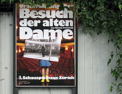
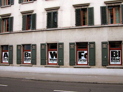
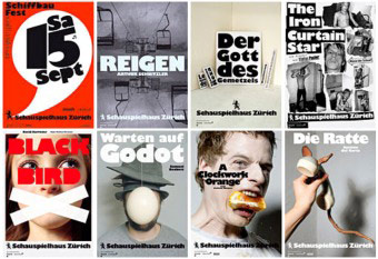
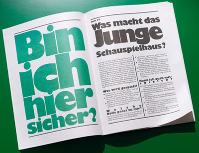
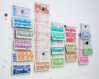
Gill on stage
‘The Swiss firm boldly embraced the face’s strong character, making it the singular voice of the Schauspielhaus, a theatre in Zürich’
The work of Raffinerie – theatre branding using the oft-maligned Gill Kayo typeface.
Detailed article by Stephen Coles here.
Christmas Merry
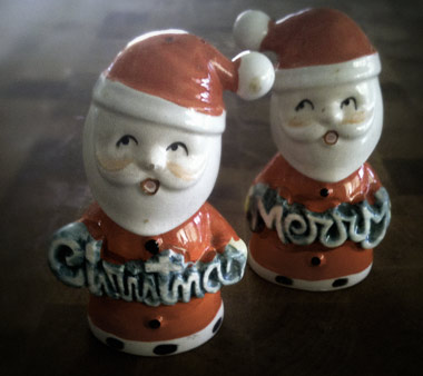
These vintage Santas are just a tad older than me.
Them, with their cartoony script lettering, would grace the table every year – with or without the requisite salt, pepper, for which they were created. Made in Japan.
Below, track from the ultimate 1960s Christmas album.
Ray Conniff: Twelve Days of Christmas
