Case for type design education
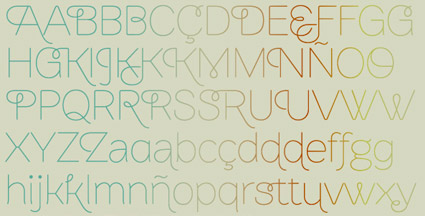
Lowercase ‘g’ study by Matthew Valentine from mehallo’s beginning type course
Here’s a great opinion piece on typographic education by Patrick Griffin.
Found via Oded Ezer
Lowercase ‘g’ study by Matthew Valentine from mehallo’s beginning type course
Here’s a great opinion piece on typographic education by Patrick Griffin.
Found via Oded Ezer
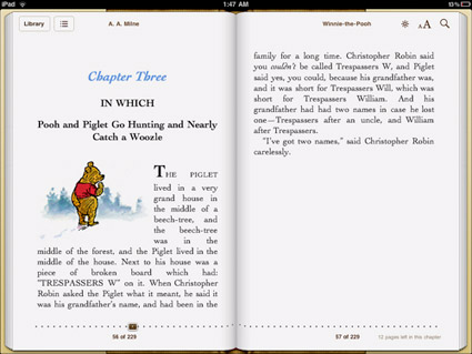
‘This is only conjecture, but it feels like Apple decided to save some cash on font licensing by relying on the same old Linotype fonts they’ve bundled with their machines for years. If that’s the case, why not go with Hoefler Text which is already installed on the iPad? And the strangest omission of them all: Georgia, the father of all screen serifs and far better than any of the iBooks options.’
FontShop’s Stephen Coles takes a look at type problems on the iPad. Read more here.
Disappointing to note because Steve Jobs was always an advocate for good typography. Hope there’s some (good typographic) upgrades coming.
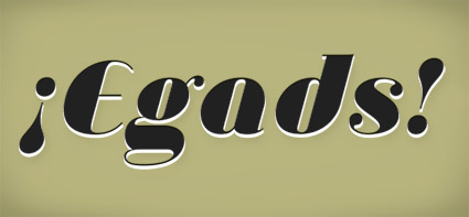
‘Exclamation points are great for things that are exciting and fun, but I’ve always felt they fell a little short when I wanted to express real anger, frustration, or panic.’
Jessica Hische’s proposal for a slight addition to the English Language. Read here.
¡Egads! set in Jeanne Moderno Ultra Italic
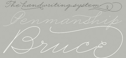
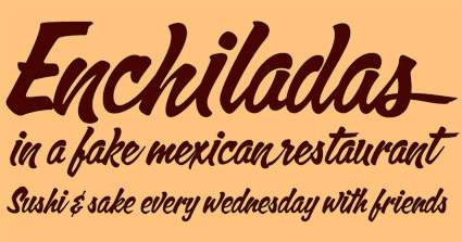
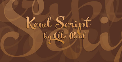
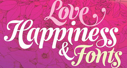
‘The list includes the unpublished Brownstone Sans (Certificate of Excellence), Business Penmanship, Calgary Script, Kewl Script and Semilla by Ale Paul and RadioTime by John Moore. Two more works were selected under the “in use” category.’
The Bienal Tipos Latinos have announced their 78 picks for 2010. Included are works from Sudtipos (pictured).
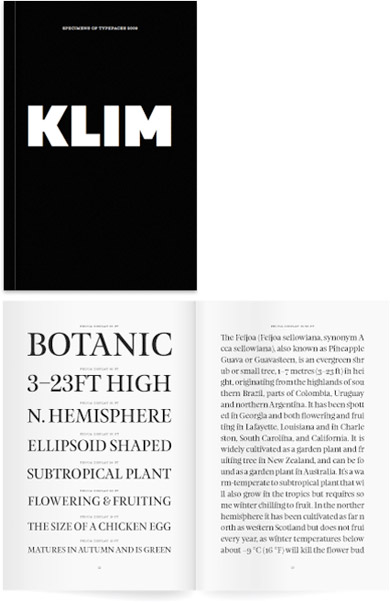
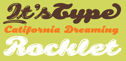
‘Limited edition 2009 Klim Type Foundry specimen book. 210 × 140mm 96 page book, printed black on 118gsm Mohawk Navajo. Sewn-sections, Otabind binding.’
Great fonts by Kris Sowersby, great specimen book.
(Tho: I always knew Klim as Milk spelled backwards)
Go here.
Found via Stefan Hattenbach

‘The magazine takes a very simple concept as its initial talking point: if you could only use eight typefaces for the rest of your life, what would they be?’
Coming soon: Elliott Jay Stock’s 8 Faces magazine.
The debut issue will feature Erik Spiekermann, David Carson, Jessica Hische, Jon Tan, Jos Buivenga, Ian Coyle, Bruce Willen & Nolen Strals.
Details here.
Found via Typegirl, Aaron Bell
‘Award-winning Typo-Animation that gives you a clear impression of the enormous amount of visual stimuli that plague us every day.’
Grab a Heine and look around. Type is everywhere.
Kapitaal is a film by Ton Meijdam, Thom Snels, Béla Zsigmond of Netherlands-based Studio Smack. Music by The Exploding Shetland Ponies.
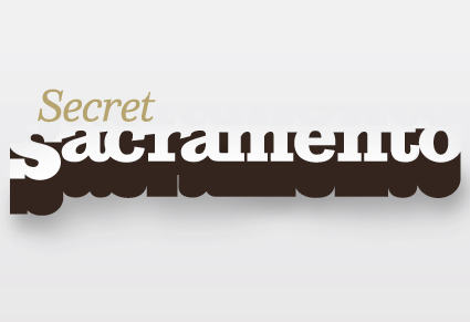
Logotype by mehallo
The secret to being in Sacramento, CA is knowing where the cool stuff is. And a lot of it is just under the radar. The right gallery on Second Saturday, the hole-in-the-wall that has the best burrito, what cool bands are in town.
Mark Bean started Secret Sacramento as a Facebook group. And it’s become wildly popular (over 3,000 followers as I write this) – and it’s spread to Twitter.
And launched recently, the Secret Sacramento website. The new site is kinda sparse – so if you’re local, login and post your own regional finds. Share your secrets.
where i fit in
In addition to designing the logo (above), I will be contributing content from time to time.
But shhhh, it’s all a secret.


the work at the mehallo blog. beta. is licensed under a creative commons attribution - noncommercial - no derivative works 3.0 united states license. if reposting, credit must be given to steve mehallo - and if possible, please provide a link back to the mehallo blog. beta.
i include images for the purpose of critique, review, promotion and inspiration - and always make my best effort give credit/link back to the original source. if i’ve screwed up, please fire me a note.
page layout based on the wordpress 'darkwater theme' by antbag, adapted and redesigned by mehallo. valuable php assistance from bill mead.