entries Tagged as [typography]
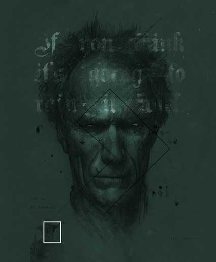
‘If you want to stay alive, the speed limit is 45!’

They used to put these digital roadsigns out on Madison Avenue, on the median.
They had taunting sayings about driving safety. Generic ‘don’t drive drunk’ or ‘be aware’ messages.
Saw the officers out there smiling as they typed in all the snotty safety messages. They would get really clever about it too. Rhyming, plays on words.
Frankly, I know I (personally) can’t easily drive AND be cleverly scolded at the same time.
The signs were dangerous to drivers. Almost crashed a couple times trying to see what the next ‘safety verse’ would be. Madison is a really busy thoroughfare.
The last time I saw the signs in use, a small graffiti tag said:
‘Fuck Cops.’
Never saw the signs again after that.
Pictured, a hacked roadsign from somewhere else. More at Urlesque.
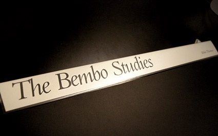
Cutting Bembo
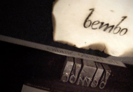
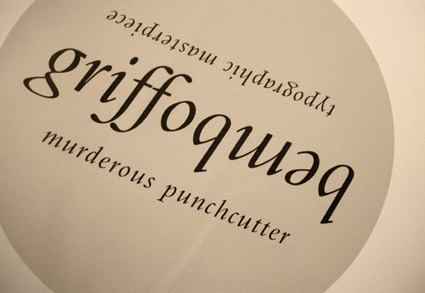
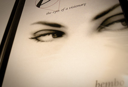
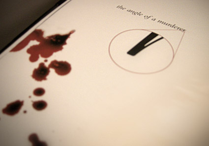
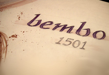
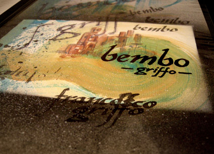
Student Mike Thomas went back to basics with his work for my experimental type course.
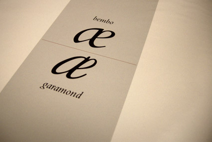
As part of an 11-week study, Mike explored types created by the originator of italics, Francesco ‘Griffo’ da Bologna (1450-1518).
Mike’s work was produced using a stack of 20 year old, aged paper – and involved media ranging from paint to ink to digital.
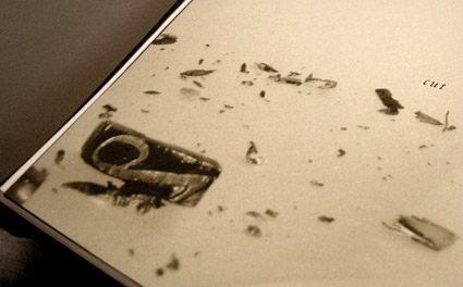
His final project (above) was realized by cutting Griffo’s italic directly out of pieces of lead and creating a ‘soot proof’ of the carved letters. Not quite to spec, but challenging nonetheless.
