entries Tagged as [typography]

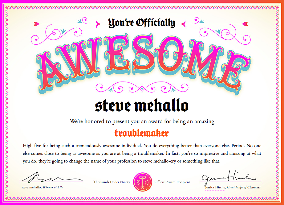
I won an award and I am AWESOME!

Too many graphic design award competitions award people for being young and full of ideas. What about the rest of us who are OLDER than YOUNG and maybe filled with better ideas?

I think experience and wanting to keep doing NEW is worth something, no?

So you can now be AWESOME too. At any age. Go here.

Courtesy Jessica Hische; found via Jessica Walsh

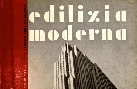
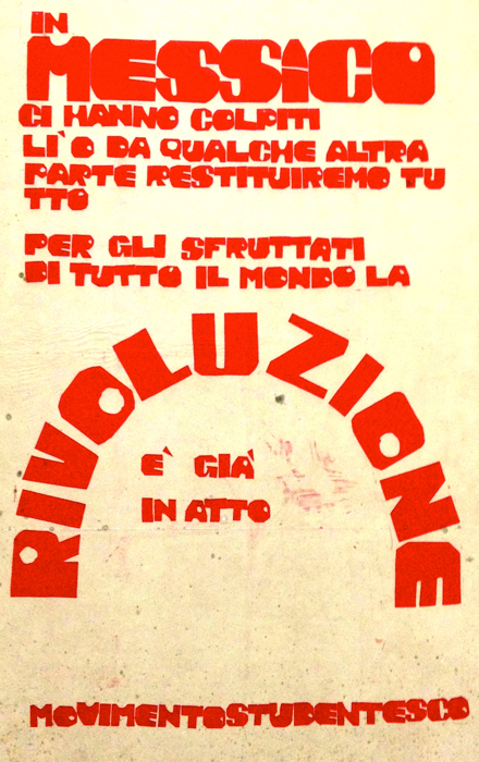
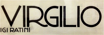
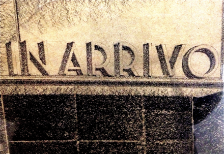
Typographic soft porn, via Italy

Last week I attended TYPO in San Francisco and noticed that my notebook was full. No room for notes.

My solution was the #typo13 hashtag, Twitter, plus big fingers and cranky iPhone. Everything I attended I tweeted, autocorrect had other ideas, TYPO ended up meaning typo.

Typically if I go on a tweeeeting binge like this, I lose ‘followers’ and get bitched out a bit. Instead I ended up meeting some cool people from around the planet.

Sol Kawage lives in South Tyrol, a ‘german speaking region in northern Italy.’ Her tagline on her Twitter account states: ‘Annoying people since 1980.’

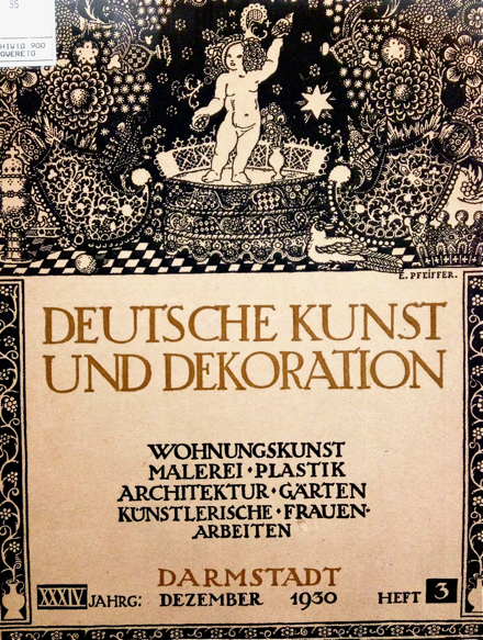
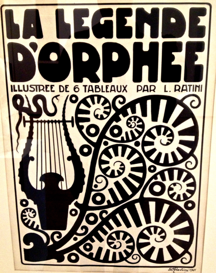
Pics are from her blog, cool holdings of a small Museum of Modern Art in the City of Rovereto. More here and here.

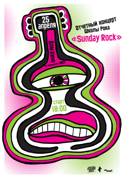
Sunday Rock, analog Cyrillic


‘Specialization of our school is contemporary music teaching for kids and teenagers’

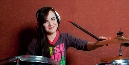
Modern Dog recently created this poster for Sunday Rock, a music school in Yekaterinburg, Russia.

And I provided Robynne and Co. some quick Cyrillic type the old fashioned way: Scanned in from early 20th Century sources, pieced together letter by letter.

Four different scripts combined to have similar weight, rough edges, heavy caps. I’ve been doing a bunch of work this way lately – sometimes one has to go back to basics.

And on weathered days (like today) vinyl sounds better than digital.

Born, Raised, David A. Smith and John Mayer

‘David A. Smith is a traditional sign-writer/designer specialising in high-quality ornamental hand-crafted reverse glass signs and decorative silvered and gilded mirrors. David recently produced a wonderful turn-of-the-century, trade-card styled album cover for popular American singer/songwriter John Mayer.’

More on David A. Smith here.

She said

‘The very first rock and roll Music Video. A stop motion film of the Beatles singing ‘I Feel Fine’ drawn by Stephen Verona and hand colored by Verona and John Lennon’

Typesetter blues

‘Voiced by Canadian legend Gordon Pinsent (Away From Her, Pillars Of The Earth) Typesetter Blues is written in the nonsense poetry tradition of Edward Lear and Shel Silverstein’

Crafted by Toronto-based TOGETHER – part of their silly rhymes series Beastly Bards.

Roman Cieślewicz, graphic designer

‘Cieślewicz always compared himself to a journalist; but he referred to himself as a visual journalist. So Graphic designer, as a profession, is very close to that of journalism; except that it is about articulating clear ideas through the justaposition of imagery and layout – it’s a question of wanting to say something.’ –Professor Andrezej Klimowski, Royal College of Art

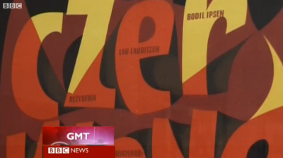
Above, a BBC overview of the work of Roman Cieślewicz (1930–96), which was part of a retrospective this summer at the Royal College of Art in London.

Click image to view video/jump.

Found via BBC News

Graphic design: Training one’s eye


Still from Ingre Druckrey: Teaching to See

As an educator, I’ve broken graphic design into three components: Message, Typography, Layout.

I’m not the first educator to do this – just happened to constantly notice these three elements staring back at me in all the student pieces I evaluate. In my opinion, careful appreciation, understanding and implementation of the three can lead to beautiful work.

message
Graphic design is a communication field, so Message should always drive the project. Today we are bombarded by thousands of Messages on a daily basis, so being on Message is critical. And yes, this usually involves language and writing – which is why I love when students take their written studies seriously.

typography
I’ve seen an (often not cited/supported) statistic that graphic design is 95% typography. Scientific or not, I agree with this. Type is important. I like comparing the exploration of lettering to that of music – there’s enough complexity for it to become a lifetime endeavor. And most of what I teach is type, from multiple angles.

form
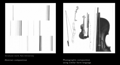
Graphic designers are taught to use grids for layout – though relying on ‘grid’ as a catch all way of handling form can be misleading. Grids provide support, a fallback position for dealing with massive amounts of information. Though important, grids have their limitations. Building structure using symmetry, asymmetry, balance, color – some elements obvious, some not – involves continuous practice, a trained eye, instinct.

These three are not formulas, can’t be added together. They need to work in tandem, like cooking a great stew where the ingredients are based on what feels just right.
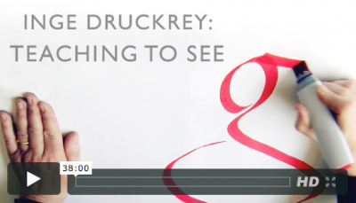

Click to view/jump

On a related note, the above film – Edward Tufte’s Ingre Druckrey: Teaching to See – found its way into my Twitter feed. It’s about graphic design and beauty. And much more.

In January I’m going to be teaching my first non-type course on Form and Space. I’m starting prep now because I consider form so important – so powerful, so delicate.

And beautiful when done right.

Video found via ayana baltrip

State of graphic design, 2012

‘As a student, live by these words, ‘Quantity rather than quality.’ The more you design the better your quality will become and you will continue to grow’ –Tony Montano

I like that quote.

Quality does come later. Being a designer becomes all about instinct – not having the best computer, not software, not measurements, not rules.

I’ve just started teaching another semester of Graphic Design History and Typography at American River College – have a whole new group of kids to introduce to my gospel of visuals.

One thought that’s been weaving its way thru my classes over the years is simply, ‘the more you do, the better you get.’ We’ve all heard this, and yeah, it’s true. The only real stumbling block is ‘the more you do, if you’re not paying attention, you probably won’t get better.’

This year the student work has been incredible – but only when tied to good, old fashioned Hard Work. Risk taking, going out on that edge, trying something one has never done before leads to fantastic creations.

I haven’t been blogging much – I also have my usual four type classes at Ai Sacramento and a rather large project that’s been taking up the rest of my time (more on that soooooon) – so something had to give. It was blogging.

I’ll be posting more as time permits; otherwise been immediately throwing finds up on my Twitter account.

I’m keeping busy. Hope you are too.

Infographic found via Ai Sacramento Graphic Design; click image to jump/view larger

Disform

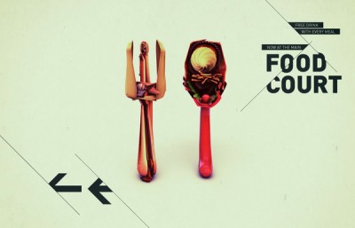
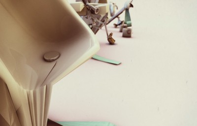
‘Signage for an alternative music festival.’

The work of Dani Wolf.

Found via YouWorkForThem

‘Want it Back’

New video for Amanda Palmer & The Grand Theft Orchestra’s Want It Back. Lettering by Curran James.

Found via aeroplanegirl


Creative Commons License

the work at the mehallo blog. beta. is licensed under a creative commons attribution - noncommercial - no derivative works 3.0 united states license.  if reposting, credit must be given to steve mehallo - and if possible, please provide a link back to the mehallo blog. beta.

i include images for the purpose of critique, review, promotion and inspiration - and always make my best effort give credit/link back to the original source.  if i’ve screwed up, please fire me a note.

page layout based on the wordpress 'darkwater theme' by antbag, adapted and redesigned by mehallo.  valuable php assistance from bill mead.