Get It On
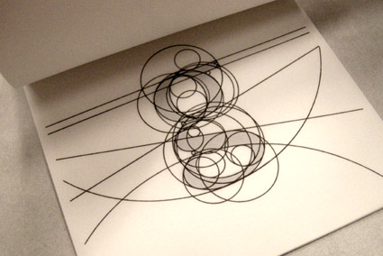
‘Cover graphics and color scheme, which were also used in the videos, were based on sketches by John Taylor’ –Wiki
Always loved this version of Get It On.
‘Cover graphics and color scheme, which were also used in the videos, were based on sketches by John Taylor’ –Wiki
Always loved this version of Get It On.
Picking fonts, not the easiest thing to do. But design student Julian Hansen has created a poster that kinda breaks it down into easy solutions.
Click the above image for a full size version.
Are there really easy solutions?
Swiss design uberguru Massimo Vignelli believes so. Here’s I Love Typography’s take on The Vignelli Twelve.
Found via Typekit
‘I heard there will be a bigger restaurant in their place. I never been to Di Lalla. I must say, it wasn’t very inviting. But it was there and now it’s not. I wish Georgette and Gilles to have a very happy retirement. On their last message, written on a paper place mat, they said : Thank you! To all our customers and friends for those beautiful 39 years. For some reason, I find this very moving.’ -nathalie
Photos by nathalie et cetera of a now abandoned restaurant that’s about to be updated by progress. More details here.

Polariod 195, ID-UV, Black Canyon City, AZ
Photo by moominsean. Flickr here. Blog here.
Found via Planetary Folklore
Intro
Here are some highlights from a candid documentary (shot in 1986) on Saul Bass. The doc is available as a 2-DVD set here.
On making money vs. quality work
Advice to design teachers
Advice to students
Thoughts on his legacy

Lowercase ‘g’ study by Matthew Valentine from mehallo’s beginning type course
Here’s a great opinion piece on typographic education by Patrick Griffin.
Found via Oded Ezer

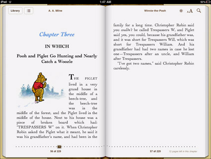
‘This is only conjecture, but it feels like Apple decided to save some cash on font licensing by relying on the same old Linotype fonts they’ve bundled with their machines for years. If that’s the case, why not go with Hoefler Text which is already installed on the iPad? And the strangest omission of them all: Georgia, the father of all screen serifs and far better than any of the iBooks options.’
FontShop’s Stephen Coles takes a look at type problems on the iPad. Read more here.
Disappointing to note because Steve Jobs was always an advocate for good typography. Hope there’s some (good typographic) upgrades coming.

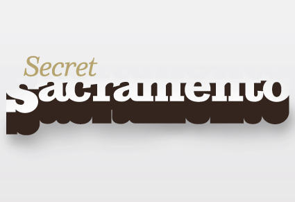
Logotype by mehallo
The secret to being in Sacramento, CA is knowing where the cool stuff is. And a lot of it is just under the radar. The right gallery on Second Saturday, the hole-in-the-wall that has the best burrito, what cool bands are in town.
Mark Bean started Secret Sacramento as a Facebook group. And it’s become wildly popular (over 3,000 followers as I write this) – and it’s spread to Twitter.
And launched recently, the Secret Sacramento website. The new site is kinda sparse – so if you’re local, login and post your own regional finds. Share your secrets.
where i fit in
In addition to designing the logo (above), I will be contributing content from time to time.
But shhhh, it’s all a secret.
‘It’s slick, futuristic and vastly different from Coca Cola’s packaging which would be the reason they wouldn’t pick this up’
so green!
A brilliant bottle concept by an Industrial Design student – Andrew Seunghyun Kim – for helping reduce Coca-Cola’s environmental footprint. Would love to see this implemented. Coke: are you listening?
Details here. More details at Andrew Seunghyn Kim’s blog.
Just don’t tell Raymond Loewy about this.
Found via Designers Couch