entries Tagged as [photography]
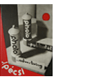
El Lissitzky: ‘Frankreich’
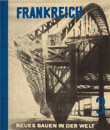
Cover design by El Lissitzky for Roget Ginzburger’s Frankreich (France) 1929.
From Neues Bauen in der Welt, a book series on modern architecture published in Vienna.
Below, recent release by Brooklyn-based Dream Diary, El Lissitzky.
Dream Diary: El Lissitzky
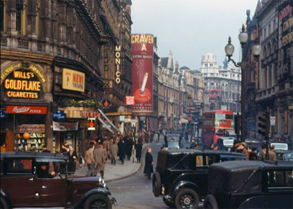
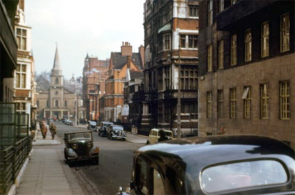
1940s London in colour
‘These photographs were taken using Kodachrome film by the improbably and wonderfully named Chalmers Butterfield, probably in 1949.’
Click on the images for larger images/zoom features/jump.
DJ Munoz/London Calling: You Drive Me Crazy (Yellow Drill Remix)
Images found via Peter Serafinowicz
Alexey Brodovitch, good layout

‘There is no recipe for good layout, but what must be maintained is a feeling of change and contrast.’ –Alexey Brodovitch (1898-1971)
Photo by Man Ray, layout by Brodovitch for Harper’s Bazaar, 1934.
Lillian Bassman, form and light
‘Her work was published for the most part in Harper’s Bazaar, between 1950-1965.’
The photography of Lillian Bassman. Beautiful geometric constructs shot in black and white.
Music by Budd/Wright, In the Midst of Life.
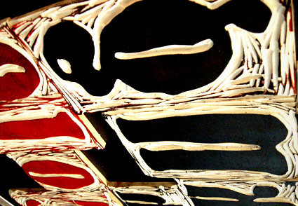
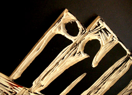
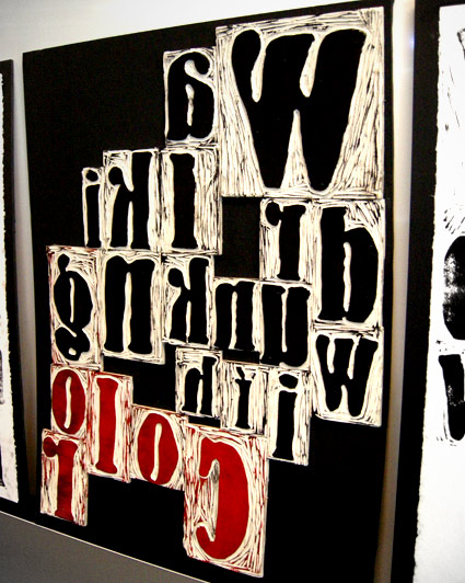
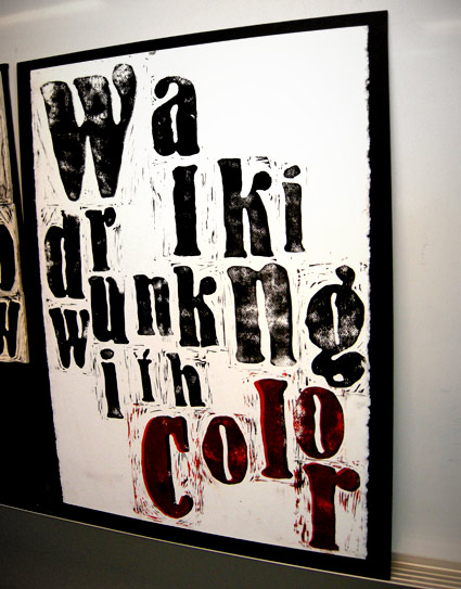
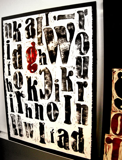
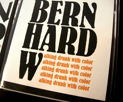
Carved BERN HARD
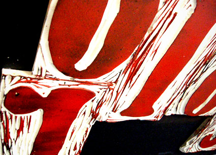
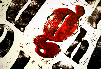
‘I was working on maintaining the quality of Bernhard’s handdone type while taking a new and different approach to it’
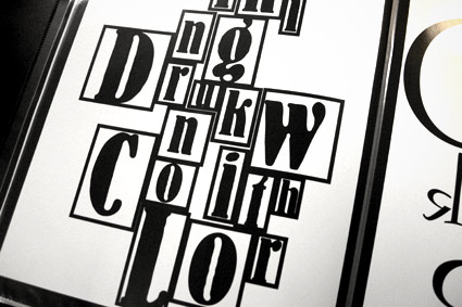
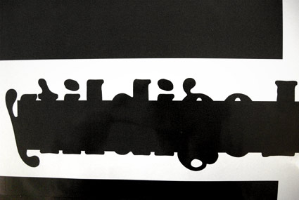
Student Lesley Gaesser’s large scale final project from my experimental type course at The Art Institute of California Sacramento.
Lesley did an 11 week study on the work of designer Lucian Bernhard (1883-1972) – which culminated in a final linocut-inspired project.
Bernard’s Antiqua type was traced onto Speedball carving blocks, cut by hand, inked and printed on large sheets of watercolor paper.
My next experimental course begins April 8.
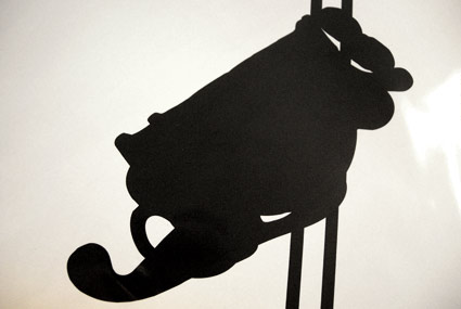
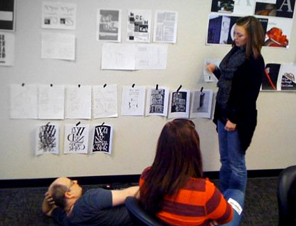
If student hangs roughs low on the wall, one can only critique if lying on the floor; Photo by Daniel Mendez
Reading milk
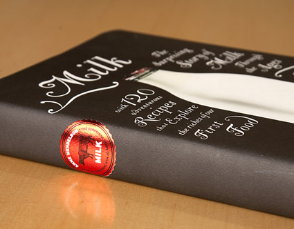
‘The Bodoni Classic Chancery set at different sizes and with as many swashes as I could create. The only color is the red foil cap in the picture. I loved that . . . so I made a foil milk cap for the spine.’
Pictured, Barbara deWilde’s design for Anne Mendelson’s Milk: The Surprising Story of Milk through the Ages.
Design details here. NPR interview with Mendelson here.
