entries Tagged as [mehallo merchandise]
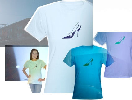
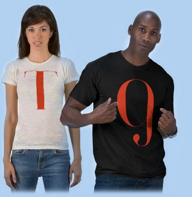
Stiletto shirts by mehallo
Choose from two vintage stiletto dingbats.
Options are an art deco-themed pump or basic, clean lines.
Part of my Moderno Collection at Café Press, limited edition tees featuring type and dingbats from my Jeanne Moderno fonts.
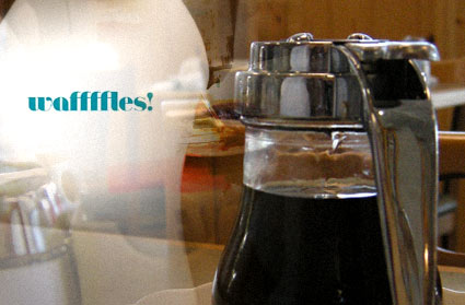
National waffffles! 2009
Today is National Waaffffle Day – celebrating the day the first US patent for a Waffffle maker was issued to Cornelius Swartwout in 1869.
Celebrate your love of waffffles with a limited edition waffffles! shirt by mehallo. Available for both men and women. Part of The Moderno Collection at Cafe Press.
Photo taken at The Original Pancake House in Roseville, CA
Normandie, theStart on tour
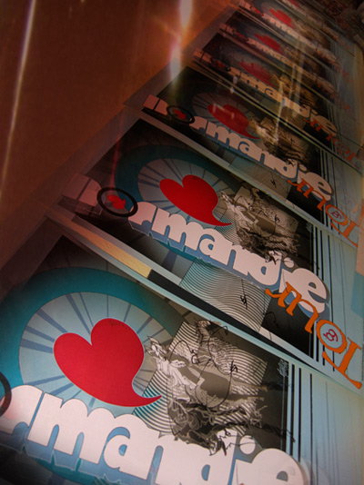
My client, Normandie, is currently touring the known United States.
The band is a side project thunk up by 3 members of theSTART; as a result, the shows become a twofer (two bands in one).
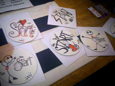
In tow they have a bunch of my tour posters (seen above) as well as some special handmade START cds doodled by the band itself (see below).
Follow their advance across the continent by jumping over to vocalist Aimee Echo’s Twitter page. As of this writing, they seem to be somewhere in the original 13 colonies . . . And may have been replaced by pirates.
Tour dates for both bands can be found on their MySpace pages here and here.
Mehallo merch: how and why . . .
i’m digging all this
I’ve had these merchandise ideas for a few years and just never got around to building them until recently. Production issues always held me up . . . so did fulfillment, pricing . . . inventory . . . [Read more →]
Jeanne Moderno, this week’s featured font at Typophile

Jeanne Moderno Bold is this week’s featured font at Typophile; it’s being used for heads, titles etc. The experimental background on the home page changes as users post messages.
And huge thanks to Psy/Ops for not only doing the final mastering of the font, but also setting up this deal (actually, advertisement).
Introducing: Jeanne Moderno, 9 new modernist fonts
get modern[o]
This is what I’ve been up to for the past year. Instead of plopping down in front of the tee vee, I decided to do something a bit more productive. [Read more →]
Escoffier Capitaux font featured in ‘In Your Face’
This summer I moved a bunch of my fonts over to MyFonts.com. They have a been a great resource for really interesting fonts, many from independents (like myself) that don’t always make it on to mainstream radar – or get lost in very large catalogs.
Today I found that one of my newest – Escoffier Capitaux – is profiled in the Fall 2008 edition of In Your Face; written up by Joshua Lurie Terrell, founder of the Typographica blog. See: 1st column, part way down.
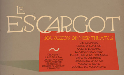
I’d love to see it being used in a menu somewhere. I’d been tinkering with it on and off for the past 5 years or so.
