The U.S.S. Kelvin, 2009
J.J. Abrams made a few changes to Star Trek.
Plotwise it had something to do with a black hole or alternate reality time travel singularity cinnamon gumball something or other. Below is what Abrams’ U.S.S. Kelvin would have looked like if it fit the style created by Star Trek’s original designer, Matt Jefferies.
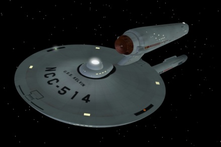
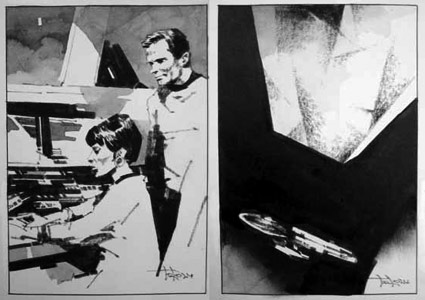
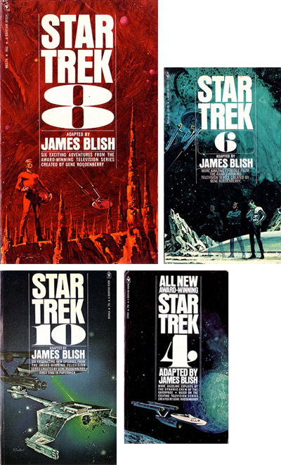
Renderings by Kenneth Thomson Jr.
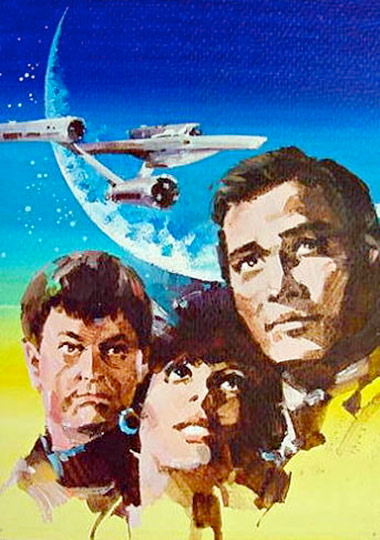
Star Trek’s 1960s production design is a reflection of its era. Cold War, The Man in the Gray Flannel Suit – or Mad Men – in outer space.
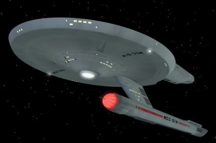
Jefferies’ original Enterprise model sported antennas on the engines, a radar dish up front with deliberate nods to the military. I think that triangle thing under the forward hull may be for an anchor. Maybe.

Battleship Wisconsin
The ships from the original series also sported traditional ‘painted’ surfaces – battleship gray hull – plus, identification tags, banners and typography. Port and starboard navigation lights. Just like the Navy. [Read more →]
Tags: design, design history, fashion, illustration, star trek by steve
3 comments . . .