entries Tagged as [illustration]
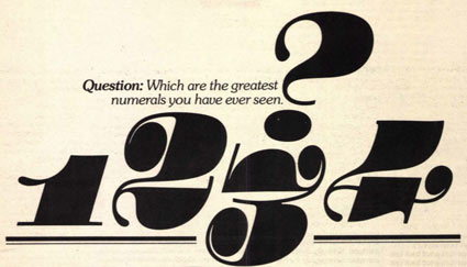
The U&lc archive: Free as PDFs
‘Over the 26 years that it was published, U&lc gathered a following of thousands of avid readers that eagerly anticipated each issue. It became the most important typographic publication of its time.’
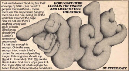
The 1970s looked like the 1970s because of Herb Lubalin.
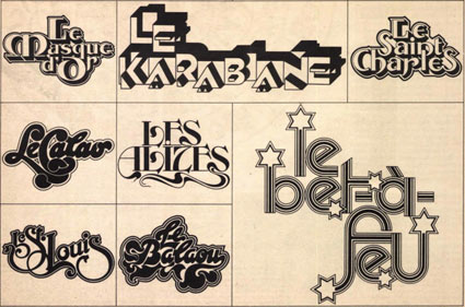
And the way he did this was thru Upper & lowercase magazine. Tabloid in size, printed on newsprint, U&lc was read by most of the graphic design industry. Within, the fonts and philosophy of Lubalin’s International Typeface Corporation [ITC] stressed letters that were set ‘close, but not touching’ and . . . aw, hell, let them touch, overlap and be funky.
By the time I was in design school, the look had fallen out of favor – most ITC fonts were actually banned from use in my homework. ITC’s philosophy was to reinterpret the classics, often into something strangely unique, full of its own style – or a lack of style. Like Helvetica.
The 1970s were all about that. Taking things like Art Deco and doing something totally new with it. [Read more →]
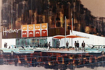
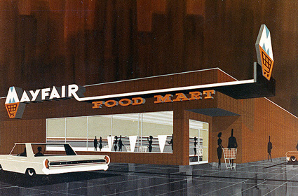
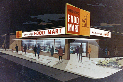
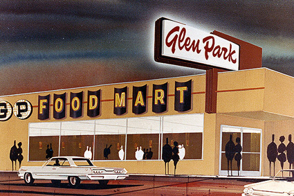
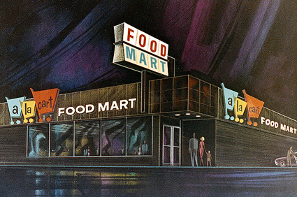
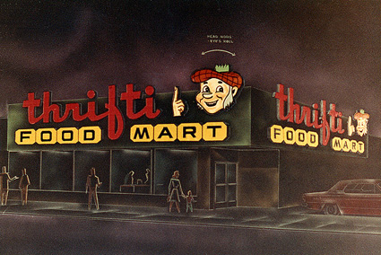
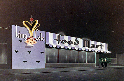
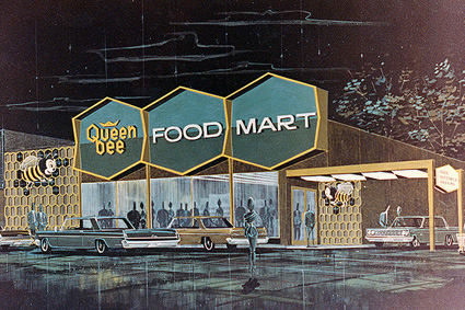
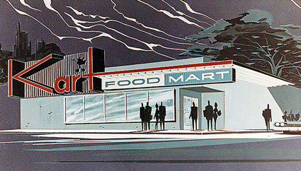
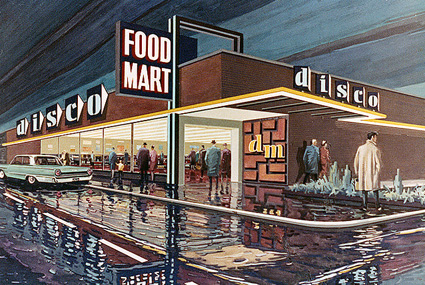
Illustrated ‘Food Mart’ renderings, circa 1962
Vintage architectural renderings of storefronts by an anonymous artist. These were found in a photo album.
It’s amazing how many of these appear to be prototypes for stores that did exist. Wonder what the story is behind them (one agency created facades for many major chains)??
More here.
Sir Julian Gould: Movin At Midnight
Found via Justin Panson
The Control Master
Film by Run Wrake. Made with official CSA ‘bonehead’ images!
And sort of featuring Steven Heller. Sort of.
Wish cartoons were as cool when I was a kid.
Amazing!
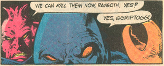
From Steve Ditko, co-creator of Spider-man.
Read it here. And wonder forever!
Found via Martin Klasch
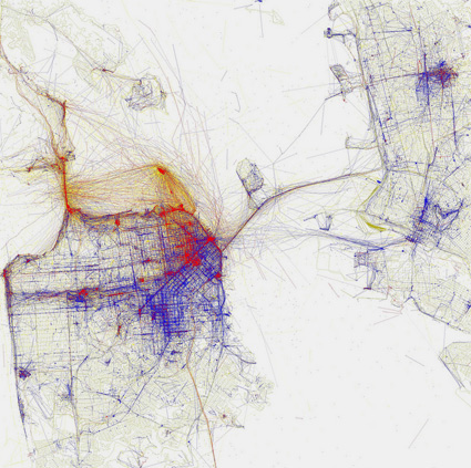
Locals or tourists
‘Blue pictures are by locals. Red pictures are by tourists. Yellow pictures might be by either.’
Where everyone hangs out in San Francisco. According to photos posted on Flickr. More cities here.
Found via CommandZed
Influence: Der Mensch als Industriepalast
‘A German, Jewish gynecologist, artist, and popular science writer extraordinaire, Fritz Kahn (1888-1968) is considered by many to be the founder of conceptual medical illustration.’
The influence of Fritz Kahn’s Der Mensch als Industriepalast (Man as Industrial Palace) was far flung.
Here’s a sum up of the work of Kahn by Vanessa Ruiz at Street Anatomy.
