The Great Times New Roman Controversy
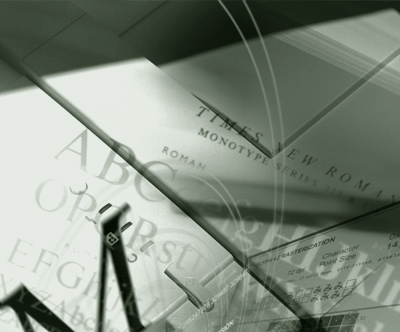
Photo composition by mehallo for Agfa Monotype, 2000
seeds
Mike Parker’s been in the news lately, mostly about the origins of Times New Roman. [Read more →]

Photo composition by mehallo for Agfa Monotype, 2000
seeds
Mike Parker’s been in the news lately, mostly about the origins of Times New Roman. [Read more →]

Typography on the web is about to change dramatically. Several entities are involved. I have a bunch of my fonts about to launch with Typekit.
And here’s a really good rundown by Elliot Jay Stocks, posted on the i love typography blog.
Designer Steven Shearer’s update of the iconic British Keep Calm and Carry On poster – typeset in one of my fonts, Jeanne Moderno. Available now on some nifty Cafe Press items.
Sort of reminds me of the revisionary 1930s British history portrayed in this version of Shakespeare’s Richard III (1995).

Released just a few days ago: Jackson Cavanaugh’s Alright Sans
Alright Sans is a really nice contemporary update of early 20th century grotesk types. With roots related to the wonderful ATF gothics (which exist today in the form of the Knockout group and Benton Sans), but with a humanist twist. Sixteen styles designed by Jackson Cavanaugh, it can be found at MyFonts here. And it’s on sale right now: 20% off.
Follow Jackson on Twitter here. Visit his foundry, Okay Type & Design here.
Found via Twitter.com/Typegirl
All about FF Dagny: Evolution of a newspaper type font, interview and post at GarciaMedia.
FF Dagny is now available thru FontShop.
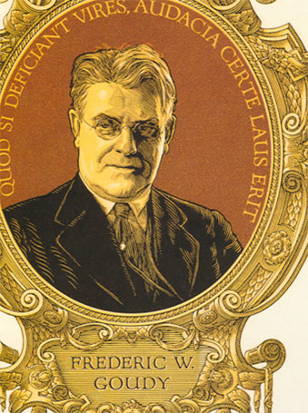
F.W.G. portrait by Clarence P. Hornung
from Leslie Cabarga’s Logo, Font & Lettering Bible
Frederic W. Goudy (1865–1947) was considered one of the most prolific type designers of the early 20th Century. Not to be confused with Antonio Gaudi, F.W.G. is mostly known for Copperplate and Goudy Oldstyle that show up on most font menus. But that’s just the beginning.
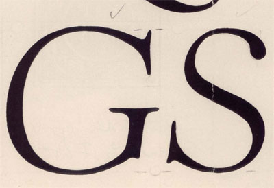
Goudy’s ‘quick sketch’ drawings for Kennerley Italic
from D.J.R. Bruckner’s Frederic Goudy
Goudy was self taught. And his font career really didn’t take off until he was in his 40s. Legend goes, Goudy could draw a font in about a week. [Read more →]

Lyon’s Coffee Shop, San Bruno, CA 1962. Found via Googie Art.
I grew up around Googie Architecture. It was just there. Space age-looking buildings, funky decor and rocks in the walls. Lots of rocks. Flintstones-like, but where the Jetson’s were running the quarry.
The 24 hour Lyon’s in San Bruno (see above) was the high school hangout. Long weird nights. In college, those weird nights spread to the other Lyon’s in San Mateo, San Carlos and Daly City. Denny’s was the alternative.
The style’s roots can be traced back to Frank Lloyd Wright and Tallesin West. Architect John Lautner designed the first Googie structure in 1949 and it was panned by critics. The firm of Armet and Davis designed most of the rest. [Read more →]
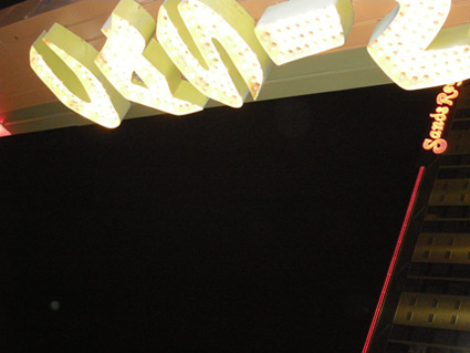
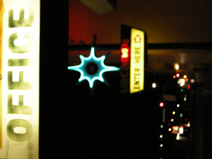
Snapped these while in Reno a few weeks back. Love 1950s vernacular typography, I’ve built an entire font family around this.
Drove the guy at the motel front desk crazy with my flash.
A really nice drug dealer tried to sell me his wares.
I’m not being sarcastic, he was really, really nice.
Took me a long moment before I realized what he was up to.
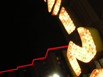

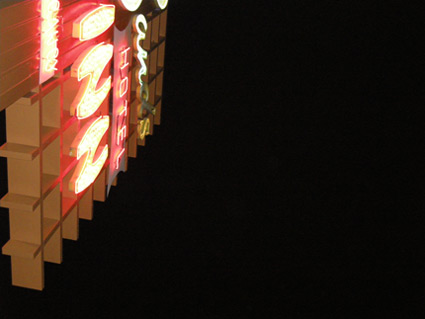
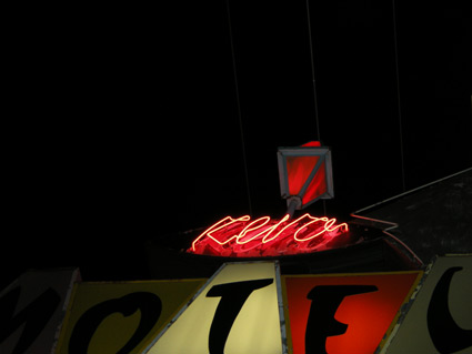
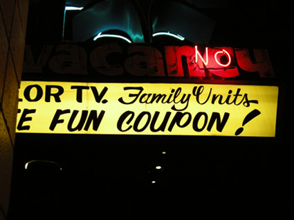
It’s the type that’s sexy.
If it were one of my fonts, that’d made it even sexier.
Make The Girl Dance is Campana & Perrin, aka Greg & Pierre. This is their MySpace page.
Found via Ashley Simko’s blog
Robust and playful, Organon is Nick Cook’s new superset type family – now available thru Fontworks UK. Click on the links above to order. Detailed release notes can be also be found in this post at Typophile.
As for the moniker, Nick says, ‘I got the name from the first line of ‘Cloudbusting’ by Kate Bush.’
Found via Twitter.com/typegirl
Here’s a great article at Typotheque on fonts who hang out in families. Where they come from, why they get along better than real families.