
The concept of ‘negative space’ (or ‘white space’) as an important part of type design is very difficult to teach. The student either sees it right away, it clicks over time or sometimes the concept is just weird enough to cause them to back away very slowly.
It’s a up is down, left is right sort of thing. Pen strokes are important, but so are the parts that aren’t made by the pen.
Just the right amount of negative space defines the character and readability. Claude Garamond (c. 1480-1561) was a master at this; it’s one of the reasons his types are still incredibly popular today.
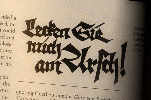
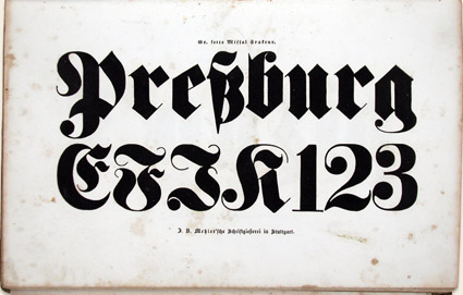
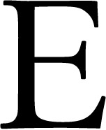
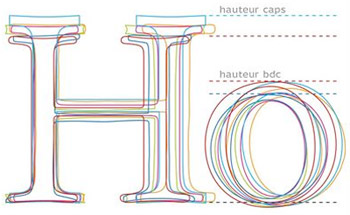
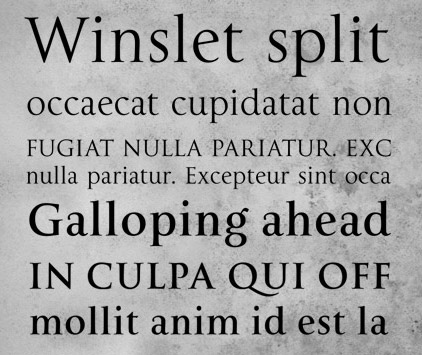
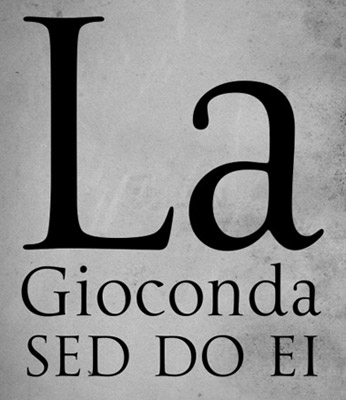
Here’s some cap E comparisons to chew on.
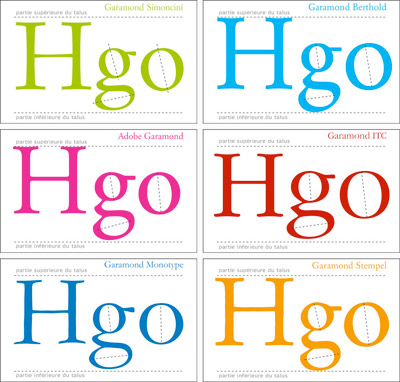
Plus, here’s a great breakdown of today’s Garamond interpretations (images below).
And, an interview with the master himself.


Cap Es found via Nina Stoessinger; Garamond comparisons by Barney Carroll
Tags: cool finds, education, fonts, typography by steve
Comments Off on White space and E
