Anderson: Cooper Black
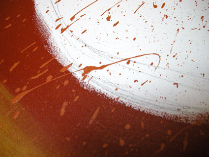
David M. Anderson’s Chaotic Times of Cooper Black, 2008. Mixed media on canvas.
Based on the type of Ozwald Cooper (1879-1940). From my Typography 3 course at Art Institute of California Sacramento.
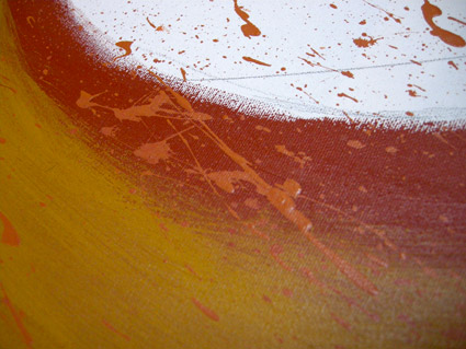
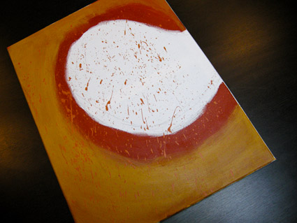

David M. Anderson’s Chaotic Times of Cooper Black, 2008. Mixed media on canvas.
Based on the type of Ozwald Cooper (1879-1940). From my Typography 3 course at Art Institute of California Sacramento.


Chandler 42 was one of my first typefaces – and one of the earliest ‘grunge’ typewriter font packages to hit the market.
It has details in it one won’t see in other autotraced typewriter adaptations. Eight fonts in the complete package. Snag your copy here.
Click on the above image to read/jump. Mood music below.
Randy Brooks And His Orchestra: Harlem Nocturne
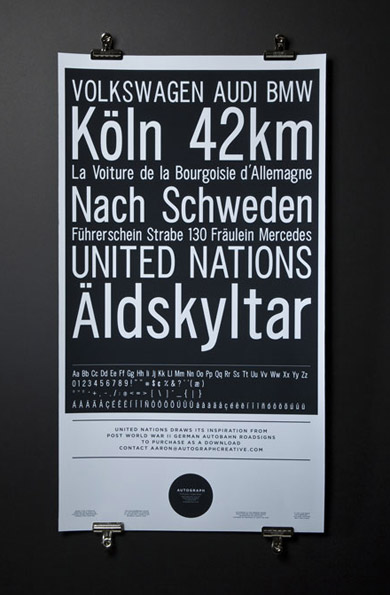
‘Drawing inspiration from WWII German Autobahn road signs and Helmut Lang’
Berkeley-based Autograph Creative’s United Nations poster and typeface.
Steven Heller, Jonathan Hoefler and Tobias Frere-Jones on type.
‘Amazing fontstaches! I love Mr. Jeanne Moderno myself =D’ –Darren Evans
Hm.
I actually am Mr. Jeanne Moderno – since I did name the font after my wife.
And I did kind of base that bracket on the facial hair of this particular potato chip mascot.
Really.
‘A look at printing the of House Industries’ Eames Century Modern catalog.’
‘Charles and Ray Eames did not design a typeface. They did, however, leave a philoshophical template for a font collection worthy of their name.’
House Industries has created Eames Century Modern – a rethinking of the original Century types – with a midcentury modern update. Details here.
The mid-century stylings of Charles and Ray Eames were a major influence on my Martini at Joe’s fonts. Snag em here.