entries Tagged as [fonts]
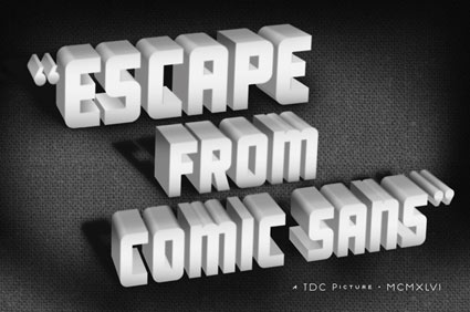
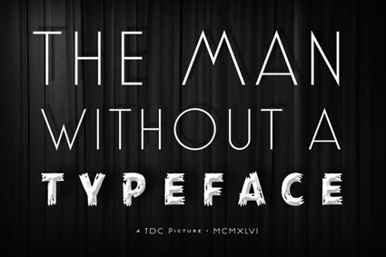
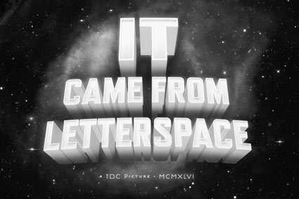
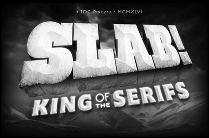
‘Escape from Comic Sans’
B-movie typography eCards, designed by Will Staehle for TDC. Go here.
And check out Will Staehle’s website here.
Found via Ilene Strizver
The Return of Joe’s
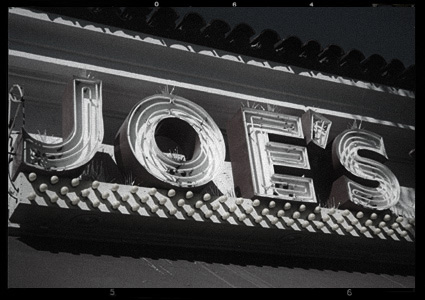
Rumor has it that Original Joe’s in San Francisco may be reopening this year.
Hoping to stop in for a Martini, of course.
Above: Photo of Original Joe’s original sign by mehallo
Brownstone, with Artie Shaw
‘An original 21st-century design by Alejandro Paul, Brownstone is a monoline sans-serif with ornate details inspired by historic brownstone buildings of Brooklyn, NY.’
Love type. But also love Artie Shaw.
Moderno baby
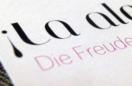
Nina Stoessinger does great work. Pictured, a bilingual birth announcement she designed for a friend, using my Jeanne Moderno Titling font, paired with FontFont’s Dagny Thin.
She dropped a few to me in the post. It’s always great to see how my fonts end up being used.
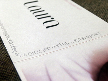
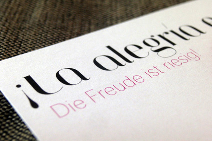
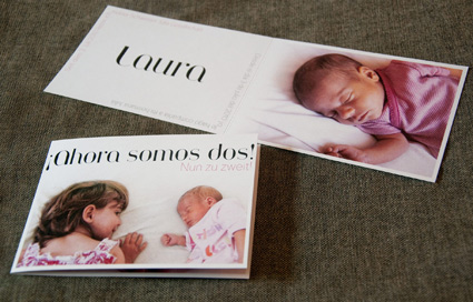
Congratulations to the new parents – and Laura!
Benguiat’s Caslon
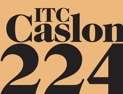
‘Benguiat has frequently said he chose the number 224 because it was the address of the building where he did most of his work.’
Ed Benguiat couldn’t leave well enough alone. And in 1982, created one of the funkiest versions of Caslon ever – for ITC.
I love the swoops and the ear on top of the lowercase g.
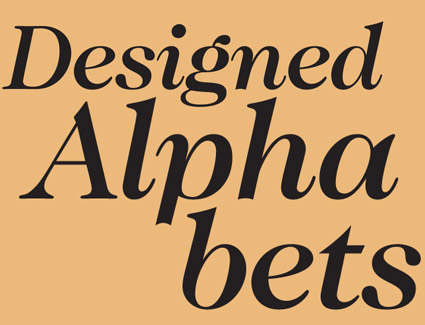
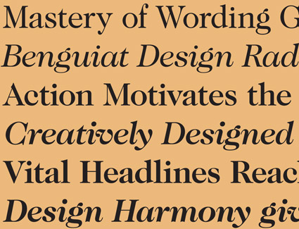
More Caslon: Today
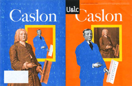
What would William Caslon look like if he were working today?
This is one of my favorite takes on Caslon (above) – editorial designed by Mark van Bronkhorst and written by John D. Berry.
It’s the 1998 front and back cover of one of the final print issues of Upper & Lower Case magazine (and as you can see, my copy is a bit mussed up). William Caslon would be wearing a blue suit today, such is the nature of the biz.
Inside U&lc was an incredible promo for the late Justin Howes’ historically accurate ITC Founders Caslon – one of the most faithful updates ever digitized. [Read more →]
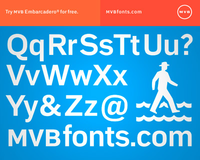
Embarcadero: Free font, limited time
I’ve been a fan of the design work of Mark van Bronkhorst for years – and he’s just relaunched MVB fonts and fired up a new Twitter account.
And if you signup/subscribe/givehimyouremail, you’ll get cool things showing up in your inbox which will include a free copy of MVB Embarcadero Bold (a real font, worth 79 bucks) . . .
All you have to do is go here and do what it says.
Offer ends September 15, 2010.
Found via Delve
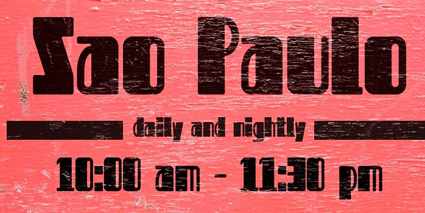
Moshun: An animated font
‘Moshun’s a fairly simple design – done in just two days in Illustrator and After Effects – that happens to leap, spiral, and shimmy into place.’
Moshun (pronounced Mo-shun, of course) was created by Dutch designer Jeroen Krielaars. Article (with much more detail) here.
