Brown bottle kombucha

I love this stuff.
Townshend’s Tea Company’s ‘White Rose’ Brew Dr. Kombucha. Not available in California. Yet. This is my last bottle, sipping it slowly.
Website here. Dang cool bottle designed by Laura Schalk.
Photo by mehallo
I love this stuff.
Townshend’s Tea Company’s ‘White Rose’ Brew Dr. Kombucha. Not available in California. Yet. This is my last bottle, sipping it slowly.
Website here. Dang cool bottle designed by Laura Schalk.
Photo by mehallo
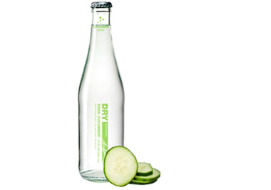
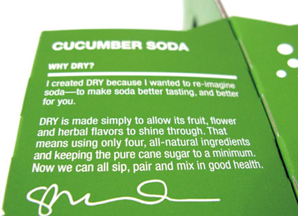
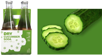
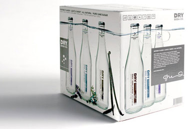
This finally made it on my radar.
Took my first sip this evening and I’m hooked. Low sugar, DRY cucumber soda. Bought a four pack.
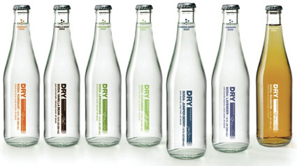
Complete line of sodas include vanilla bean, juniper berry, lavender, lemongrass, blood orange and rhubarb. Website here. Blog here.
Brand design by Seattle-based Turnstyle.
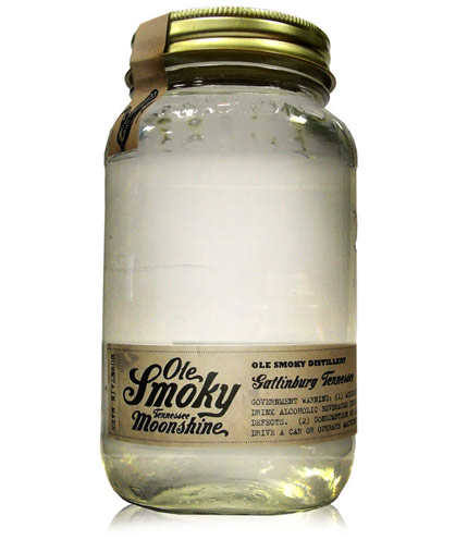
‘Moonshine now finds its first taste of legality with a recent state law in Tennessee allowing the distillation of spirits’
Of course, the ‘first legal moonshine in Tennessee’ needs some good branding.
Ole Smoky’s script logo was designed by letterpress specialist YeeHaw – with Ole Smoky Distillery owners Jessi and Joe Baker, Cory Cottingim and Tony Breeden developing the look of the mason jar bottle, label and seal.
The team at Robin Easter Design pulls it all together with a kick ass website.
More details here. Order here.

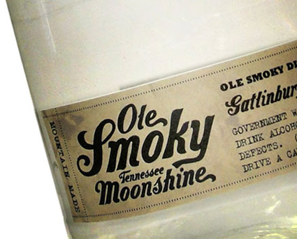
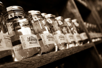
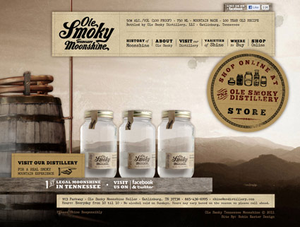
Info provided via Whitney Hayden at Robin Easter Design; images found via The Dieline, IVI Blog and Thirstysouth

‘Hillbillies, long misunderstood and maligned as isolated and backward, actually have a 300-year history of achievement and success that has contributed significantly to our national identity.’
I caught this doc last year on the History channel.
Hillbilly: The Real Story (2008) – hosted by Billy Ray Cyrus – is a great overview of the ‘Appalachian American’ subculture that brought us moonshine whiskey, labor unions, NASCAR and country music.
Stream Hillbilly here. DVD here.
Pictured up top: An original ‘painter’s piss’ runner, found via theTHROTTLE
related
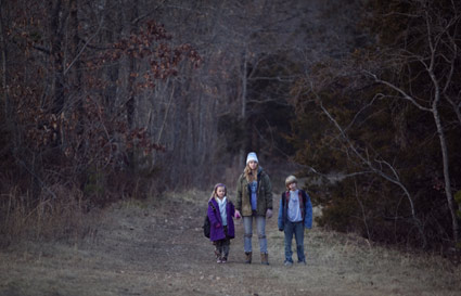
Also, Hillbilly does a pretty good job of setting the stage for Oscar nominated Ozark kin drama Winter’s Bone (2010). Incredible performance by Jennifer Lawrence, below. Review here.
Tex Avery’s Blitz Wolf, Academy Award-nominated war propaganda cartoon from 1942. Uncut version.
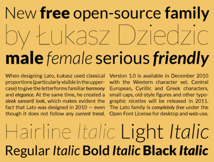
‘Lato is a sanserif typeface family designed by Warsaw-based designer Łukasz Dziedzic. Lato consists of five weights (plus corresponding italics), including a beautiful hairline style.’
Details at Typophile. Download the Lato fonts via Google.
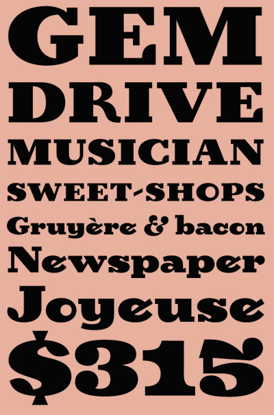
‘Birra arose from years of compulsive doodling in pen and ink, and conjures the whimsy and syncopated contrast of novelty handlettering in the early 20th century’
Birra is Joshua Darden’s reworking of Frederic W. Goudy’s least favorite novelty font, Goudy Stout. Though Birra is actually totally different and completely not the same. Not unlike being not similar like. It’s odd, fun, playful and one can download it free.
Grab it here.
Just my mindset this morning.
Set in Alte Hass Grotesk, a free font based on the ‘cold type’ version of Helvetica. Download here.
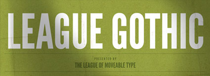
This week I gave my design history talk on American Type Founders’ Gothics – a large collection of (mostly 19th century) sans serifs typefaces.
ATF was formed in 1892 by a merger of 23 American type companies – resulting in, literally, a huge pile of metal that had to be sorted, catalogued, duplicates removed and if necessary, redesigned. Morris Fuller Benton (1872-1948) ended up doing a lot of the dirty work – among the results were ATF’s very industrial Gothic series of typefaces.
These types exist today in many digital forms – some with their original ATF names, such as Franklin Gothic and News Gothic – or as revivals, which includes Benton Sans and Jonathan Hoefler’s comprehensive Knockout series.
Amidst recent revivals is Caroline Hadilaksono and Micah Rich’s League Gothic (above) – an interpretation of ATF’s Alternate Gothic No. 1 (below).
Snag your own free version here.
And hell, if you see any problems, fix em. The font is open source.
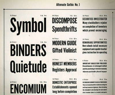
Alternate Gothic No. 1 specimen (cropped), ATF’s Book of American Types, 1934

M.F. Benton, read more on Benton here
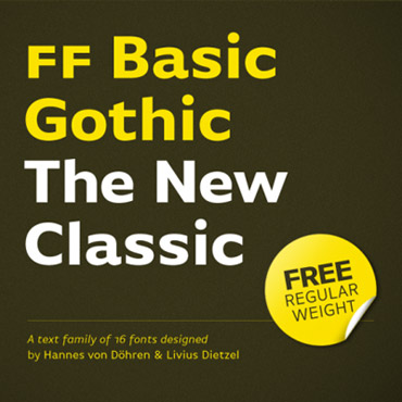
‘The name says it all: FontFont’s Basic Gothic is a neutral American grotesque for all purposes, something between Gill Sans and Verdana.’
More from Hannes von Döhren: The Basic Gothic types were a joint project with Livius Dietzel. Basic Gothic uses ideas from the 19th Century – resulting in some really nice workhorse fonts for today.
Grab the Regular weight free here. Another limited time offer.
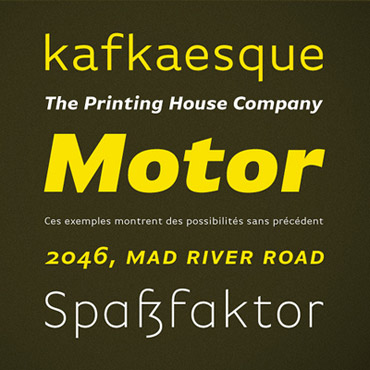
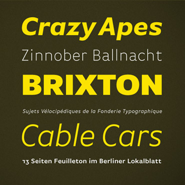
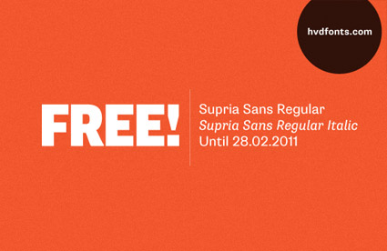
‘An extended family of 36 fonts inspired by Swiss type design.’
Released just this year, Supria Sans is an incredible new type family designed by Hannes von Döhren.
And you can snag the Regular weight (+ Italic) free here. Offer ends Monday, February 28, 2011.


the work at the mehallo blog. beta. is licensed under a creative commons attribution - noncommercial - no derivative works 3.0 united states license. if reposting, credit must be given to steve mehallo - and if possible, please provide a link back to the mehallo blog. beta.
i include images for the purpose of critique, review, promotion and inspiration - and always make my best effort give credit/link back to the original source. if i’ve screwed up, please fire me a note.
page layout based on the wordpress 'darkwater theme' by antbag, adapted and redesigned by mehallo. valuable php assistance from bill mead.


