entries Tagged as [education]
A TETRIS History of the Soviet Union
Video for Pig With The Face Of A Boy’s A Complete History of the Soviet Union as Told by a Humble Worker, Arranged to the Melody of TETRIS. Directed, animated and edited by Chris Lincé.
Andrews, 1934
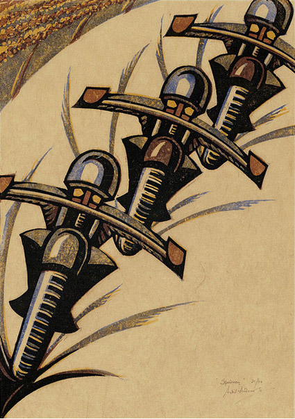
Sybil Andrews’ Speedway (above) is a linotype print commissioned by the London Passenger Transport Board in 1934 to advertise what was a new spectator sport, Speedway Racing.
The final piece – like the famous ‘keep calm’ poster – was never used for its intended purpose.
Found via Gunther Stephan
Goncharova, 1913
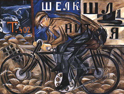
‘She did not hesitate to break up forms and rearrange their component parts. She introduced musical notation, letters and words, as they flash past in shop signs; she expressed movement by repeating the same form in several phases of its action and velocity by blurring contours.’ –Goncharova: Stage Designs and Paintings
The work of Natalya Goncharova (1881-1962).
Metzinger, 1913
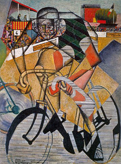
‘Metzinger celebrated the salutory effects of exercise on the male population in his ‘Cyclist,’ which focused on a sport that historian Eugen Weber has described as a French creation, and one affordable to the French working class by 1900.’ –Mark Antliff, Patricia Leighten
In 1913, Jean Metzinger (1883-1956) created his Cubist Cyclist to depict audience, participant and the interaction involved.
(Been doing a lot of reading on early modern art)
David Byrne: Architecture affects music
‘Does the venue make the music? From outdoor drumming to Wagnerian operas to arena rock, he explores how context has pushed musical innovation’
Found via Lucy Cook
Design in use: ‘How Buildings Learn’
Designing for use is something often overlooked by designers. What happens once the design is in the hands of actual people?
Stewart Brand takes a long look at design AFTER it’s implemented – in this case, the design of buildings. Does ‘form follow function?’
6-part, 3-hour BBC Documentary. Based on Brand’s book. Music by Brian Eno. From 1997.
Posted in its entirety on Google. Part one above. For part two thru six, go here.
Coolness: Stippled Conan
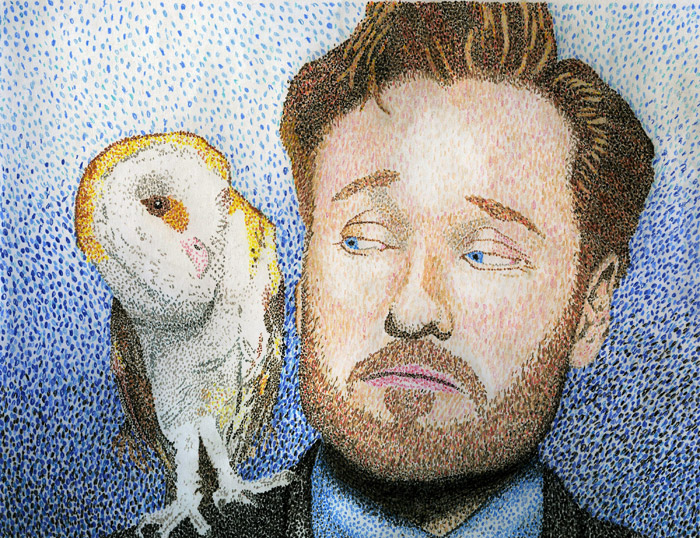
‘it took a week to do it’
For anyone who’s taken an intro to typography course with me – there is a fair amount of stippling involved as part of some really complex letterform studies.
And one of my former students – Freya Kiessling – who dotted her way thru letters – has gone national with her work.
Her color Conan O’Brien pointillism illustration (above) was used as a bumper on Conan’s show, April 11, 2011. The drawing was submitted thru their Coco MoCA page (many, many images abound).
And today – per show request – a print hangs in the show’s green room at Warner Bros. in Burbank.
Below, another Freya-produced Conan piece – from a beginning animation class.
Creative secrets: The super obvious
Tonite this link just sort of popped in from former student Campbell BrownKorbel. It’s secrets that every creative – from illustrator (the focus) to designer to comedian to (hell) anarchist – should know.
Phil McAndrew’s Super Obvious Secrets That I Wish They’d Teach In Art School. Read the whole thing here.
Lost in type: Gill Sans
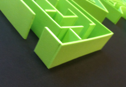
Dmitriy Antropov’s final project was a Gill Sans maze, hand crafted from foam.

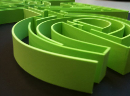
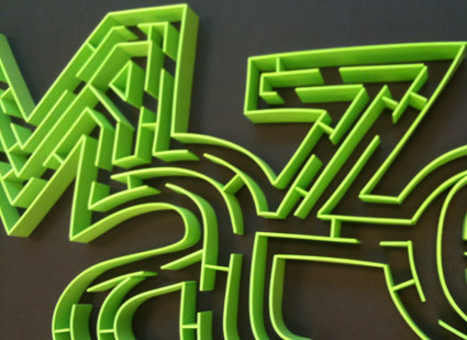
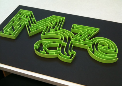
After we tried to actually do the maze (and failed), Dmitriy reached down and carefully removed a small partition – near the bottom of the a – and we were able to complete.
