Support St Bride
‘The St Bride Library is the largest library for printing, publishing and the graphic arts in the English-speaking world.’
The St Bride Library now has a shop. Limited edition type/printing books, snag em here.
‘The St Bride Library is the largest library for printing, publishing and the graphic arts in the English-speaking world.’
The St Bride Library now has a shop. Limited edition type/printing books, snag em here.
Just had a discussion – and major test question – involving 19th Century wonder Clarendon in my history class. As a type, Clarendon has been popping up all over the place for a bunch of years now.
I use it (paired with Jenson) for handouts in my introductory type course at ARC, up until recently, it was the corporate font for Starbucks . . . it just boldly says, read me.
New article (and cool samples) posted by SOTA’s Tamye Riggs here.
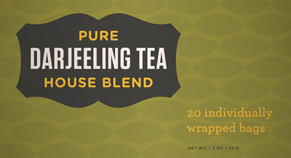
‘Is there a way to know what fonts will work together? Building a palette is an intuitive process, but expanding a typographic duet to three, four, or even five voices can be daunting.’ –H&FJ
‘how do I pick the right font?’
. . . is the most common question I’m asked in my type courses. And my answers aren’t usually simple. I liken it to picking the right suit, tie and shoes.
What handbag will work best, nail polish, lipstick, gloss or none, which eye liner will simply look great . . .
One learns by doing. [Read more →]
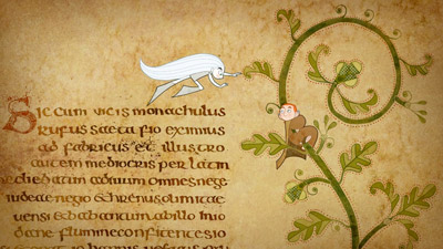
‘Your eye travels over Celtic crosses and through forest glades, studies architectural schematics and drinks in delicately washed landscapes . . . And it is only fitting that a movie concerned with the power and beauty of drawing – the almost sacred magic of color and line – should be so gorgeously and intricately drawn.’ –A. O. Scott, NY Times
The Secret of Kells, which premiered last year in Berlin, has been quietly gaining attention on the festival circuit, racking up awards – as well as an Oscar nomination for Best Animated Film. (tho – Disney’s Up won the statue)

The film is the story of Brendan, a 12-year-old who – in 9th century Ireland – discovers the beauty of art and sets out on a life’s journey to complete work on The Book of Kells.
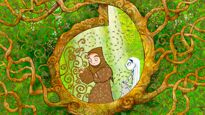
Official website here. Filmmakers’ blog here. Facebook fan page.
The film is still in limited release, slooowwly making the art theatre circuit.
Early promotional trailer
Final US trailer
Right now my history students are freaked out by the study guide they received this week.
Among the many graphic design historical items listed is the Irish Book of Kells, c. 800 A.D.
The Book of Kells is the most elaborate illuminated manuscript ever created – that we know of. A brief overview can be seen in the NBC video above; its origins are the stuff of legend.
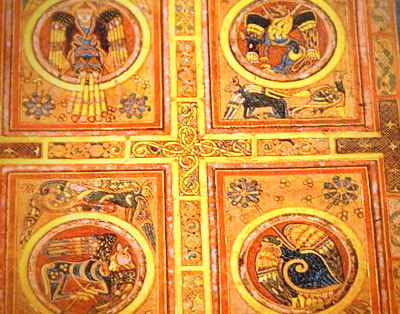
book of kells resources
Many different resources exist for study. A detailed history can be found on the Wiki site here. There are also introductory books, official sites, fan sites and more. The most accessible would be The Book of Kells on DVD, which details every page of every folio. Preview video below:
Or
If you simply want a Kells-based journal, you can snag one here.
Today Show video found via MSNBC
Kermit, from 1969.

‘A sixty-page book covering the philosophical & semiotic aspects of typography, with content based on lectures by a SCAD professor & Robert Bringhurst’s The Elements of Typographic Style’
By Steven Acres. Details here.


Found Via Creativeoverflow
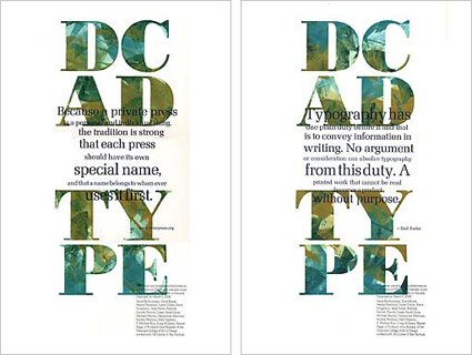
‘Typography is what language looks like.’ –Ellen Lupton
Great collection of typography quotes (with article), collected by Jacci Howard Bear. Go here for more.
And
Check out as8: Alessandro Segalini’s collection of quotes on typography here.
Image found via Lead Graffiti
‘It’s all in the details. Our end slug was pulled right from the logo itself, the dot on the ‘i’ to be exact. This was a small but proud moment for us. I’m sure you saw the connection right away . . . right?’
Check out this great, detailed article about the recent NYT Magazine redesign at the Society of Publication Designers Blog.