Shein
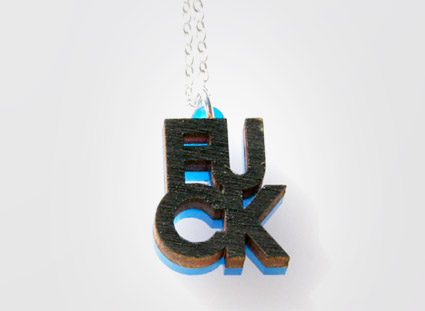
‘Nope, it’s not French Connection United Kingdom. It’s plain and simply Fuck.’ –Between the Cracks magazine
Jewelry by Steven Shein.
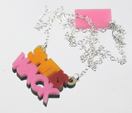

‘Nope, it’s not French Connection United Kingdom. It’s plain and simply Fuck.’ –Between the Cracks magazine
Jewelry by Steven Shein.

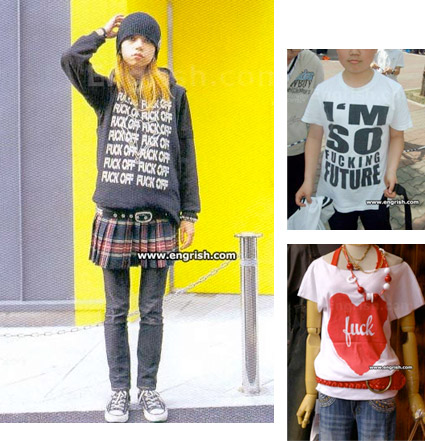
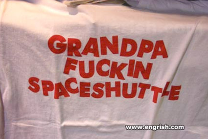
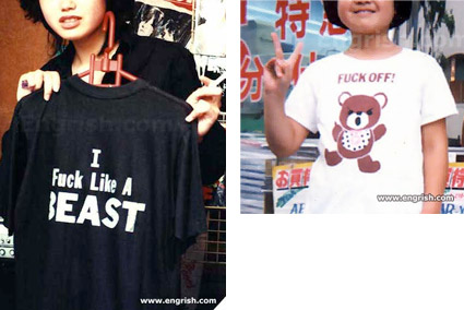
In honor of Fuck Week, here’s some highlights from the Engrish blog.
Actual products from Asian countries where English, of course, is not the primary language. For teens, for babies, for grandpa.
Regular Engrish site here. Adult content site here.






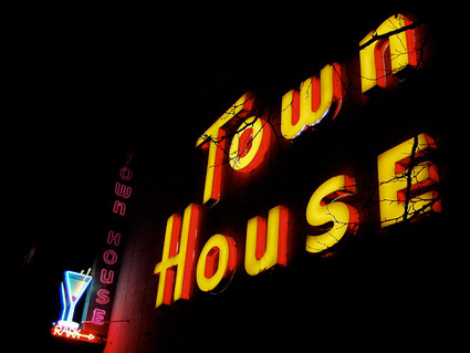
Sacramento’s Town House Lounge, photo by Tom Spaulding
In the shadow of the California State Assembly is Sacramento’s Fuck Fridays at the TownHouse Lounge.
Tonite: DJs Shaun Slaughter/Jon Droll, Short Circuit, a Cops and Robbers theme and one of the best fucking signs anywhere (above).
More info via Twitter, MySpace or Facebook.
And
Check out Tom Spaulding’s incredible Sacramento Signs Flickr set here.
‘And no matter what the locals tell you, don’t take the pink line to the yellow line.’ –Gizmodo
Speaking of the Underground, here’s Sam Lomen’s Underskin.
Found via Justin Nelson
Reanimating and recreating BBC graphics.
Here’s a few more (in addition to the work I posted on Wednesday); above a recreation of the classic BBC globe. And some other odd stuff I found while browsing around . . .
‘A weird BBC World twister ident’
‘BBC 1 in a retro style’
‘BBC 2 tangled’
Plus
Some real BBC idents from over the years:
BBC 1
BBC 2
‘This set of opening title sequences for the BBCs regional news bulletins was unveiled in 2008 as part of the Corporations attempt to create a unified brand for BBC News across all platforms (television, radio and new media).’
This is the real thing, though I prefer Michael Wood’s interpretations. Designed by Lambie-Nairn. I like the subtle nod to the Underground. More below:
I look at swirling American television news graphics – which include CNN’s uncanny ability to use the wrong apostrophe – with Trajan, voice overs from Michael Douglas, James Earl Jones and Morgan Freeman. Music by legendary movie composers John Williams, James Horner. Dramatic excess.
Amongst all this, the graphics for BBC News are a breath of fresh air.
Here’s a bunch of constructs by designer Michael Wood. Simple, cool intros . . . not quite the real thing (I’ll feature those in part 2), but smoooth.
Images by Petra Cortright.
Blog here. Interview here. MySpace here. Plus, check out her sparkling videos here.
Very basic tools, intriguing results.
Found via today and tomorrow
‘TYPEFACE is a piece of custom software that translates facial dimensions into generative type design.’
By CIID student Mary Huang. Check out this detailed article at PSFK.
The Geeks Were Right by The Faint.